Club Brugge - A versatile brand for one of Belgium’s top football clubs
Founded in 1891, Club Brugge is one of Belgium’s oldest and most successful football clubs, winning the league on 16 occasions. The club has become a regular feature in the UEFA Champions League – a prestigious competition with a global audience. Seeking to meet the media demands placed upon today’s elite clubs, especially in the digital realm, Club Brugge chose Studio Dumbar/DEPT® to refresh its brand.
Strategy
First and foremost, this wasn’t a radical rebrand. The Club badge was off limits – changing a historic crest when fans have it tattooed on their limbs is problematic, to say the least. Our task was to look at all other aspects of the brand, introducing clarity and impact online, on social media, and in motion graphics.
Design
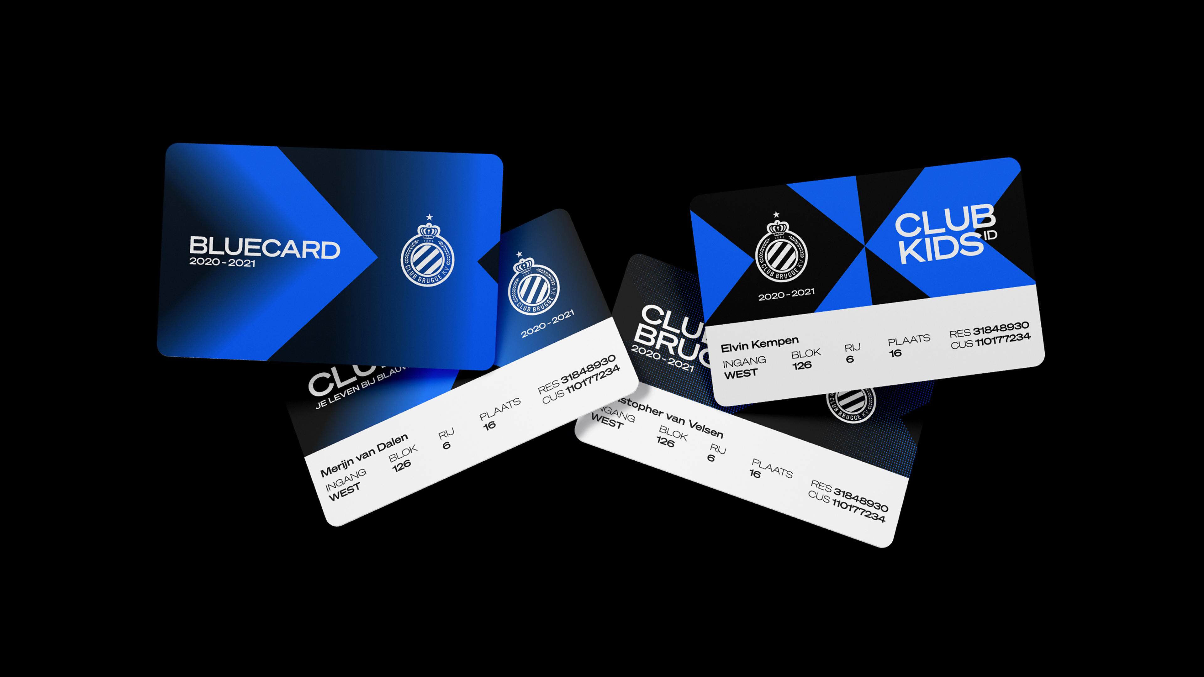
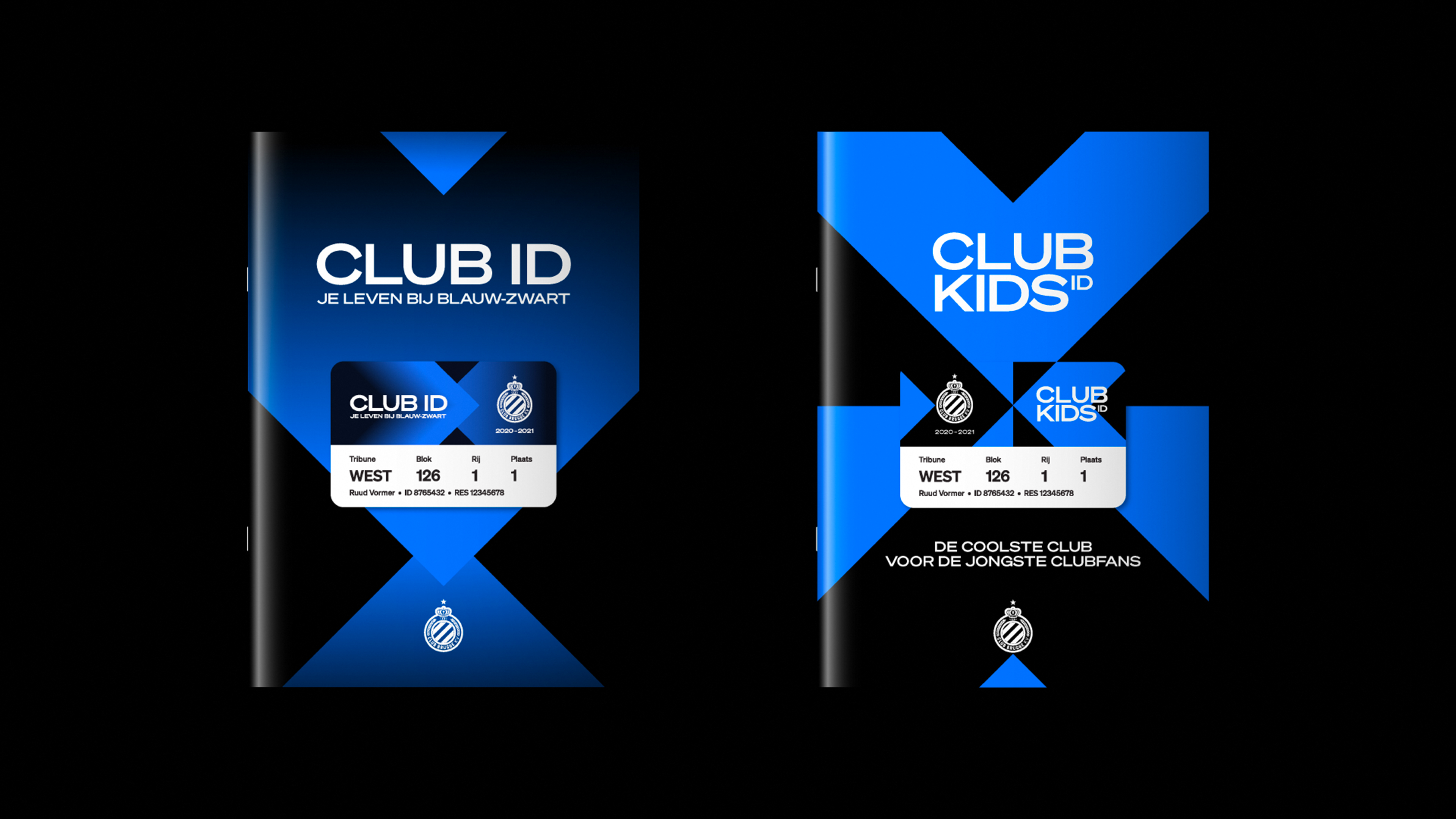
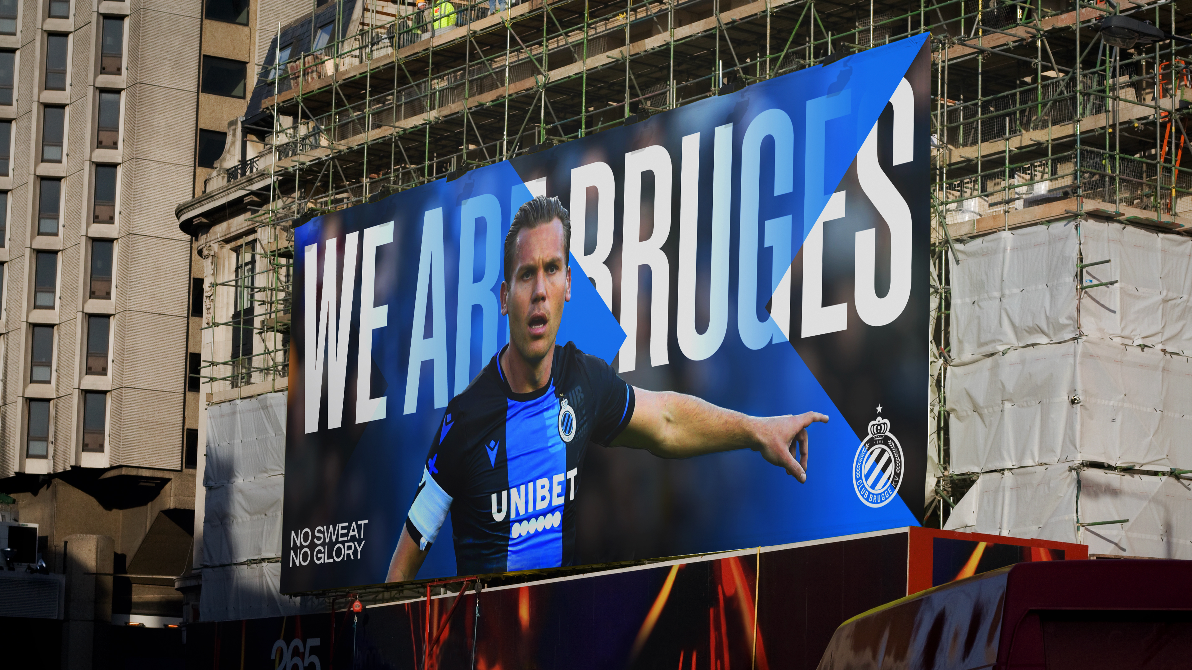
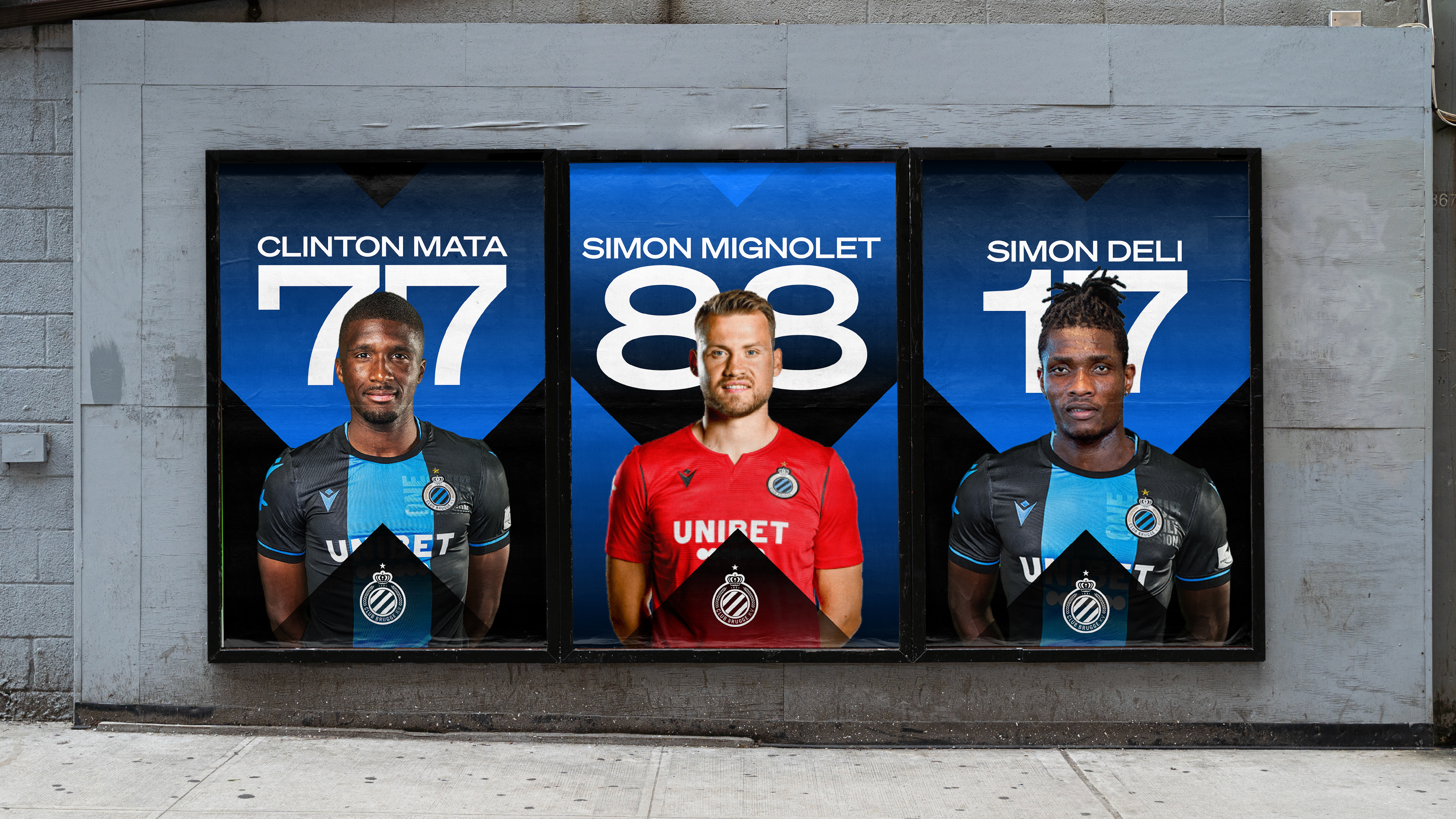
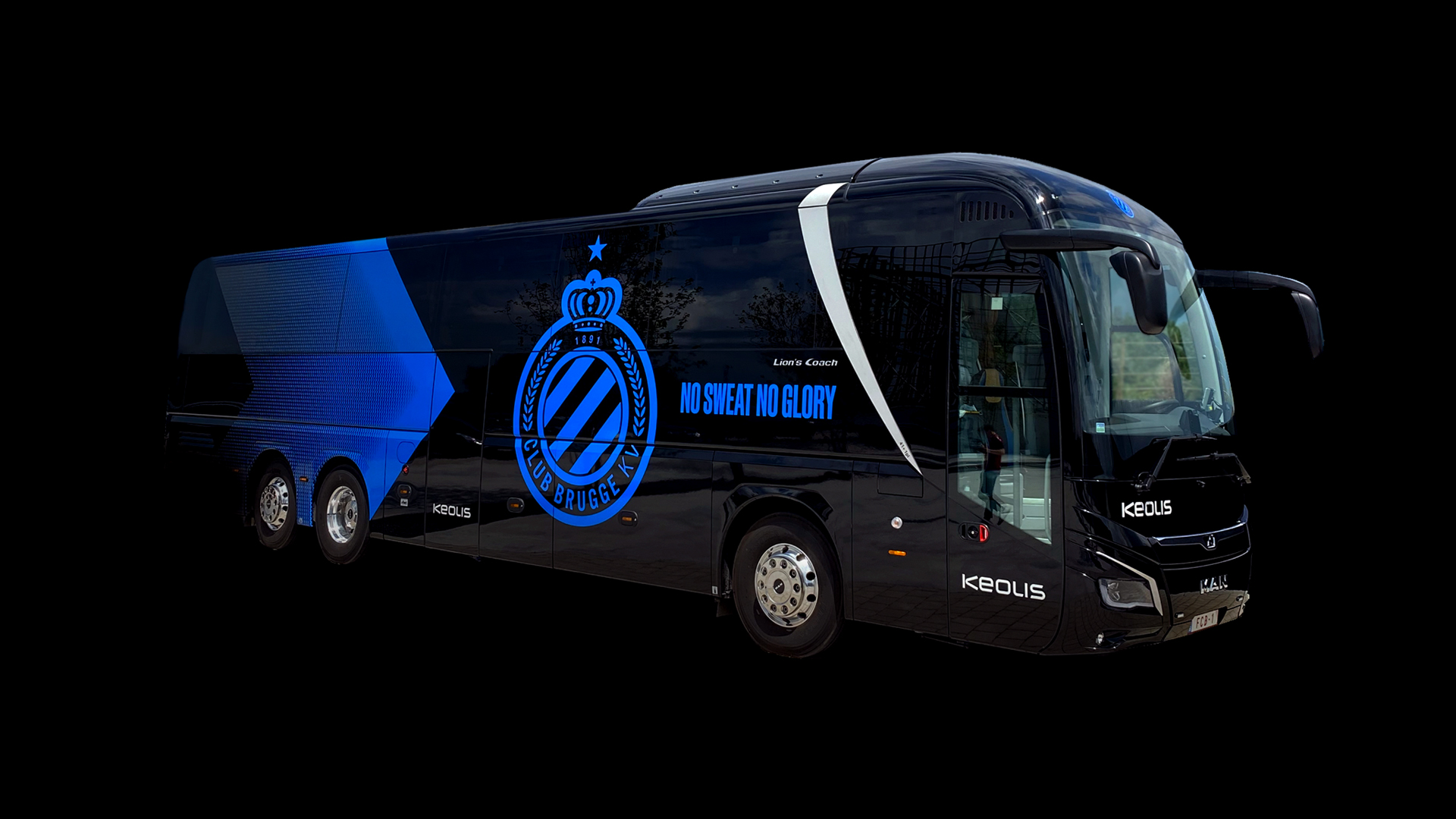
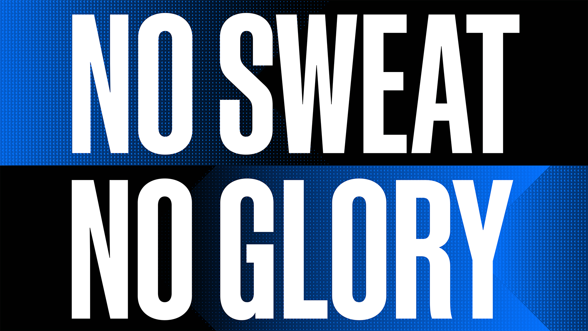
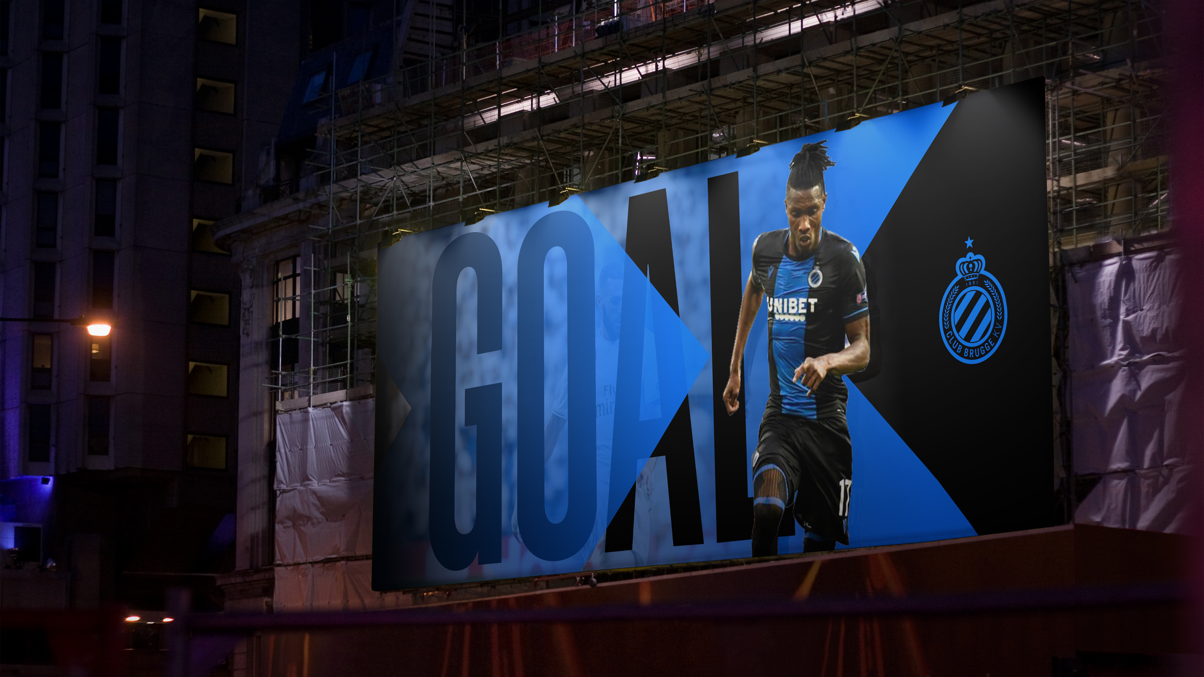
The new look and feel adds a contemporary edge to the club’s branding. Arrows are used to great effect, combined with bold typography, a more stylised approach to photography, and a strong colour palette – led by the club’s traditional blue and black, with flashes of white. Motion graphics are crisp and dynamic, with snappy transitions suggesting a positive attitude. The arrows became a unifying graphic motif across the various teams in the Club Brugge family – including CLUB YLA (the women’s team) and CLUB NXT (the youth academy).
Results
The new look and feel has created a much-improved presence online and across social media; adding a new dimension to their motion graphics, ensuring the visual brand reflects the club’s on-field achievements.