INTO — Branding a meditative innovation
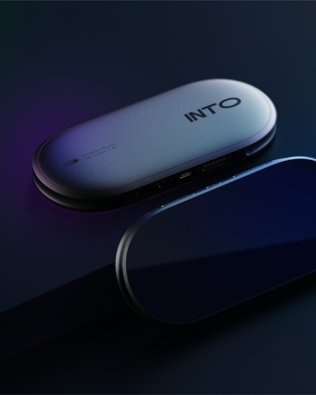
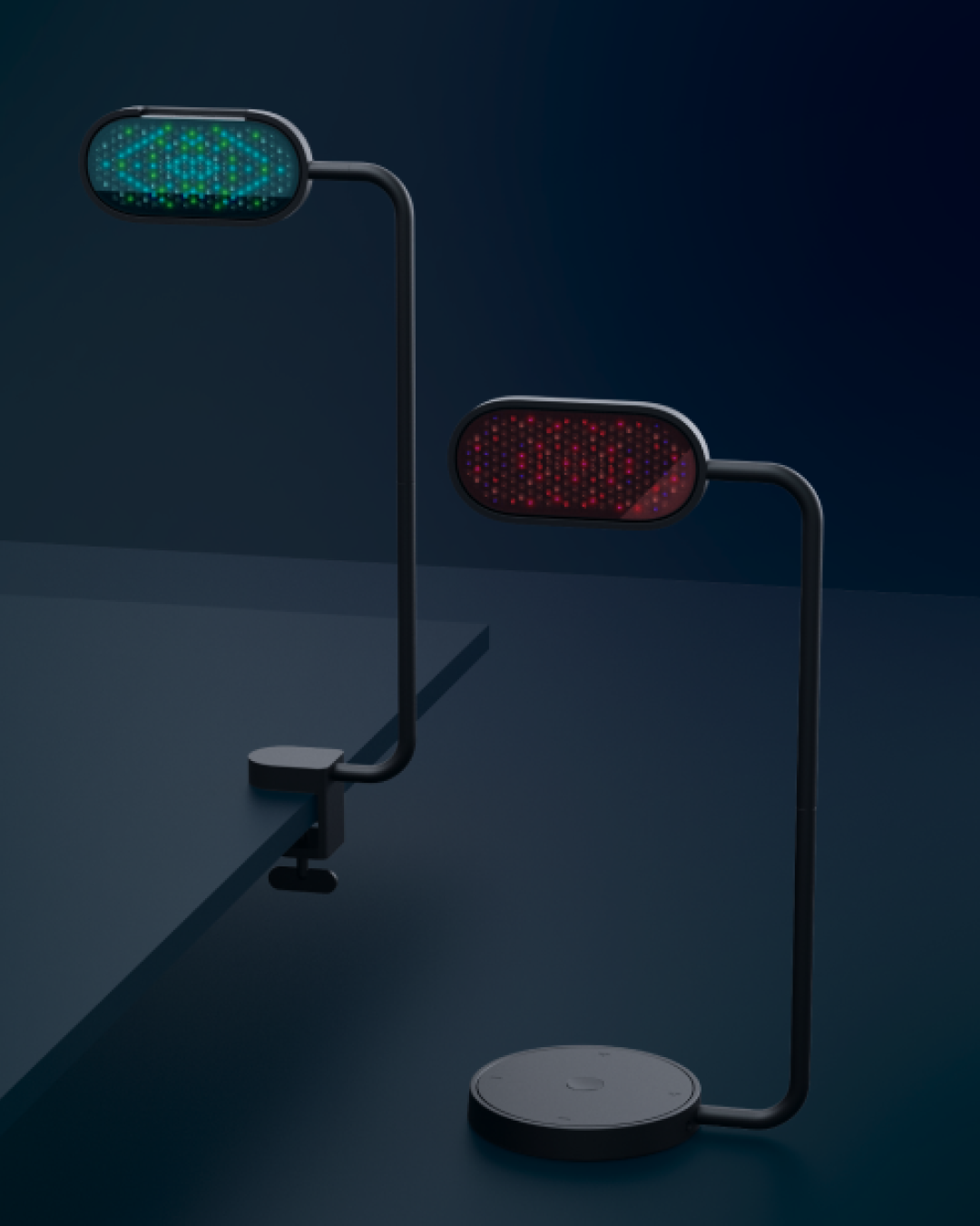
Offering inspiring moments of calm and reflection, INTO is a new concept in tech-assisted meditation. Users face a desk-mounted screen which projects dynamic patterns and compositions of coloured lights onto their closed eyelids. Accompanied by pulsating music, the overall sensation fosters a meditative state that some liken to a runner’s high. Sleek and contemporary, the product has a simple, elegant interface. Following a naming process and a three-way agency pitch, Studio Dumbar/DEPT® was appointed to develop the strategic positioning and design the brand identity.
Strategy
While the appearance of the product and its colourful lights played a role in the branding, we identified the need to build the identity around the experience. Everyone interacts with the product in their own way so, rather than mimic the experience, the identity should be open to interpretation. It also had to be strong and flexible, anticipating future brand evolution and the expansion of their range. Notions of a transformative experience, moving from one state of consciousness to another, provided the spark for our design direction.
Design
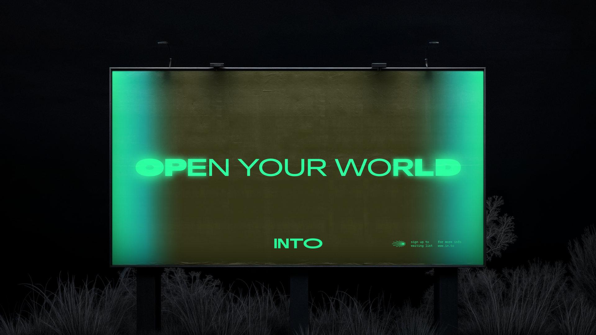
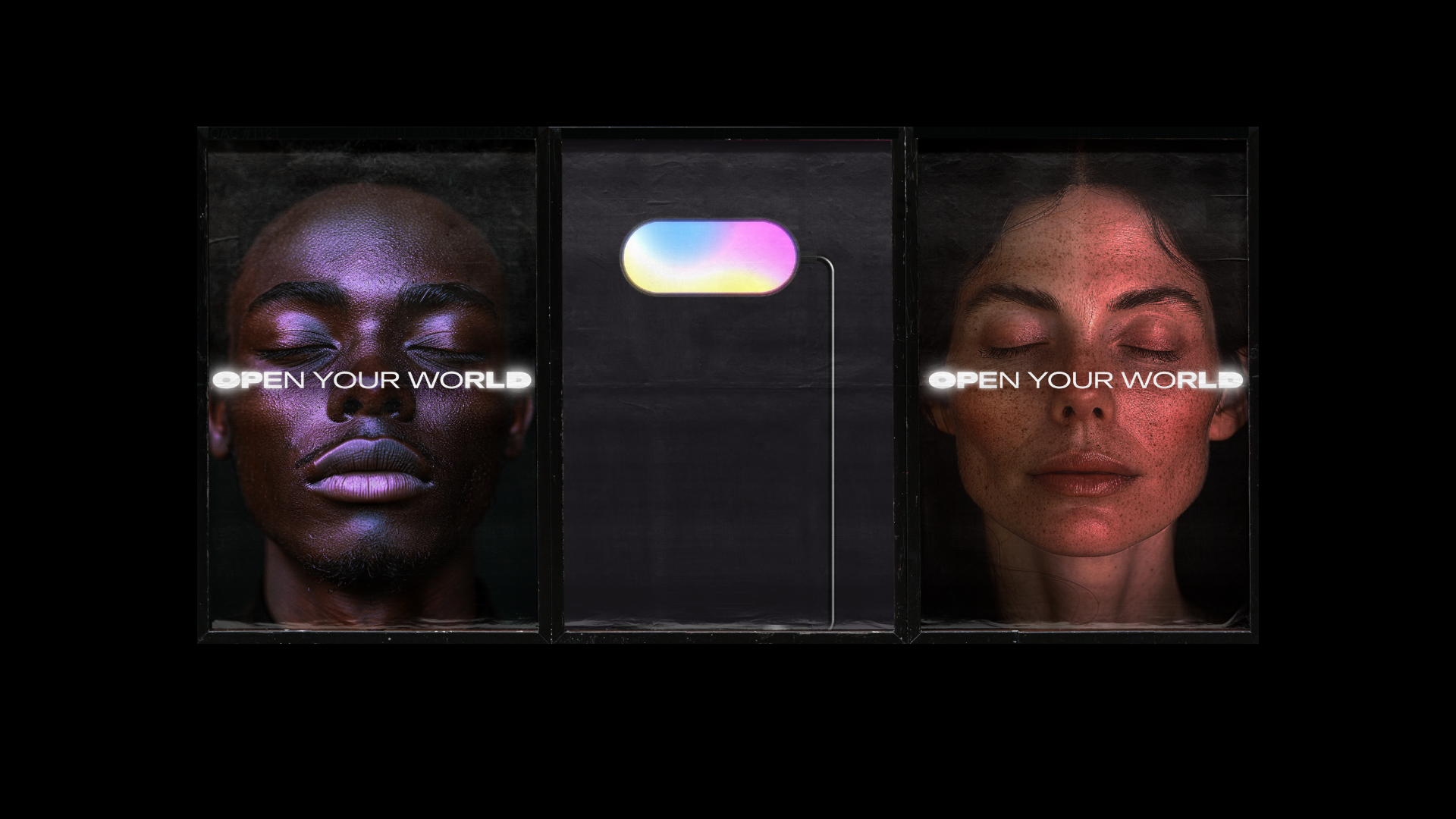
Simple and effective on the surface, the visual identity is both rich and sophisticated. The word-mark embodies the spirit of our design direction with tasteful economy. The letterforms stretch, expanding in width from left to right, visualising the shift towards a meditative state. We worked with New Glyph to add custom weights to the typeface (Antarctica Variable), to illustrate the transition from heavy to light, and back again. Hinting at the product’s use of colour, a range of vibrant hues work in tandem with the typography. Together, they form the beating heart of the identity. Gradients were built colour by colour to achieve a softer, more ethereal spirit, while a range of dissolve techniques bring variety to motion and digital, as well as print. A family of custom-designed icons offer clarity and a lightness of touch whenever required – from app icons to packaging, signage, and everything in between.
Results
Vibrant and evocative, the visual identity we created for INTO reflects the nature of the experience. It also provides the tools required to launch their product across a range of touch-points – from pre-launch promotion to the product’s arrival in physical and online stores.


