Alzheimer Nederland — Communication design with integrity
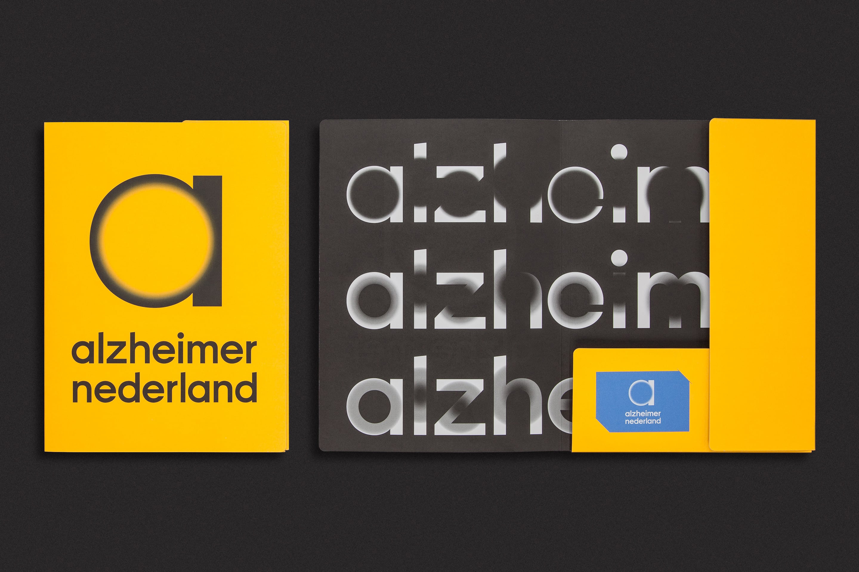
Alzheimer’s and other forms of dementia are presenting the human race with one of its toughest challenges. Alzheimer Nederland works hard to raise awareness and funds for vital research, but times are hard. With their existing style lacking emotion and a competitive edge, Studio Dumbar/DEPT® were appointed to design a new visual identity.
Strategy
Competition between charity organizations is fierce. They all need to raise funds for important causes, but there is no way of ranking the seriousness of the problems each organization is working to solve or alleviate. Gaining sympathy is crucial. Our priority for Alzheimer Nederland was to speak to people’s hearts in a powerful way, but also quietly, without shouting – with impact and integrity.
Design
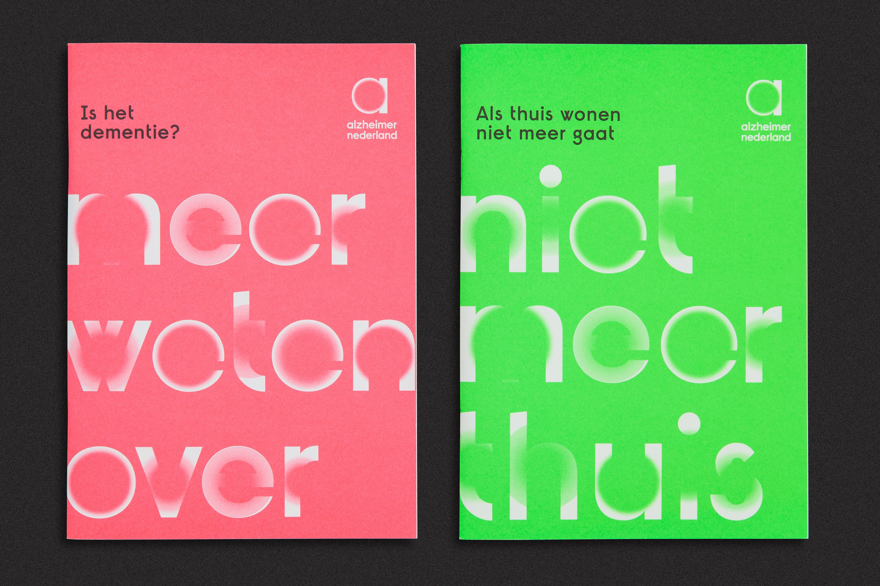
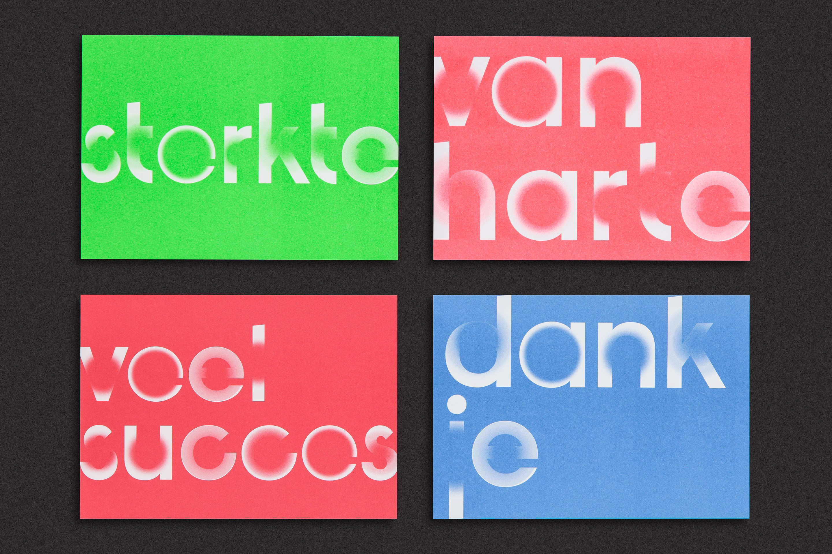
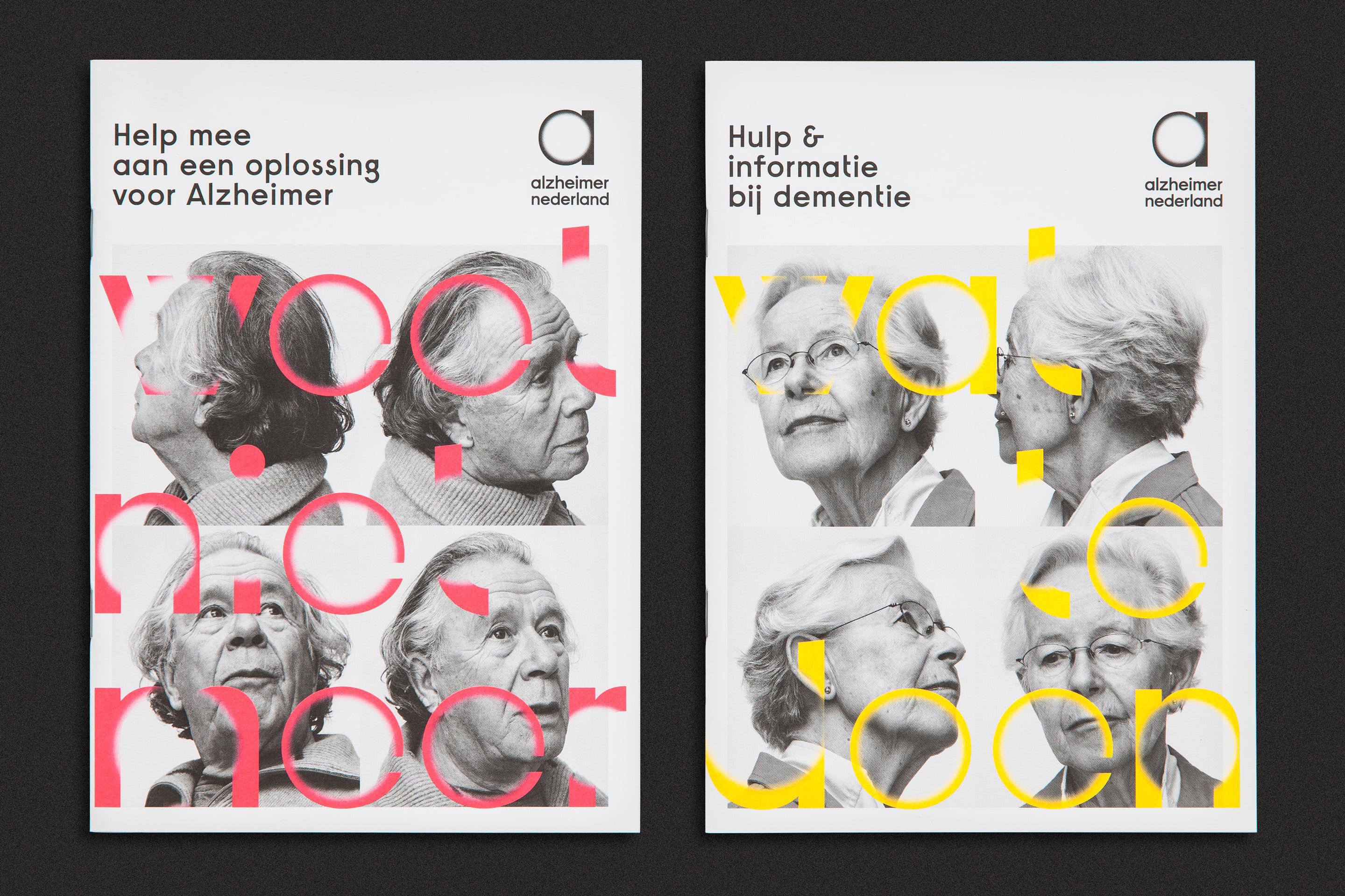
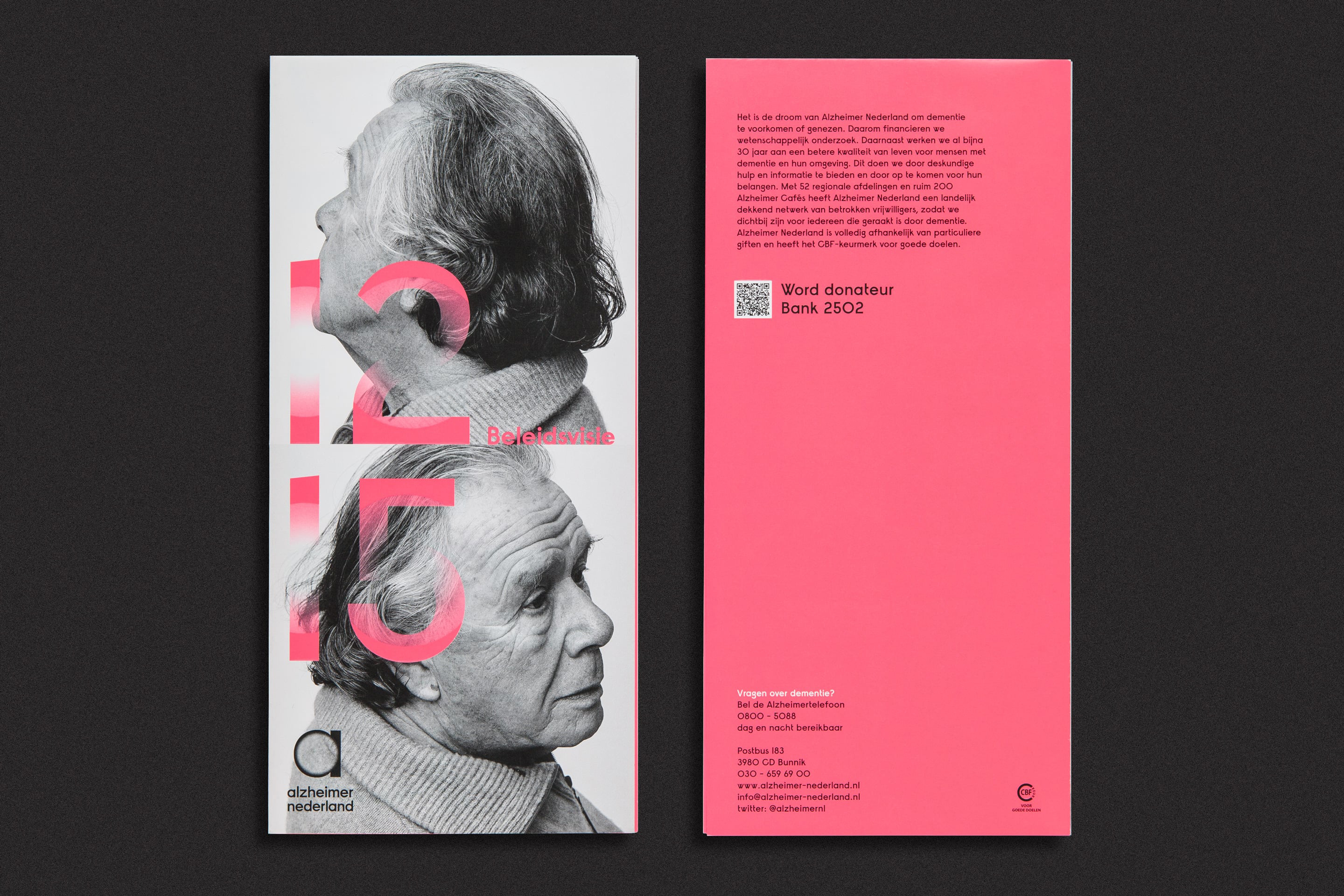
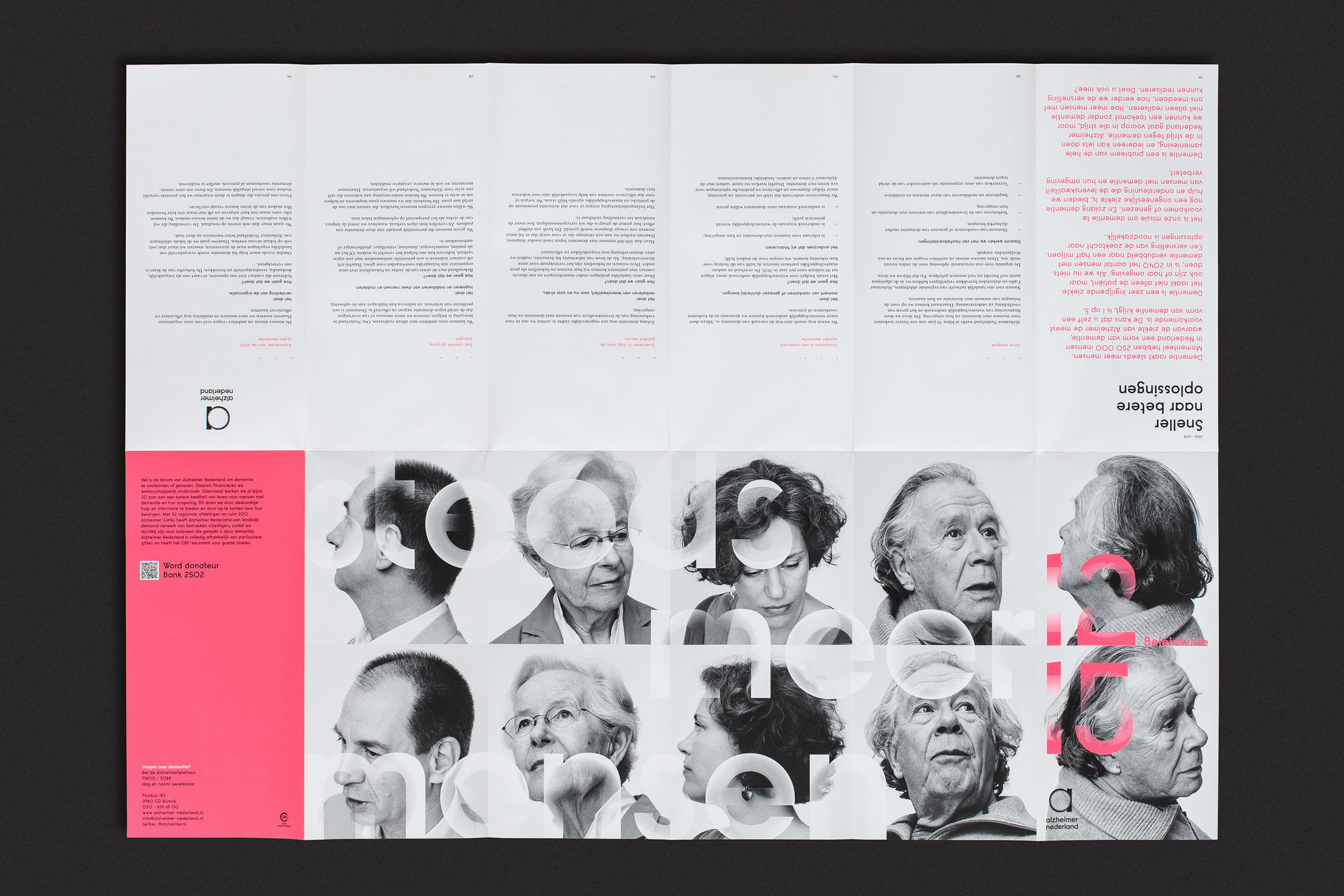
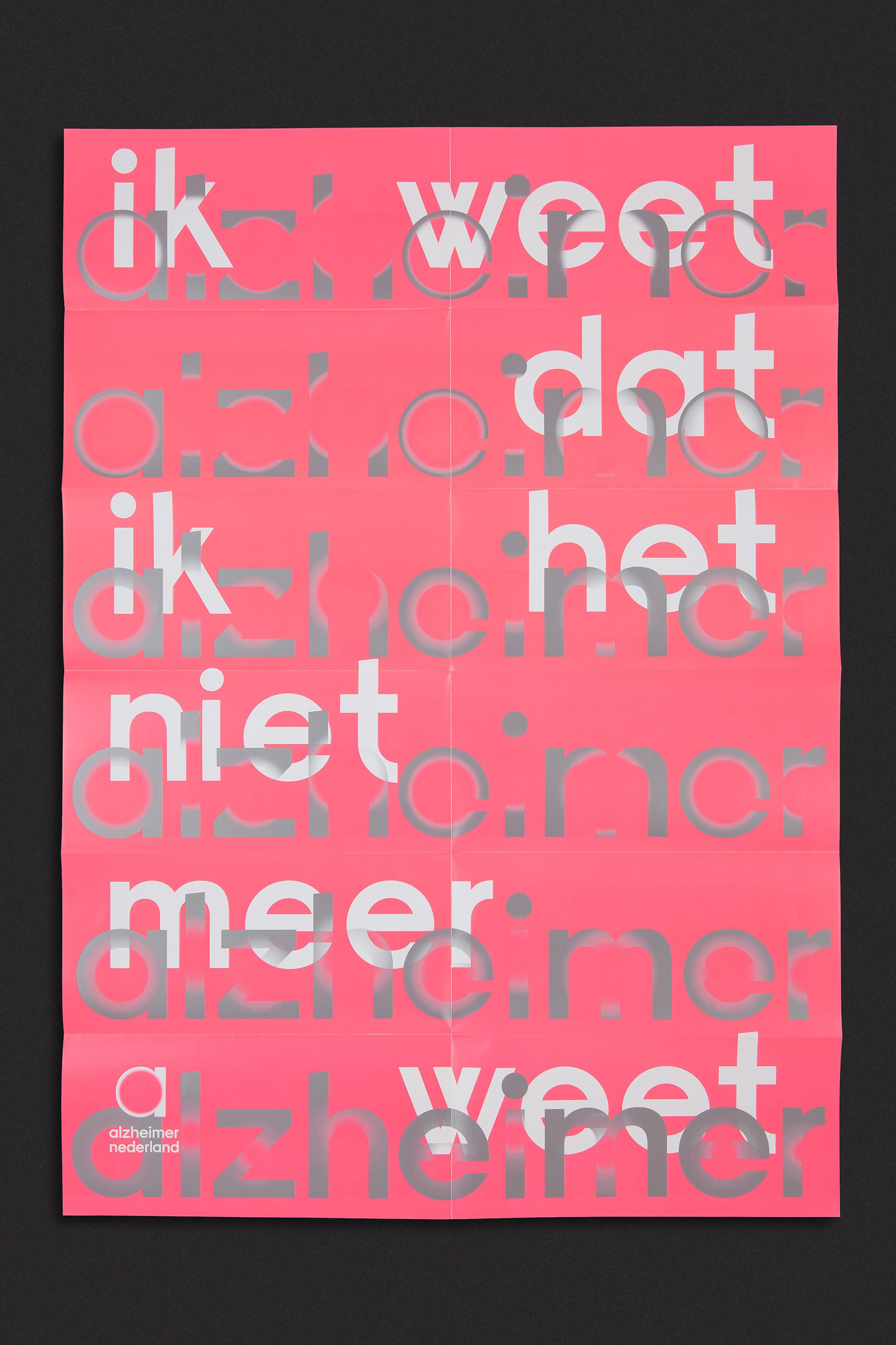
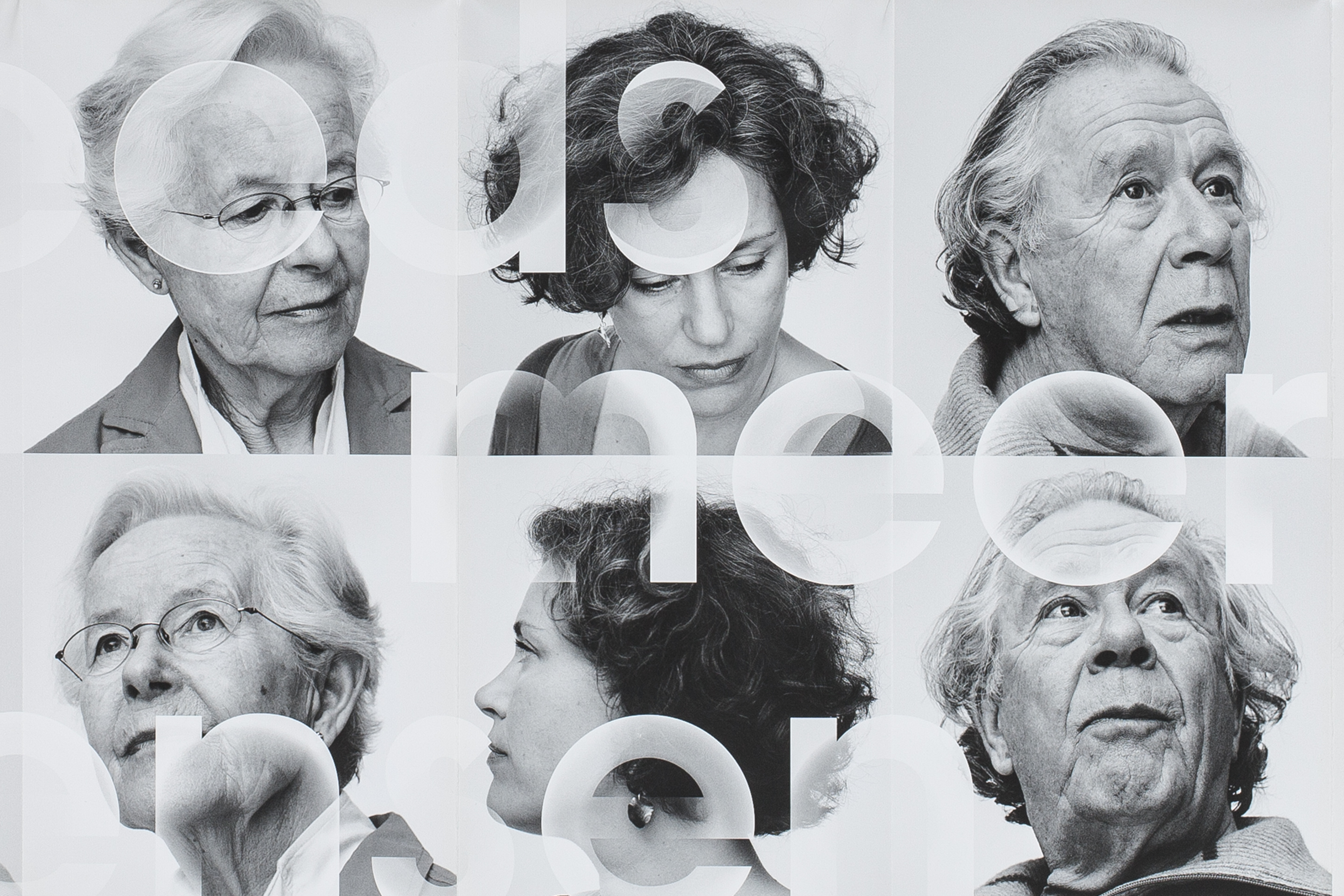
Having met patients, families and carers to experience the disease first-hand, we developed a strong and instantly recognisable identity. The new logotype is bold and confident, but like the human mind it also changes… The ‘vanishing points’ – the blurred, fading elements in the typographic style – visualise the effects of dementia, while some people have also seen them as sources of light and hope.
Results
The most important moment in the process came when the identity was shared with patients and carers. We were delighted and relieved when their feedback was so positive, and people continue to comment on how they feel an immediate emotional connection with the identity.
