ATypI — Designing an event identity for an international type association
The Association Typographique Internationale (ATypI) is the world’s leading organisation dedicated to type and typography. ATypI’s annual conference brings the international type community together for talks, workshops and events. With the 2013 conference taking part in Amsterdam, ATypI appointed Studio Dumbar to design an identity and several touch points.
Strategy
Our approach was guided by the central theme of the conference. ‘Point Counter Point’ focused on how visual communications are created and perceived, and the back-and-forth dialogue that characterises cultural practice in The Netherlands. The key to our way of thinking was to be expressive and attractive only by using typography and typo-related terminology.
Design
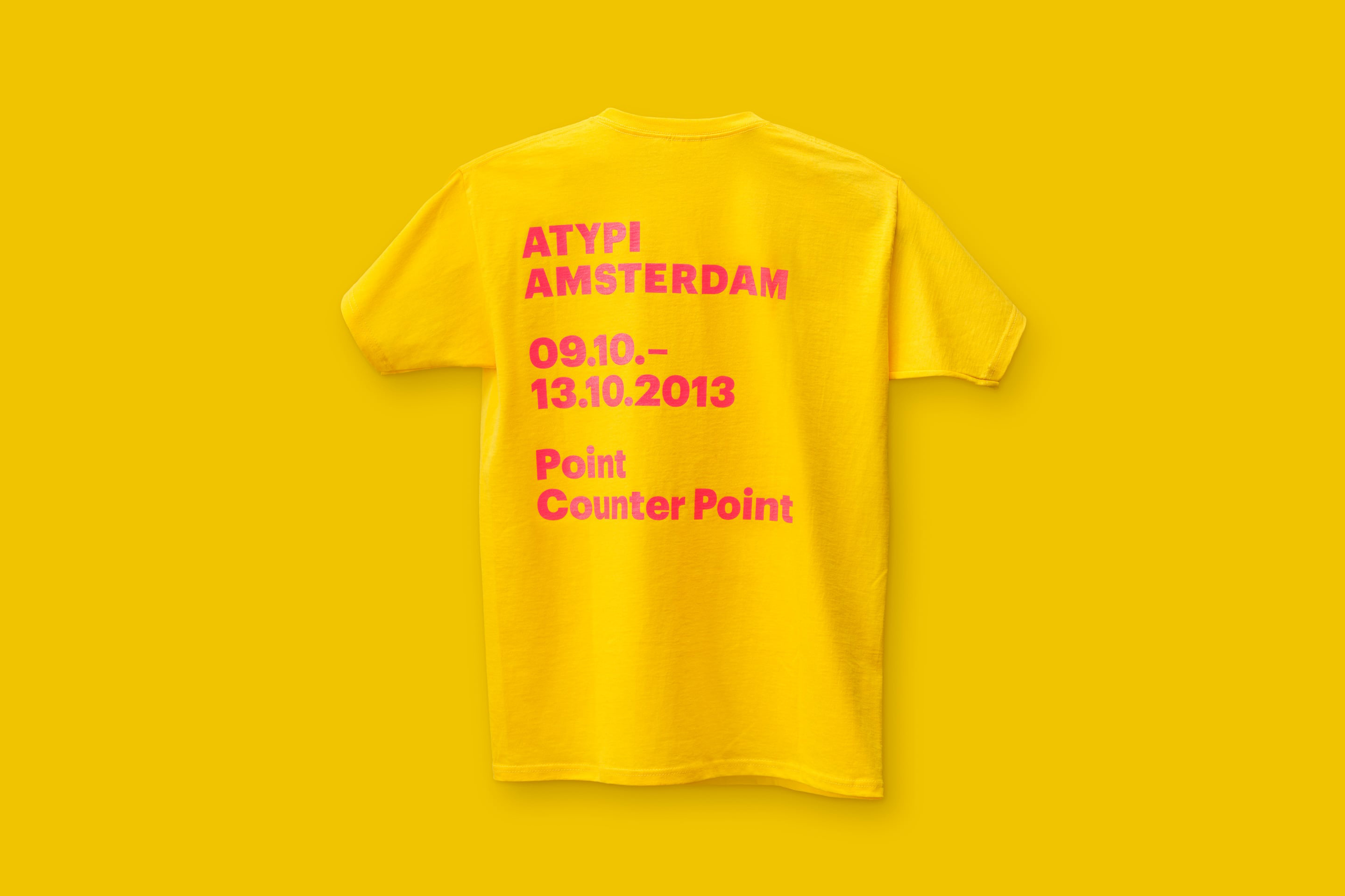
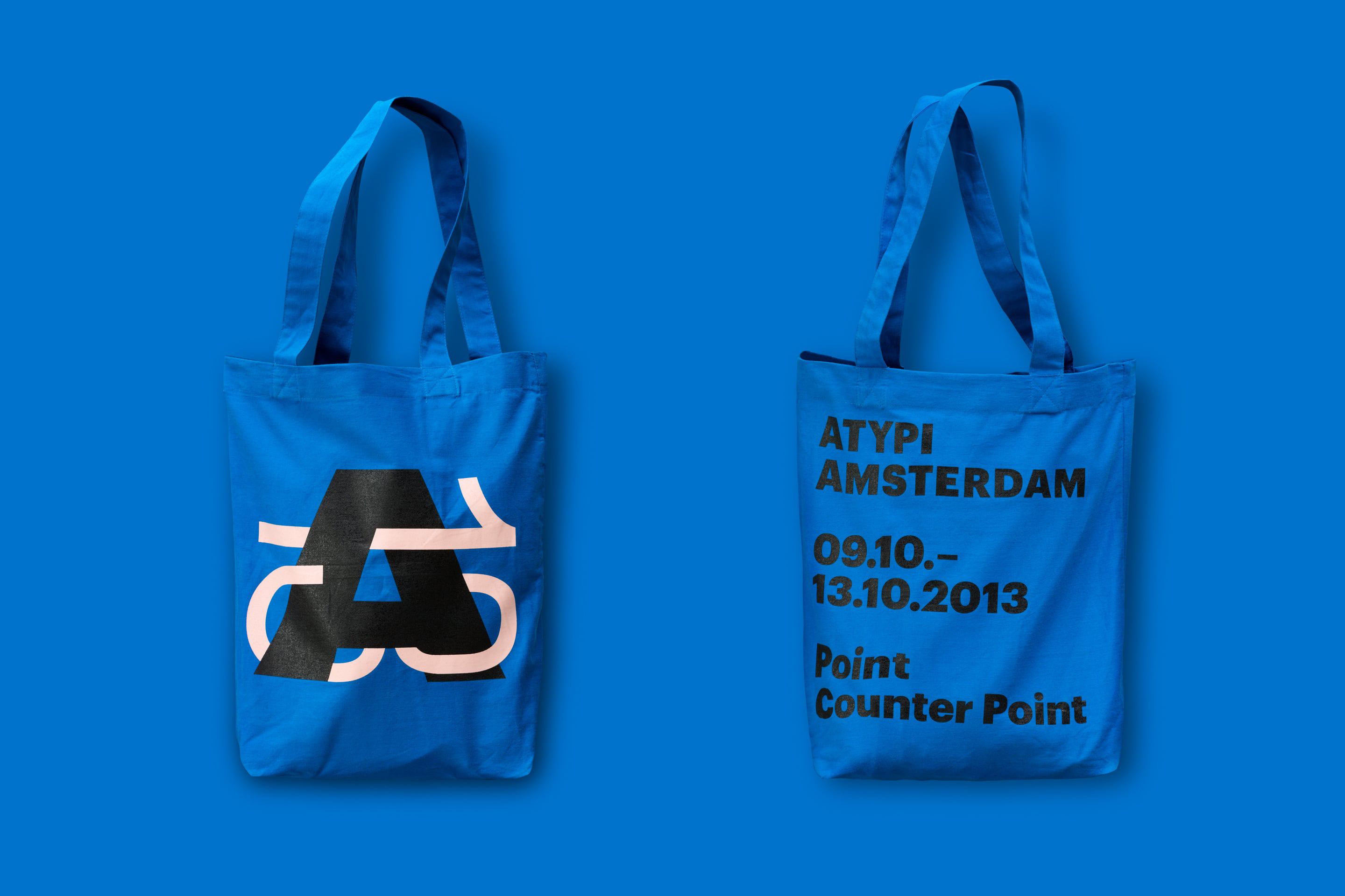
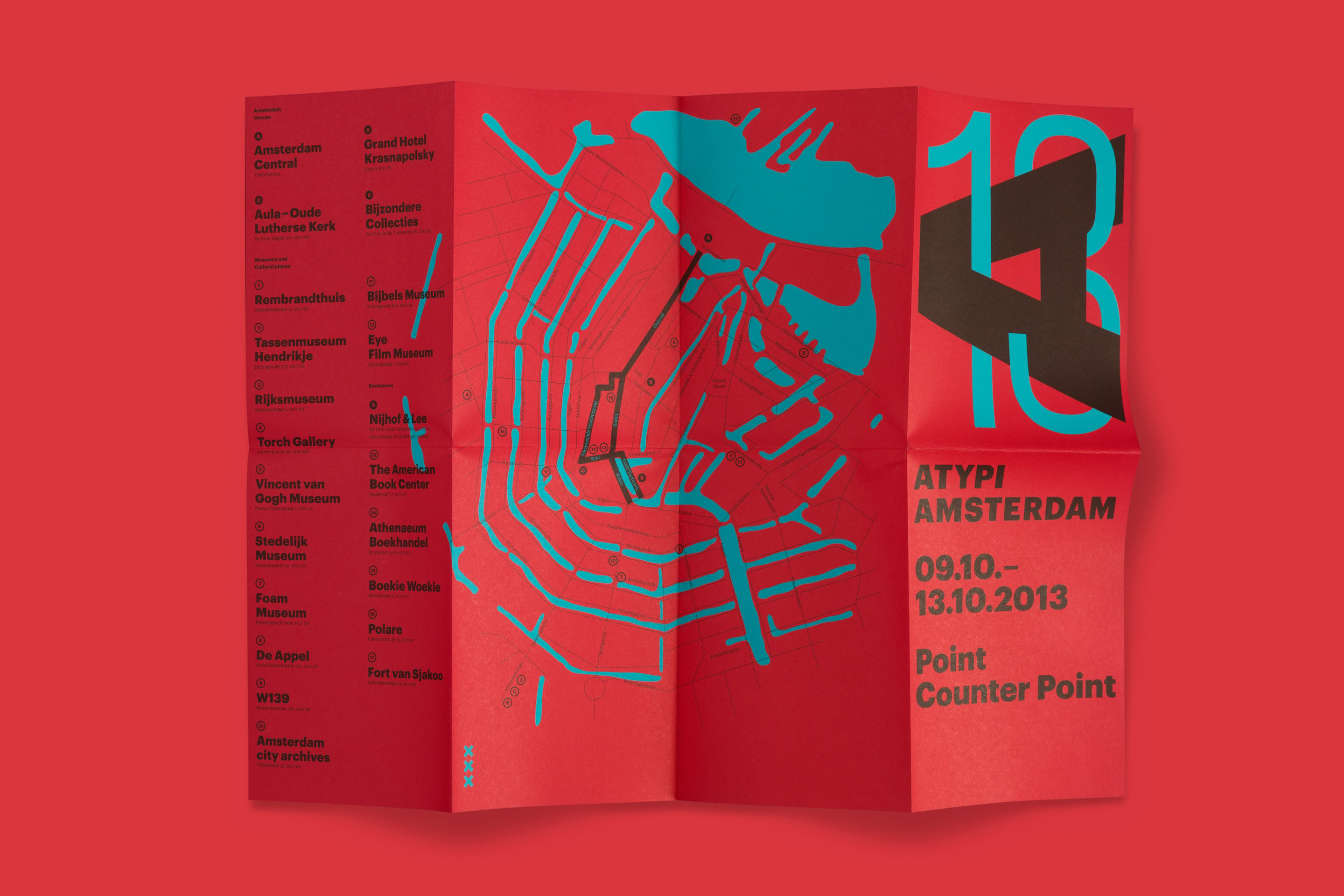
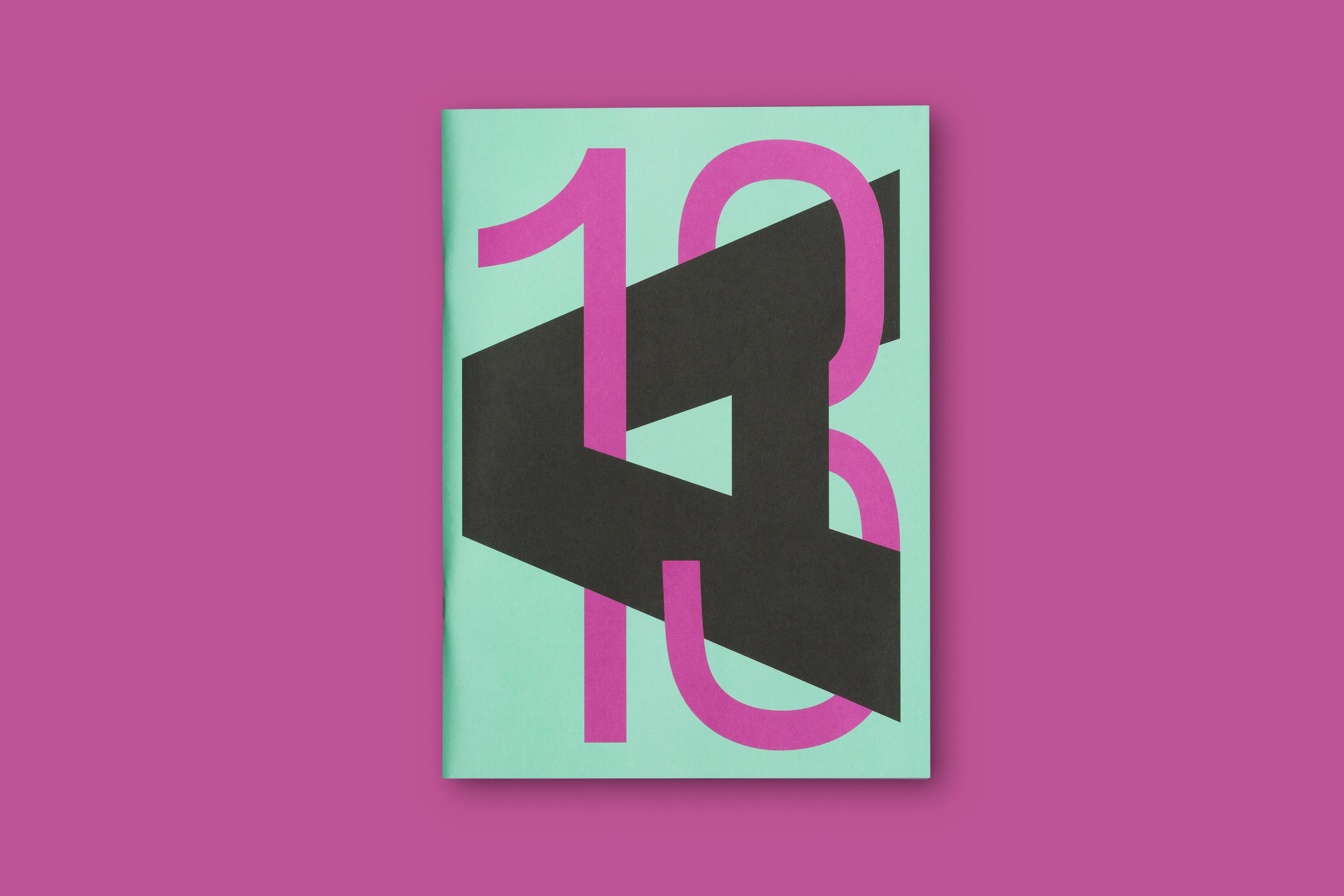
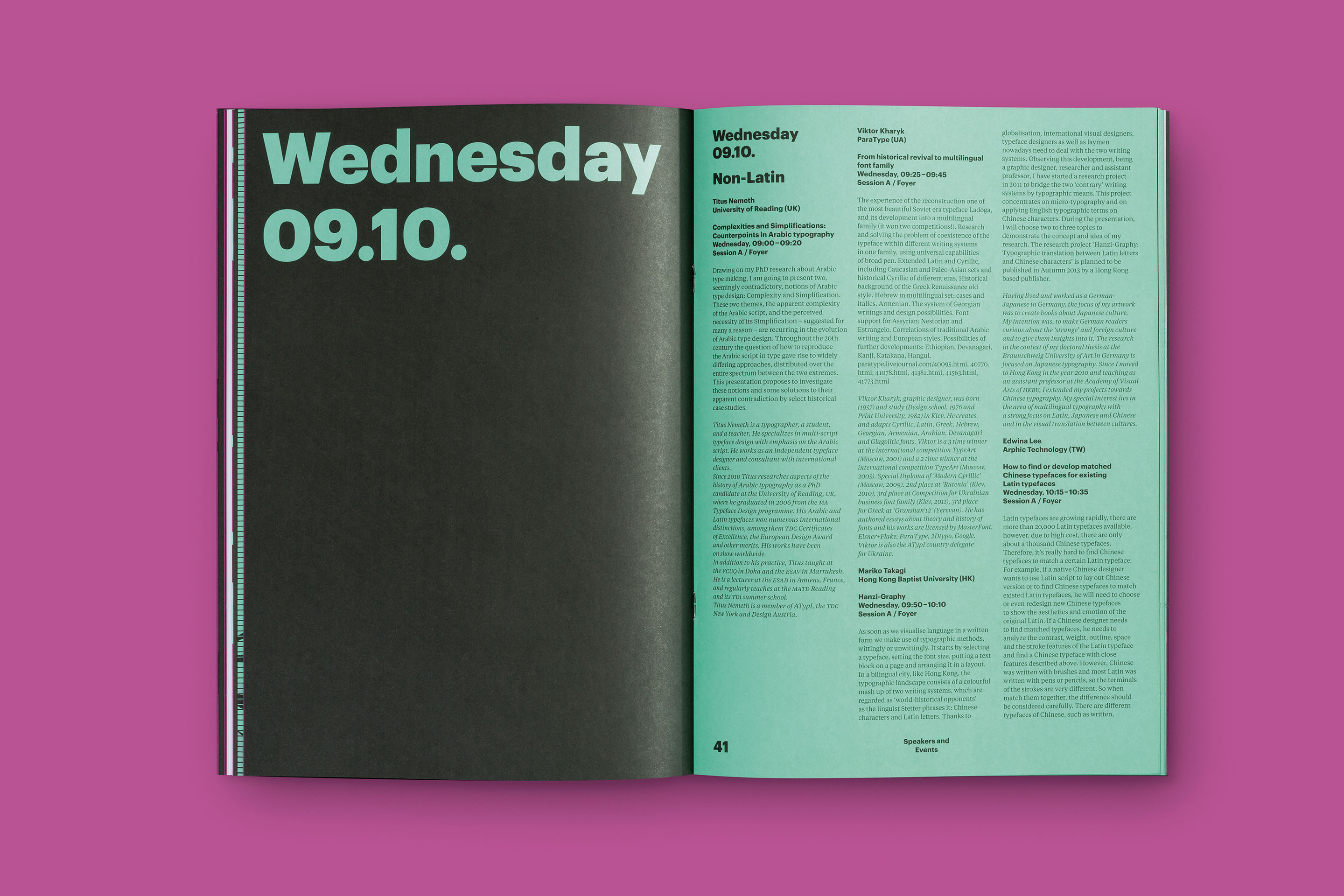
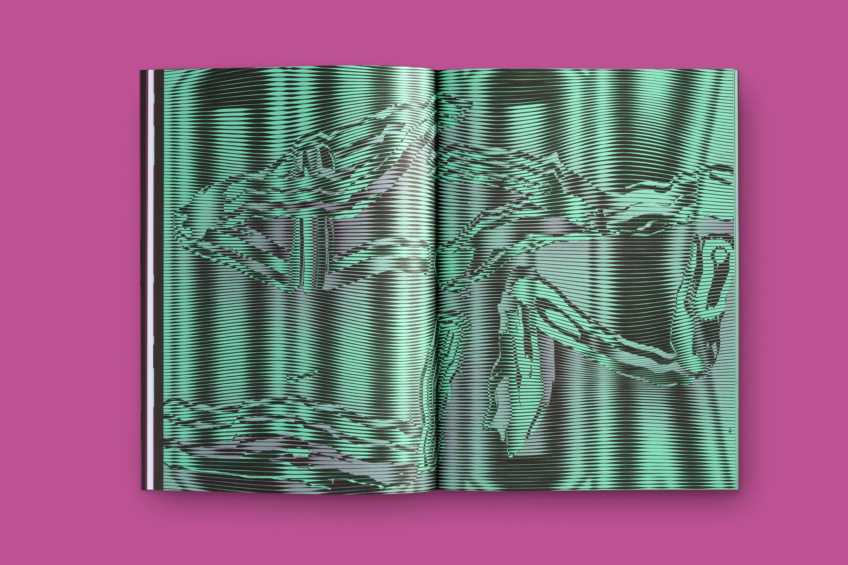
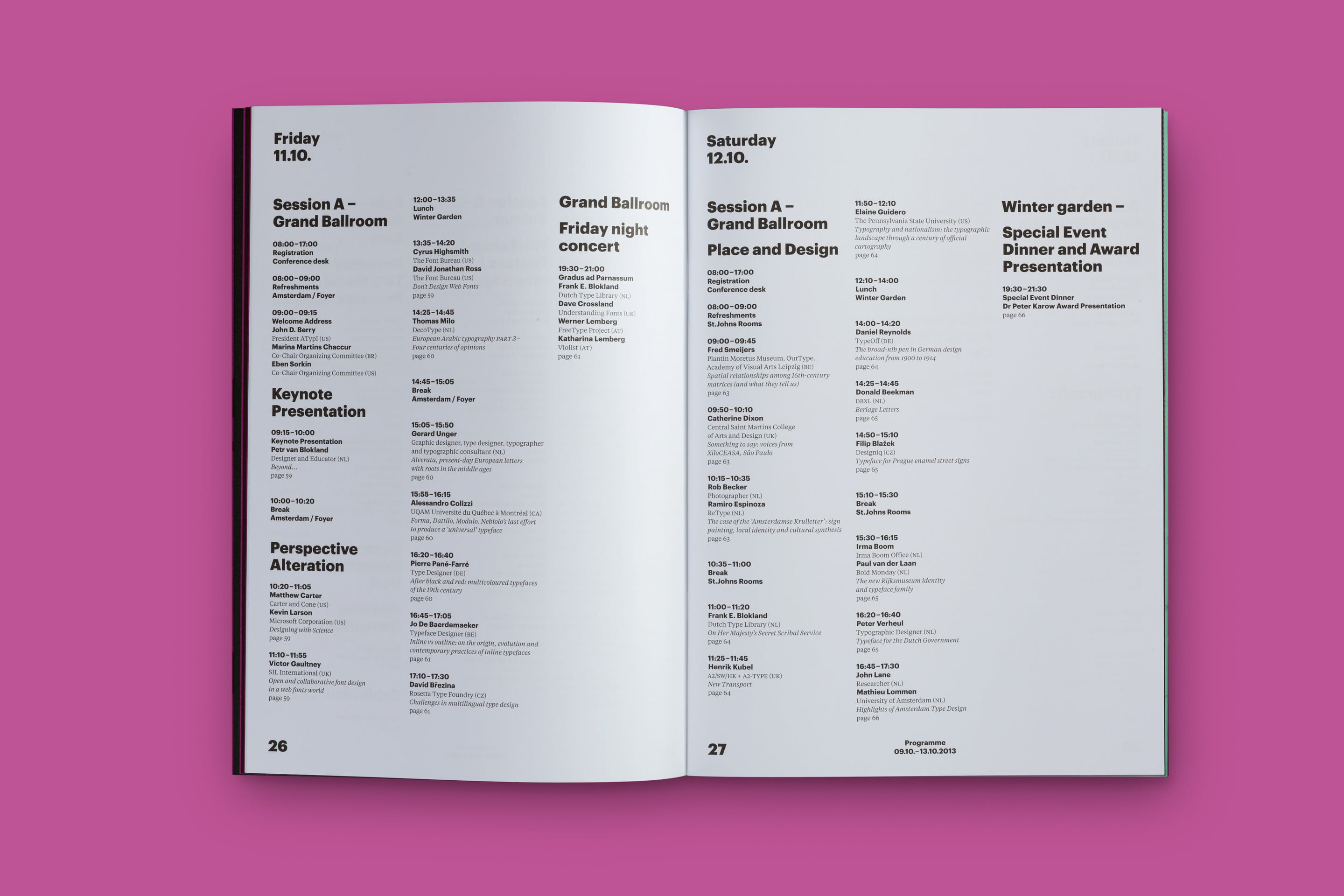
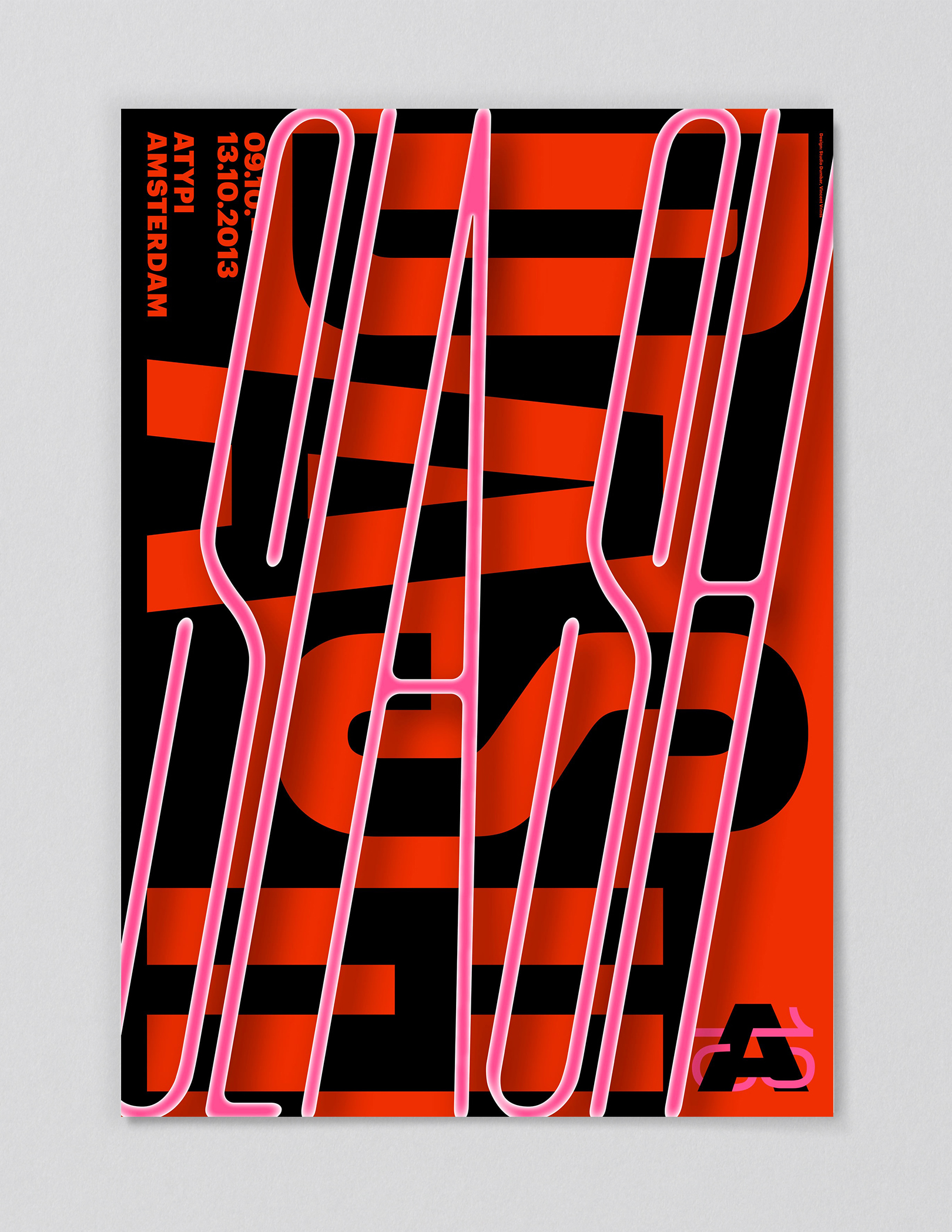
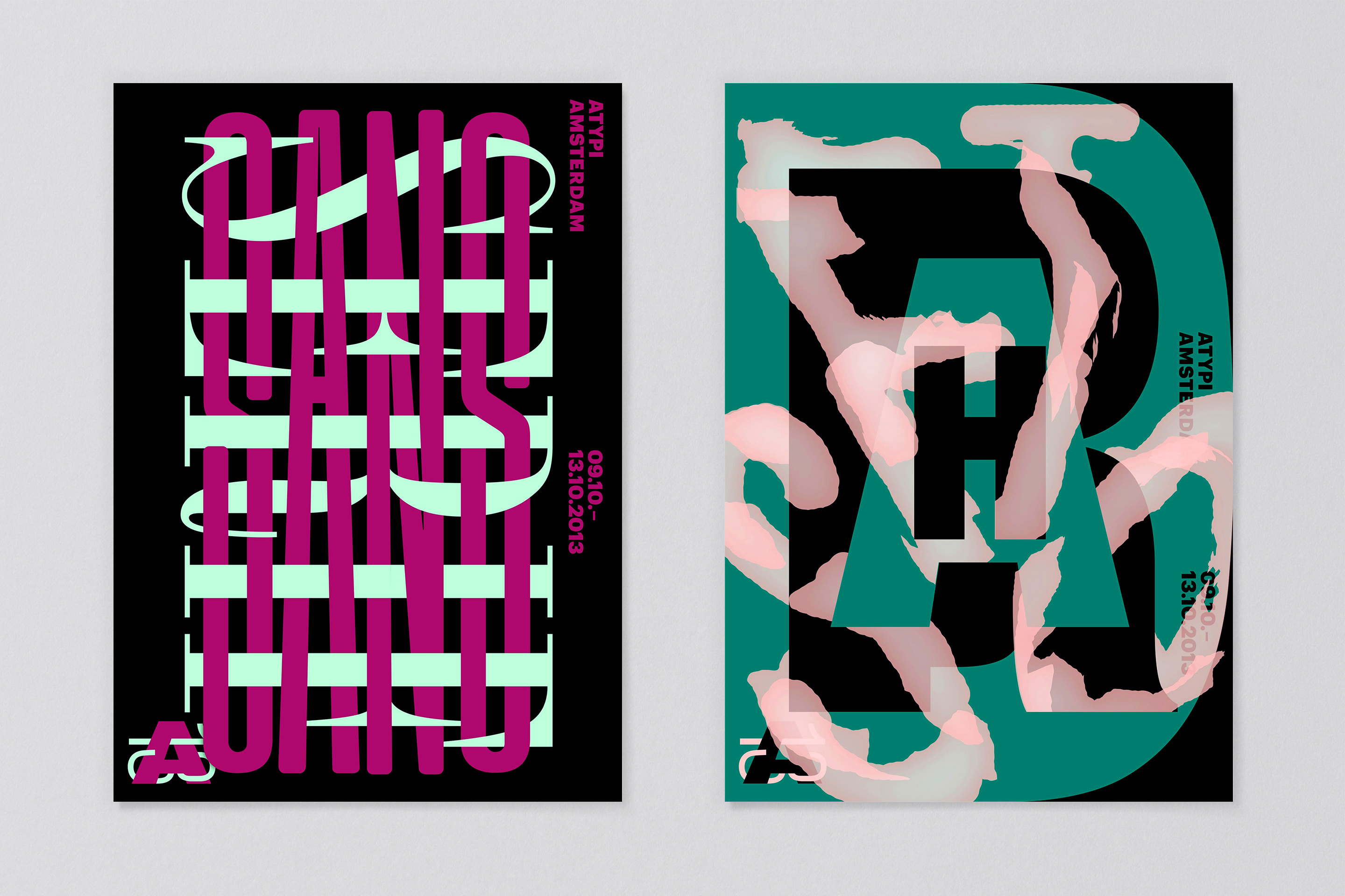
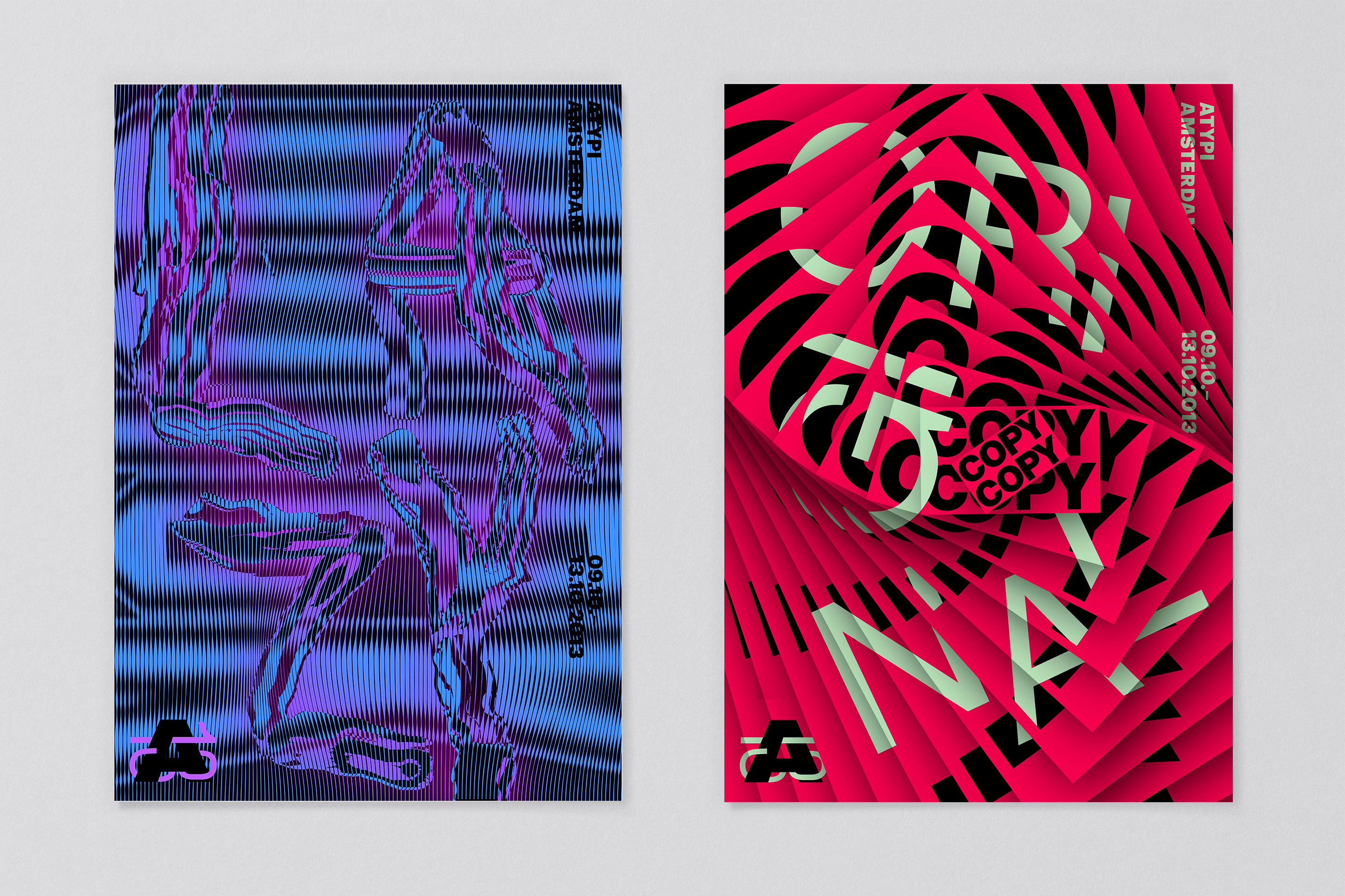
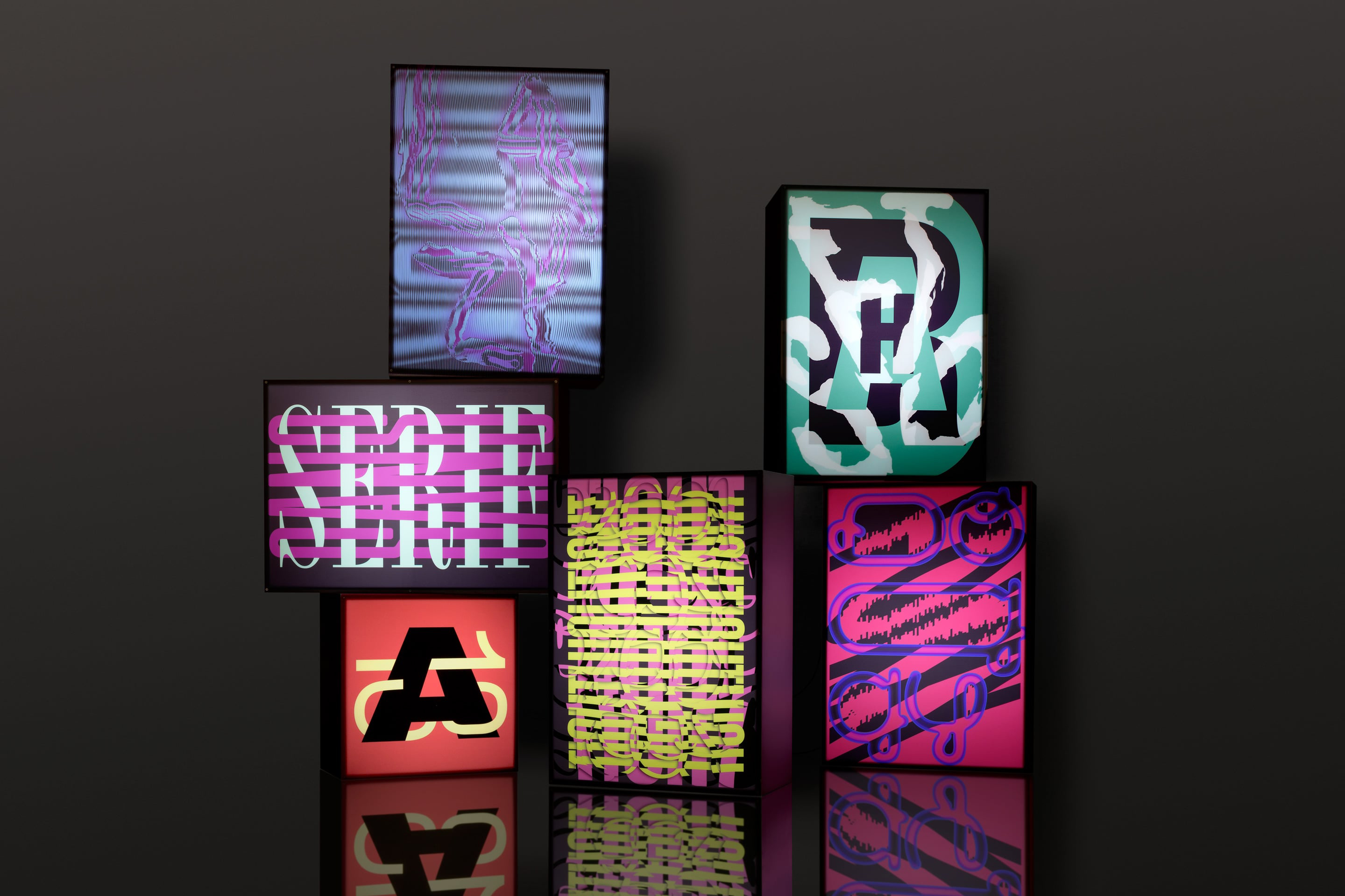
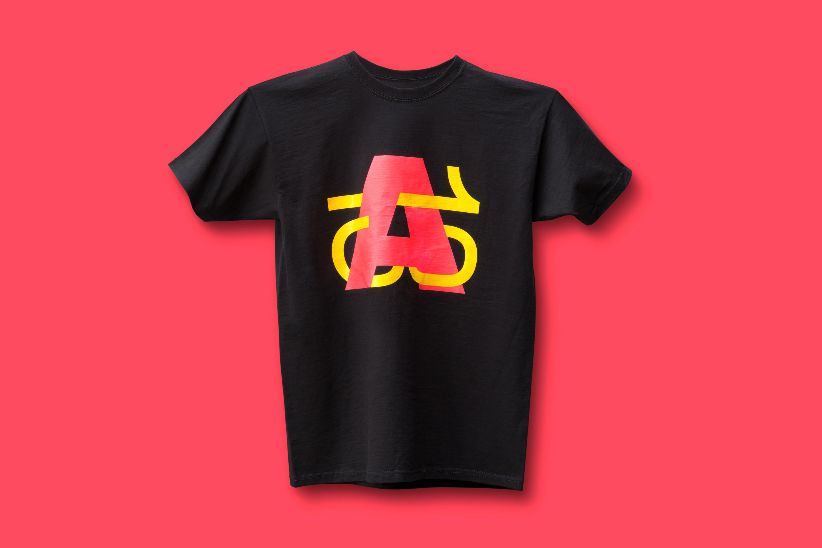
The ‘A13’ mark reflects this dialogue and offers its own visual contrast, a bold upper case ‘A’ intertwined with a lighter ‘13’. We created an eclectic and at times eccentric palette for posters, programmes and other collateral. The posters display contrasting typographic styles, striking colour clashes and conflicting phrases from the typographic lexicon such as ‘Dash/Slash’, ‘Soft/Hard’, ‘Sans/Serif’, and ‘Copy/Original’.
Results
The event identity introduced challenging, expressive design statements in a world that is traditionally rather quiet and modest in its visual behavior. We were delighted to see that the style stirred up discussion and debate… Point Counter Point? Mission accomplished.
