Van Gogh Museum — Keeping the artist central
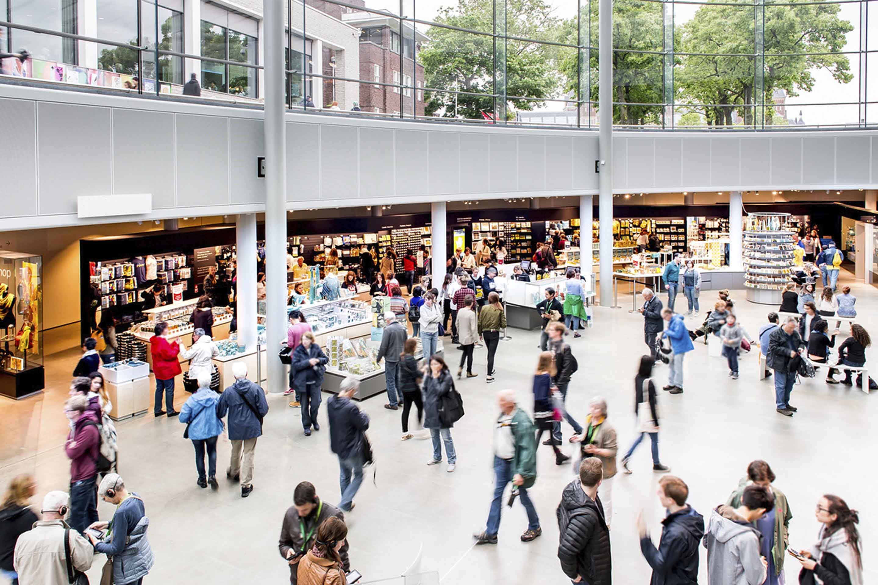
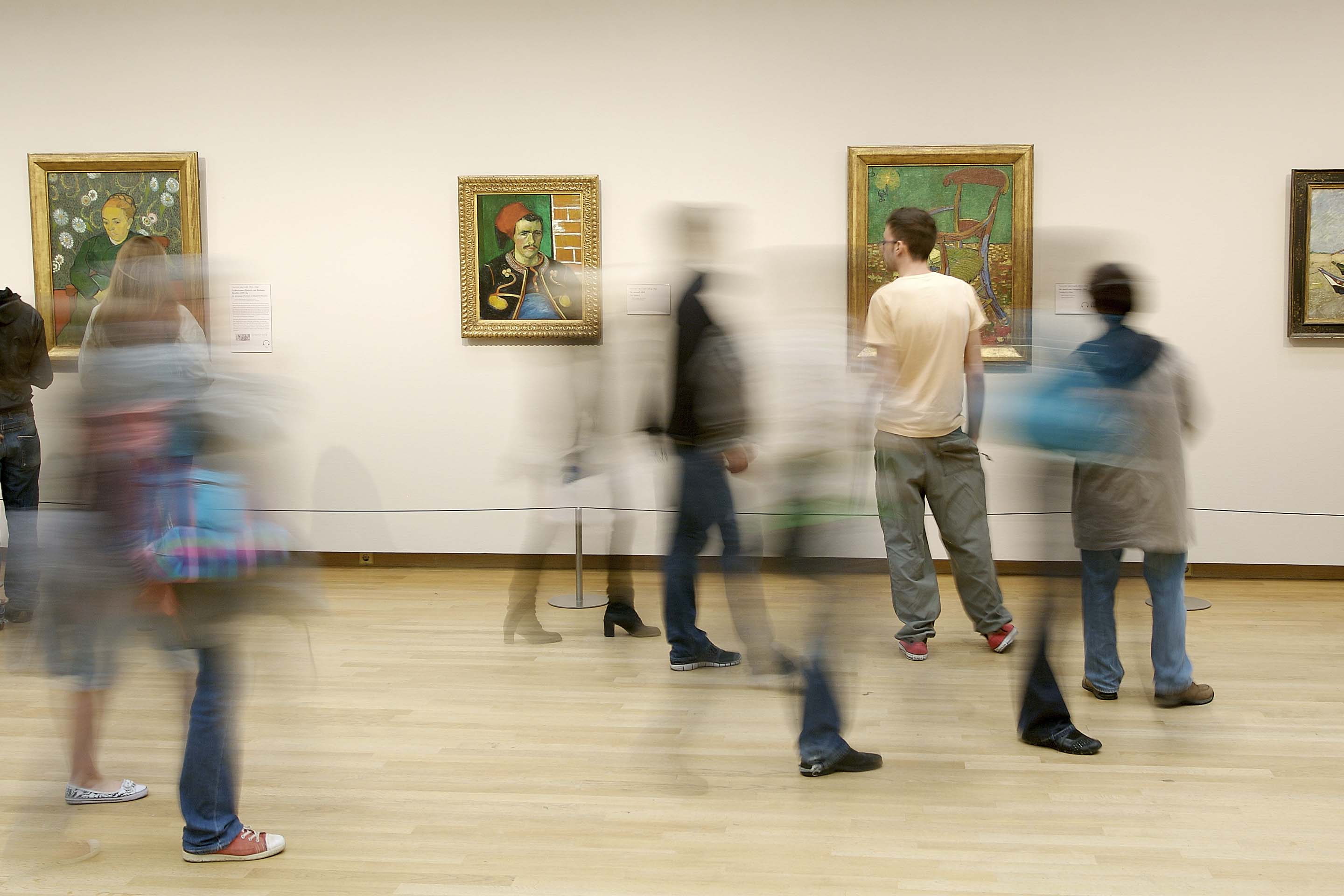
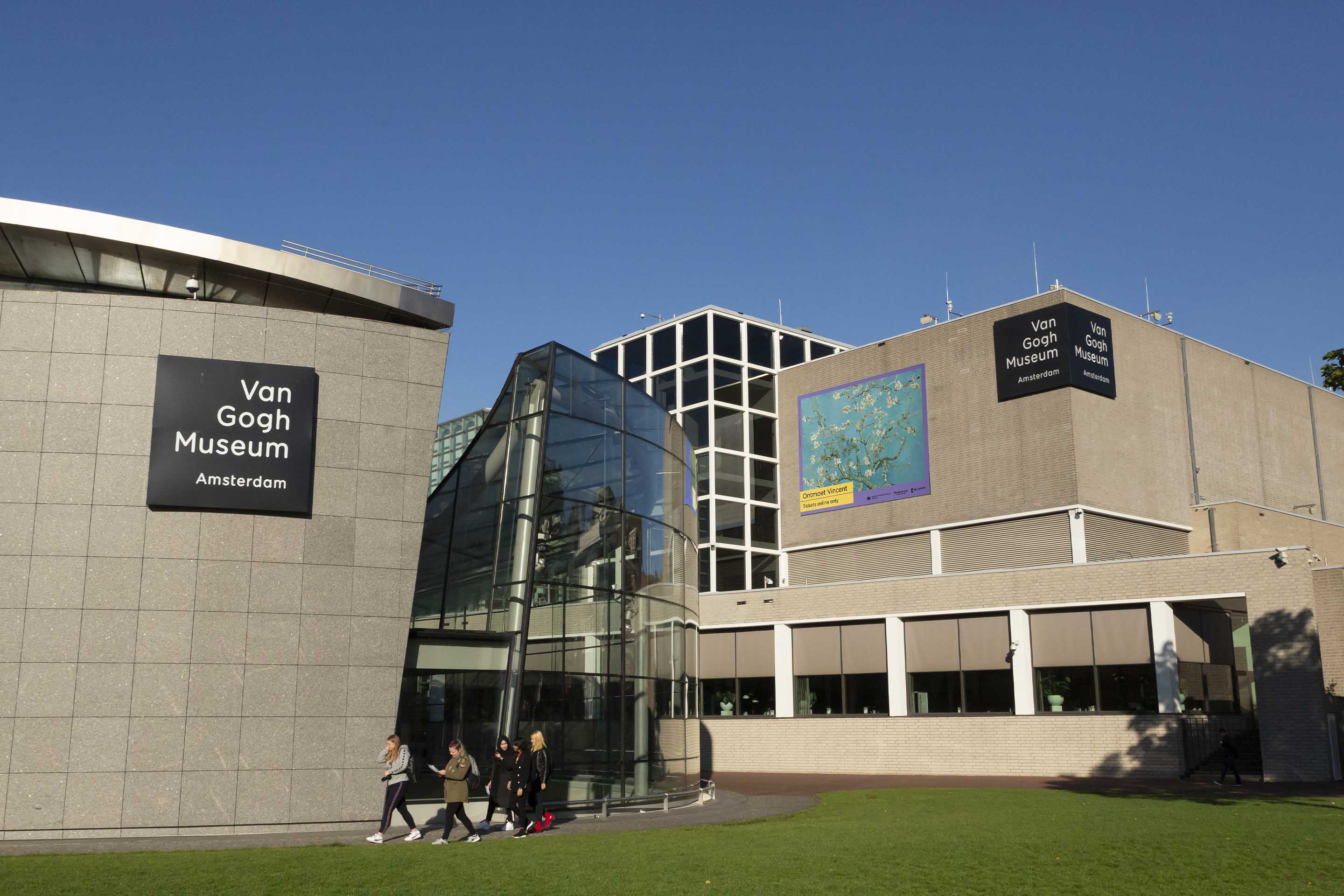
The Van Gogh Museum is the most visited gallery in The Netherlands, attracting 2.26 million visitors in 2017. Located in Amsterdam’s Museumplein, it houses the world’s largest collection of Vincent Van Gogh artworks, correspondence and ephemera. A powerful cultural and commercial brand, the museum runs a broad spectrum of activities encompassing research, education, travelling events, and much more. To maintain a sense of order and clarity across a dynamic range of activities, we were invited to help organise the brand governance and refresh the brand identity.
Strategy
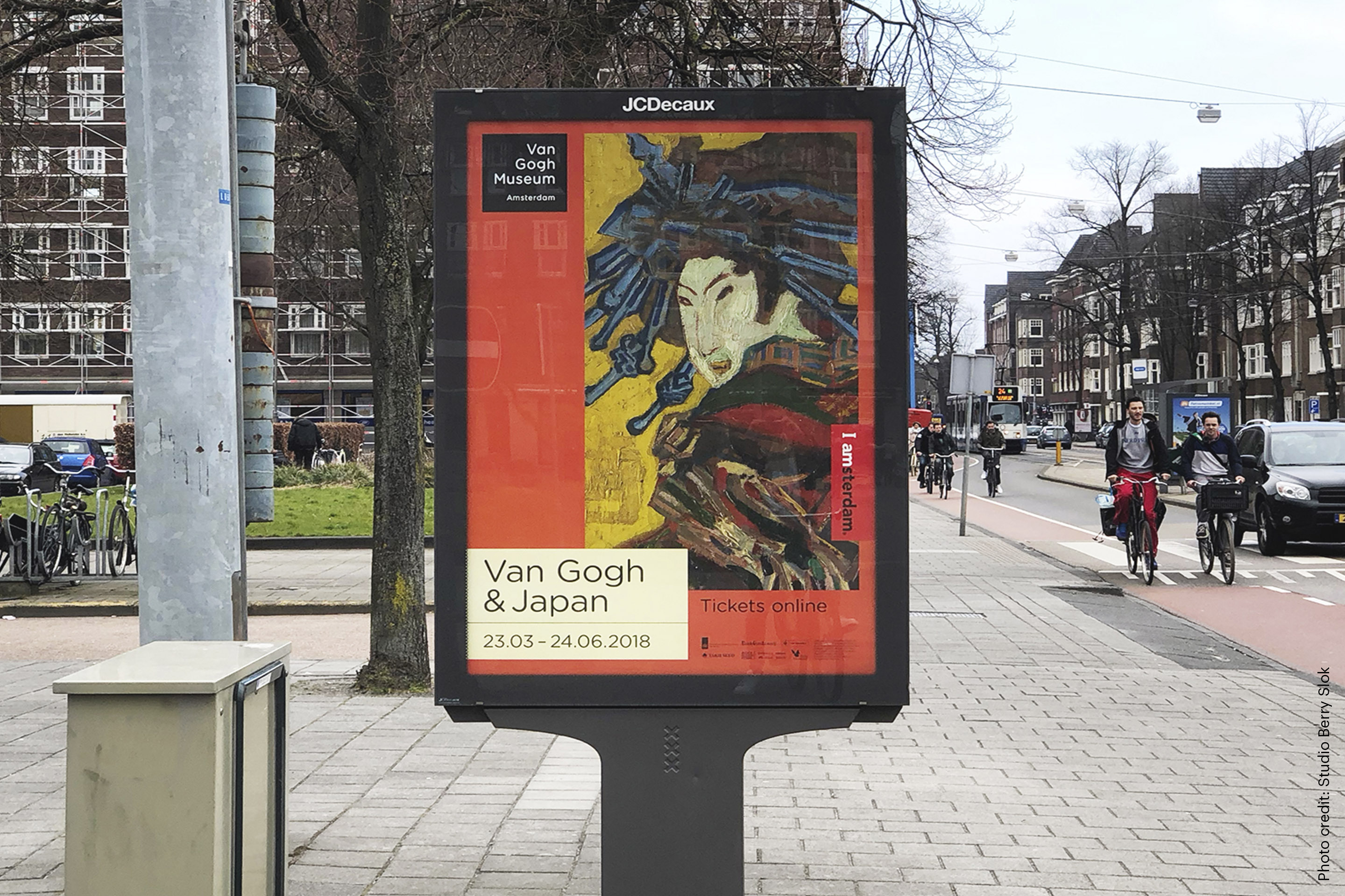
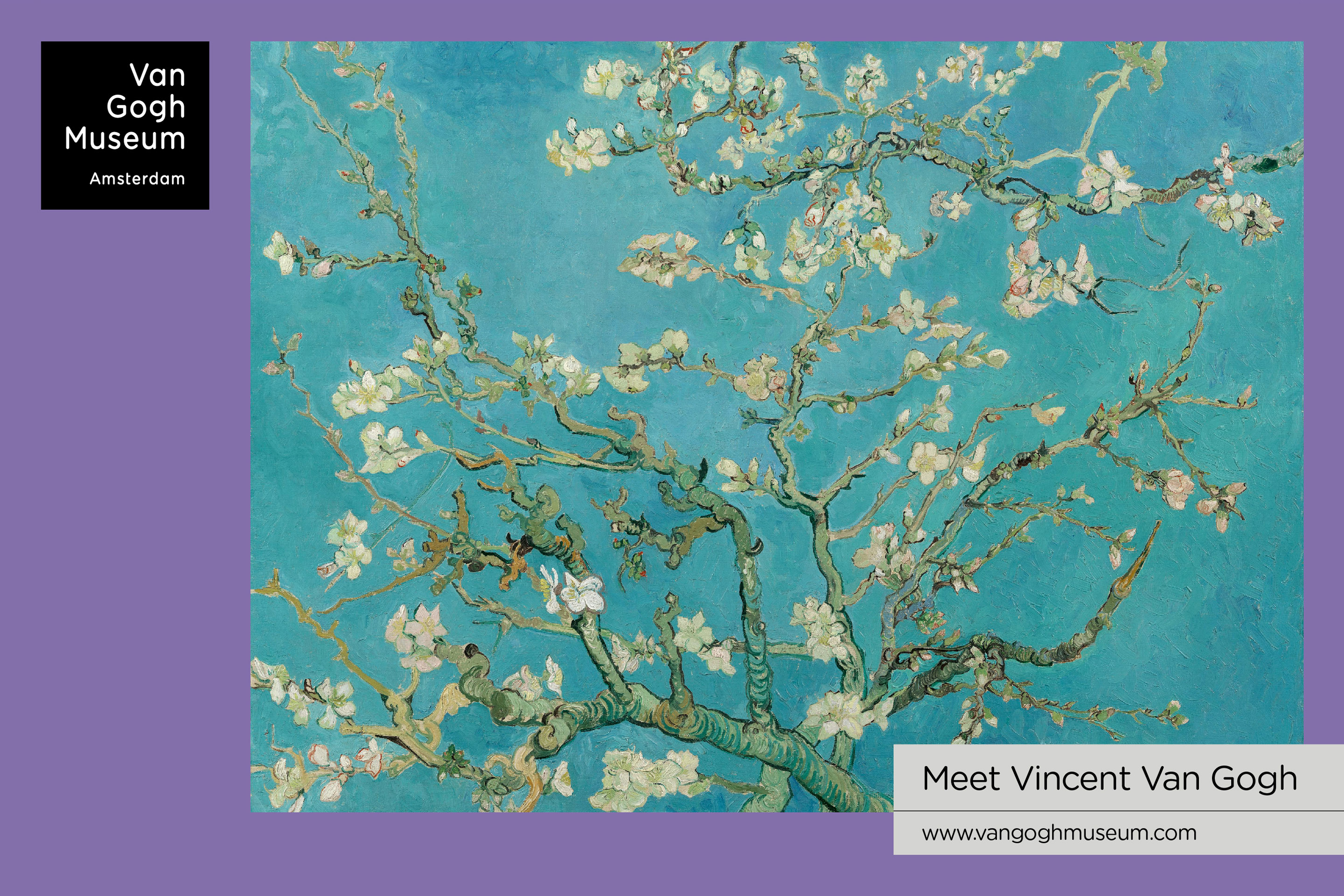
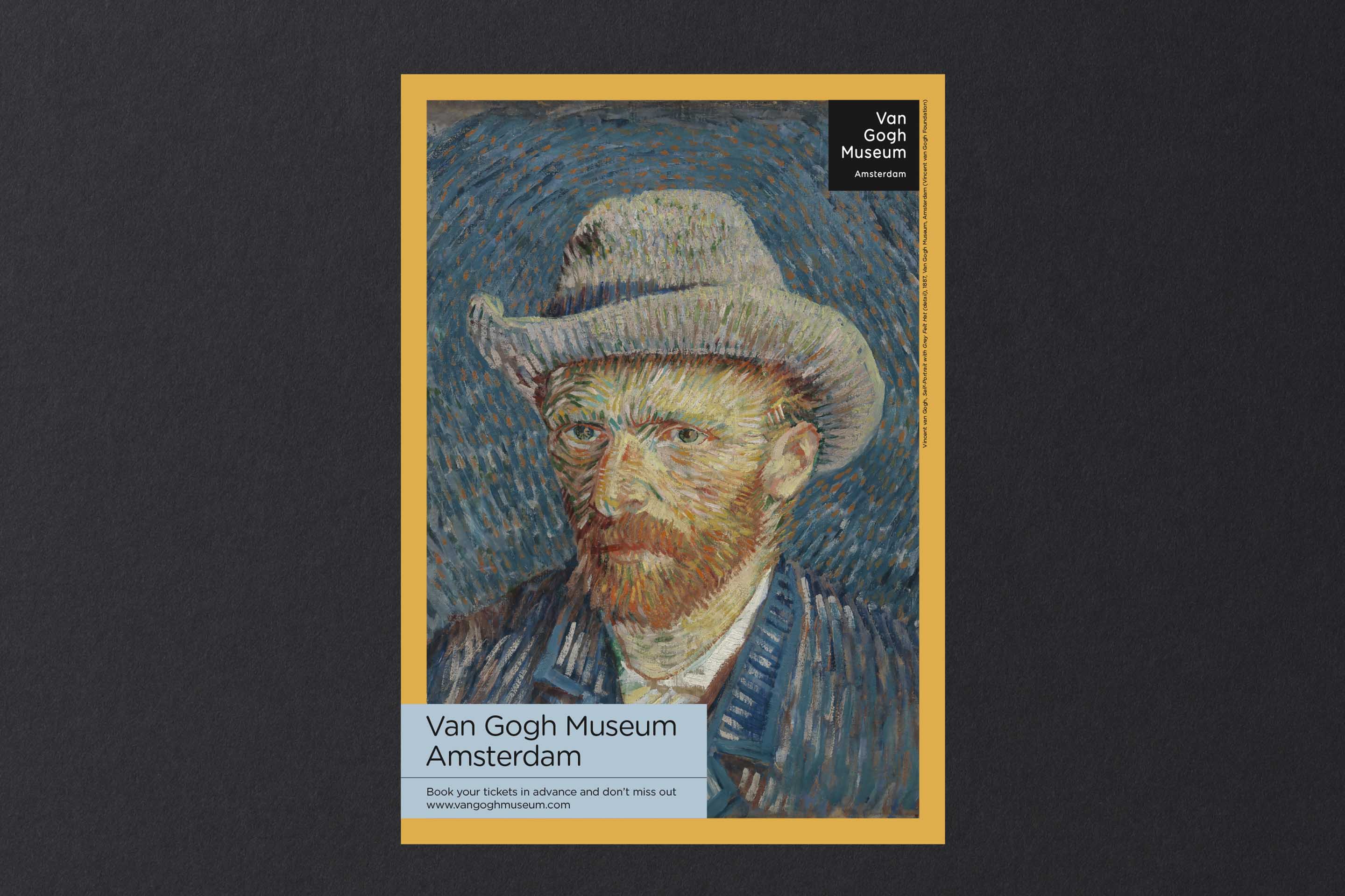
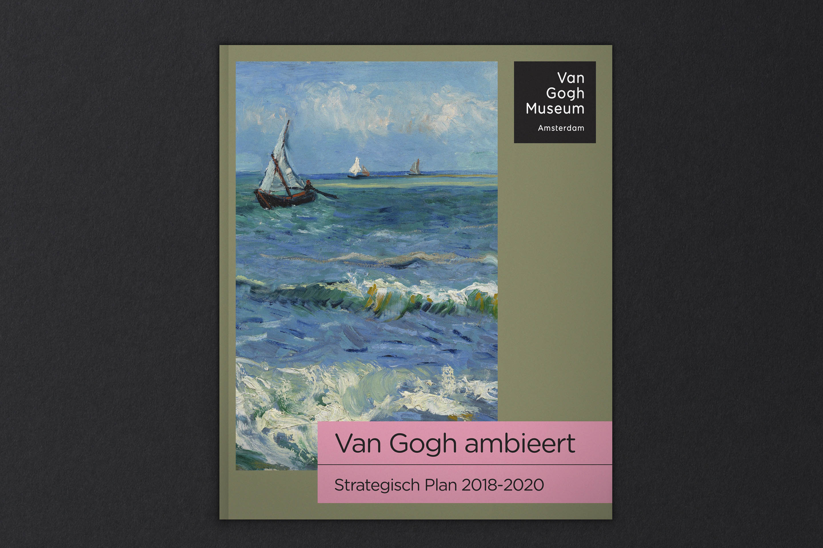
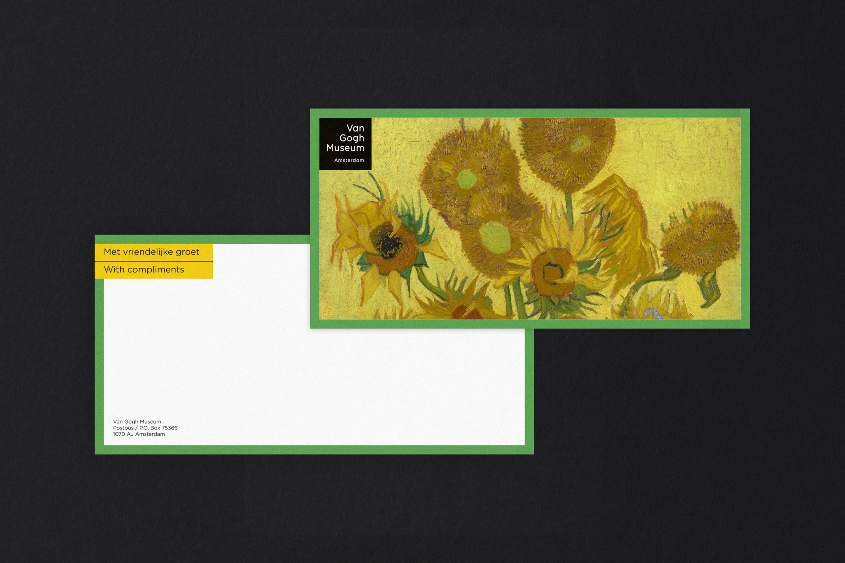
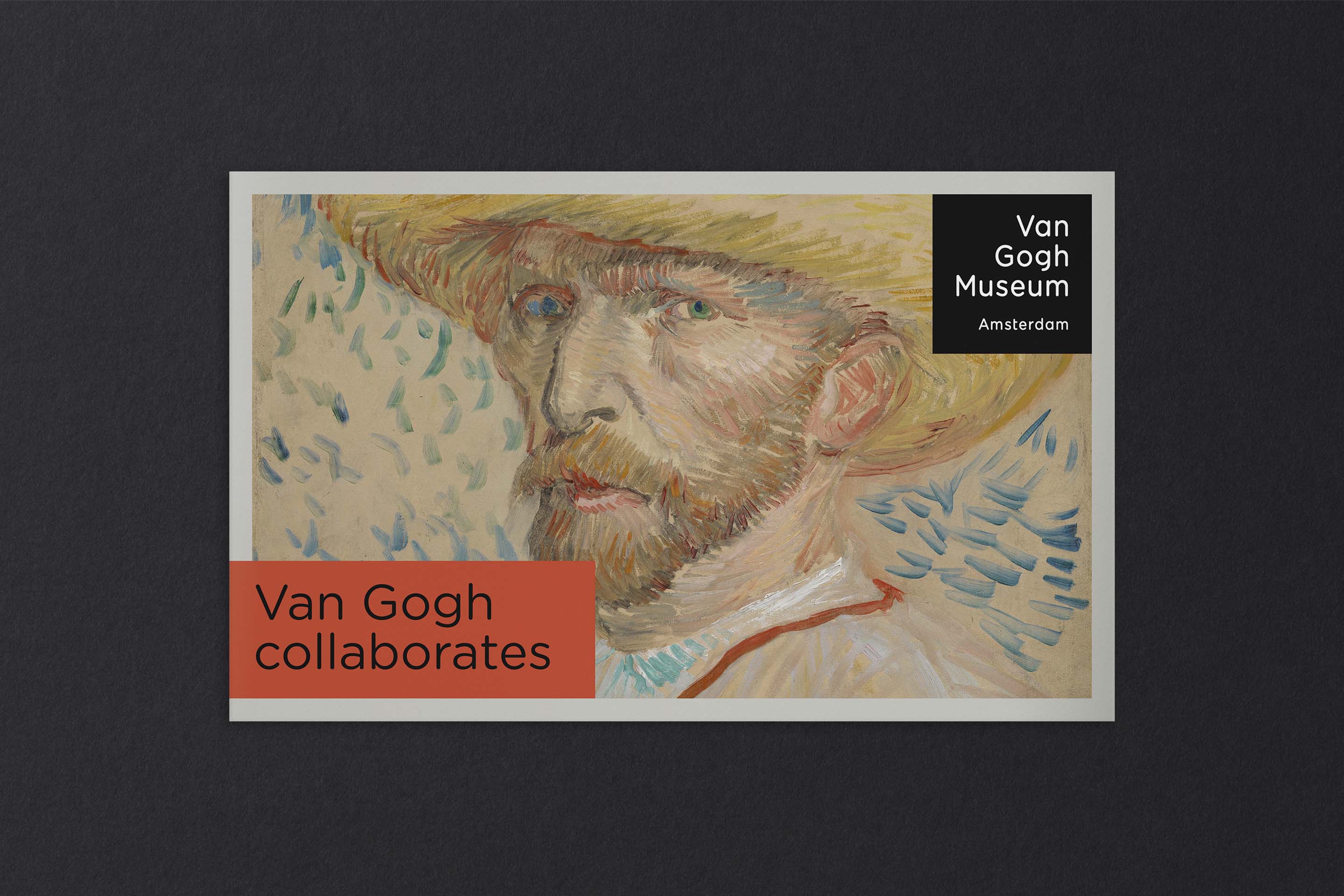
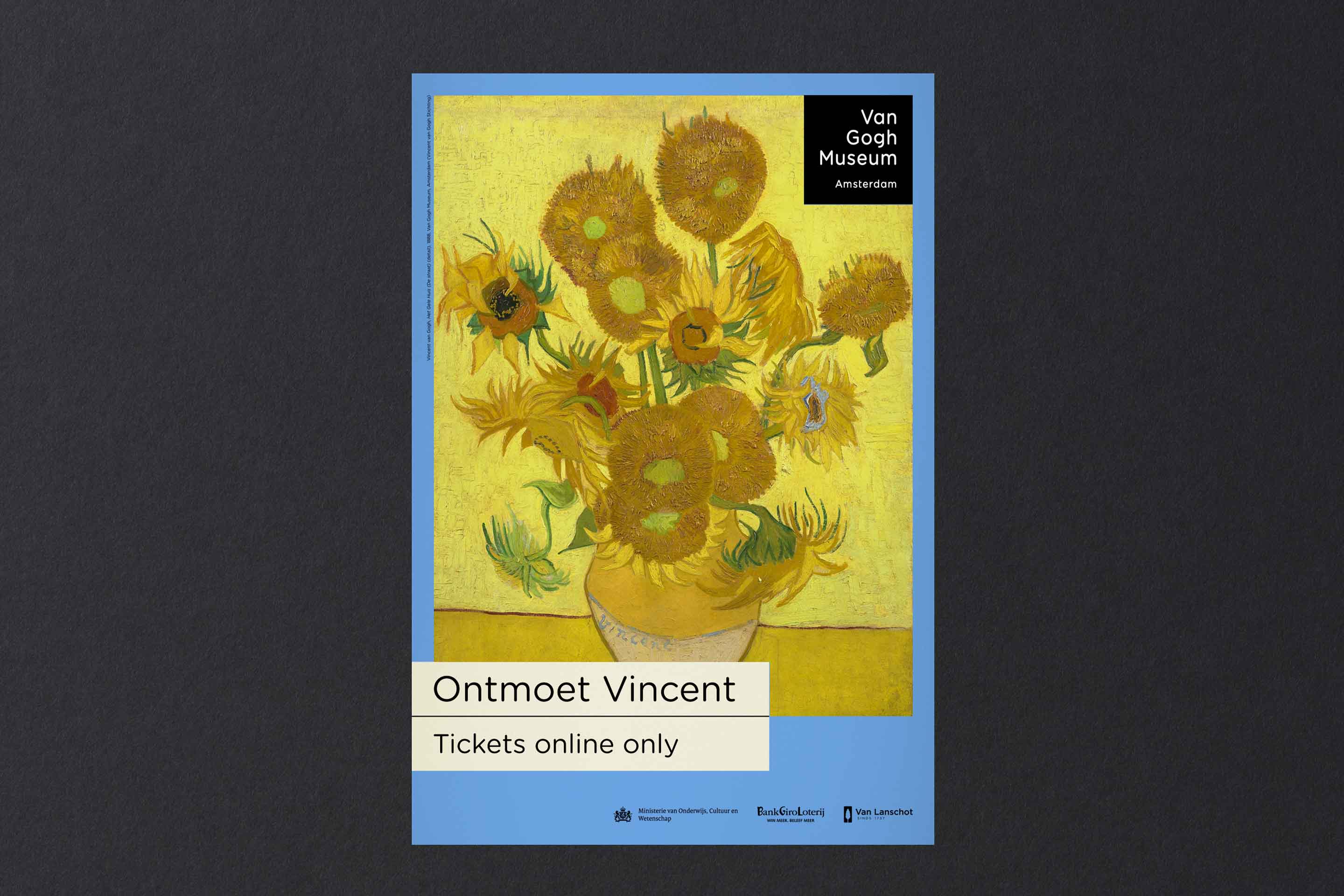
To restructure and improve the management of the brand, we suggested a more streamlined, monolithic identity. The idea: to pare it down to the bare essentials and bring everything under one recognisable brand. To achieve this, we retained two key components of the existing visual identity: the black square logo and the typography. What followed was a process of simplification and clarification, with the added aim of ensuring that the focus always remains on the art of Van Gogh.
Design
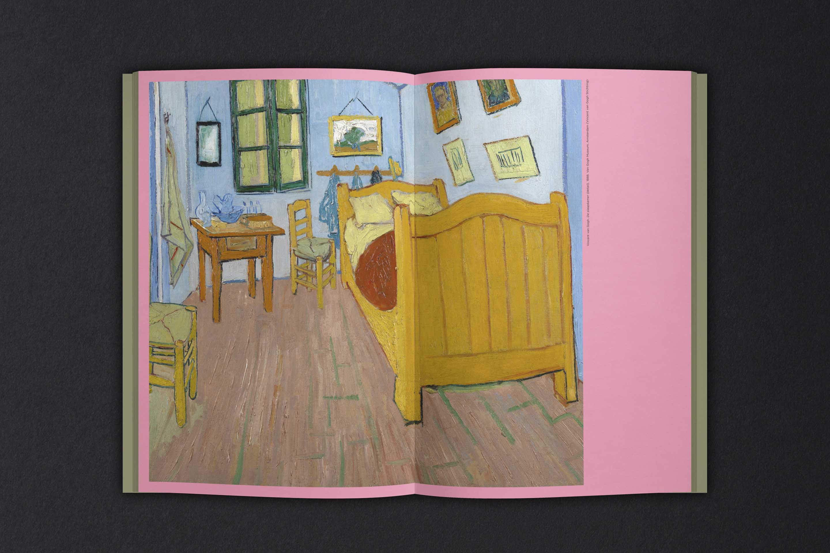
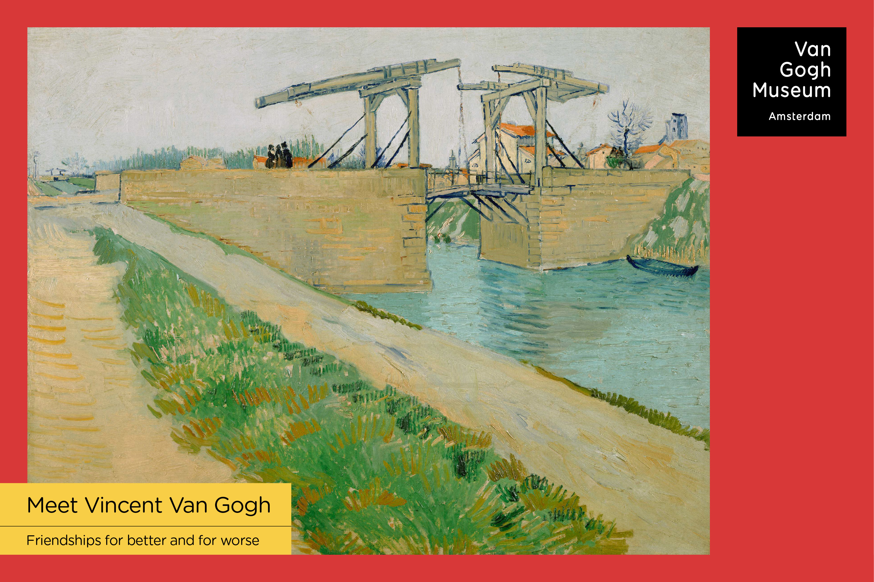
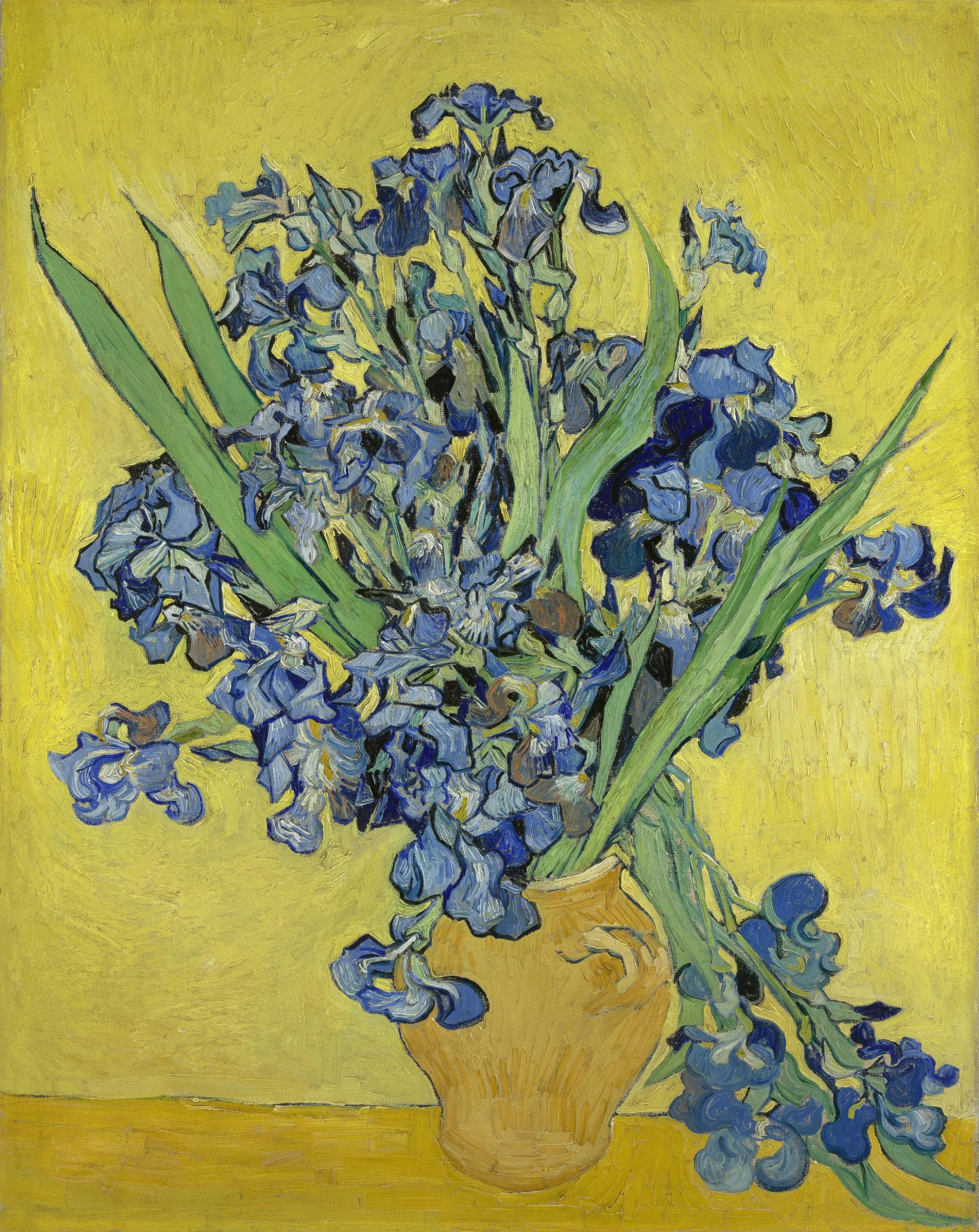
Colour became the second most important element in the refreshed identity. Colour, and complimentary colours in particular, are crucial to Van Gogh’s work; he never stopped experimenting with colour. Our selection of colours directly references his palette, combining familiar Van Gogh hues – like chrome yellow and cobalt blue, with less familiar secondary colours. Striking and often surprising, these colour combinations position Van Gogh himself at the very heart of the identity. It also reframes his work and in doing so, offers a new perspective on his work
Results
The refreshed identity has improved visibility for the core brand, uniting multiple activities across a wide range of online and offline touchpoints. Tasteful and modest, the identity has strong visual impact. By placing the art of Van Gogh at its core, the identity succeeds in creating a natural relationship with the artist and his legacy.
