EUNL — A logo for the Dutch Presidency of the European Union
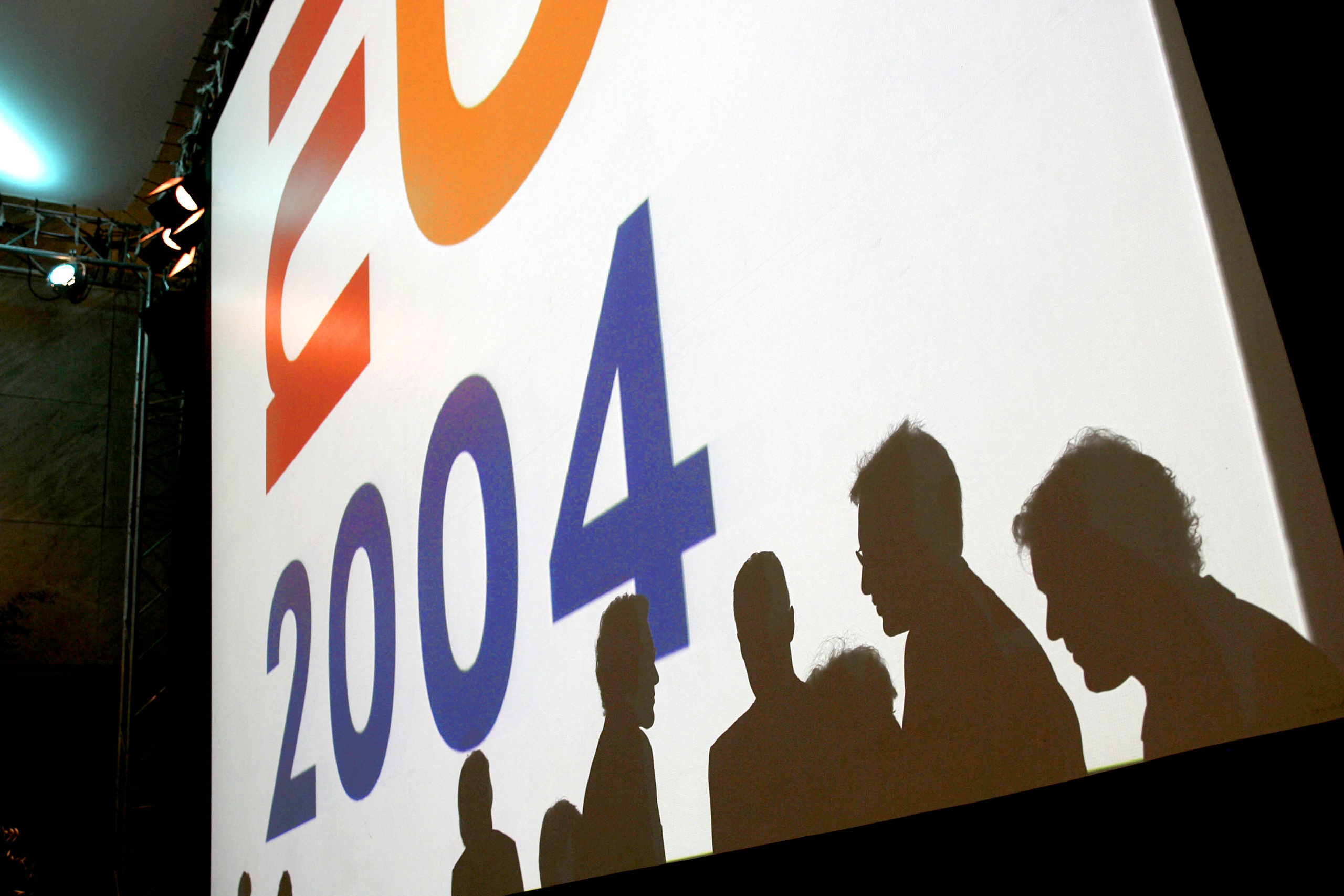
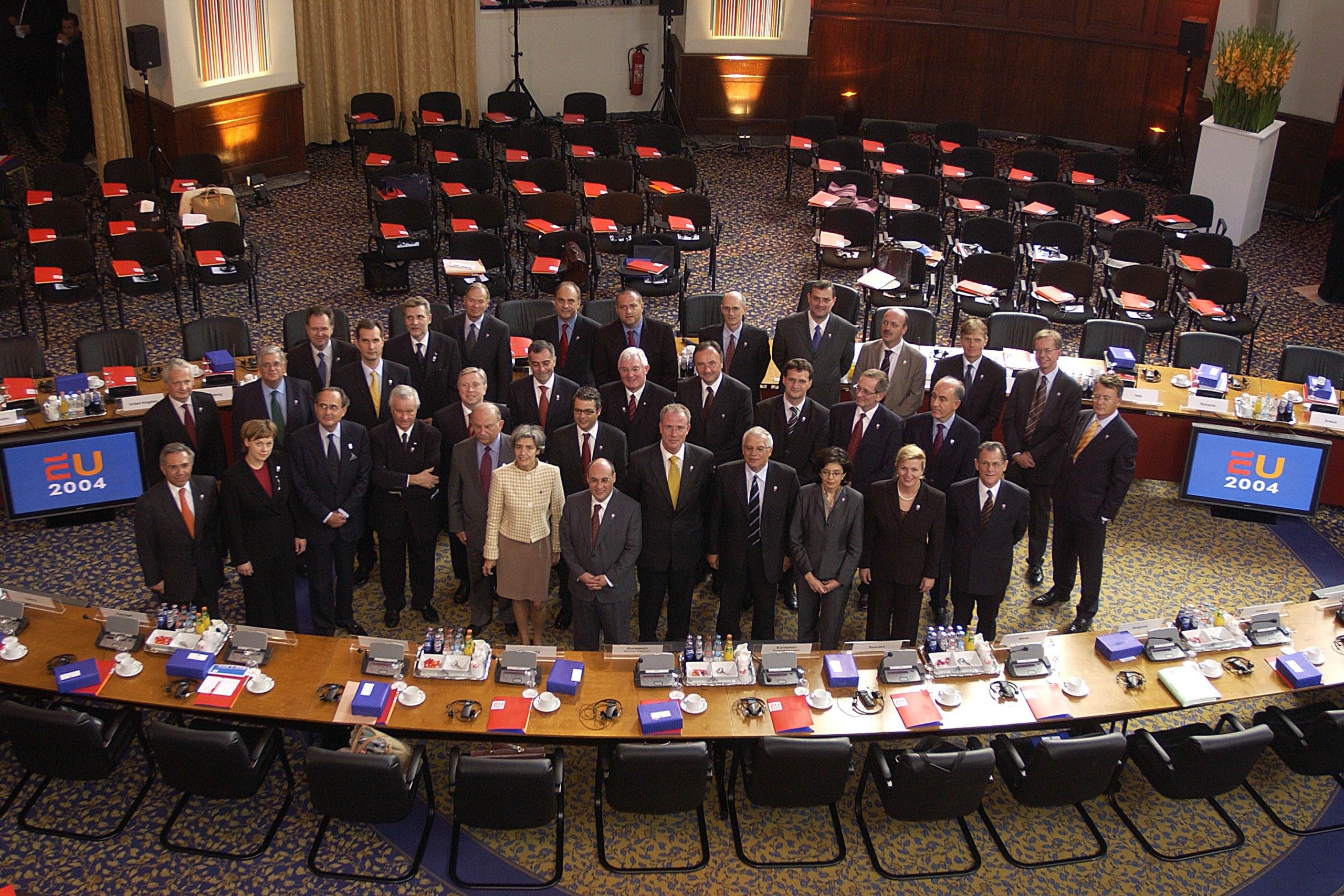
Rotating between different EU member states every six months, the Presidency of the Council of the European Union takes responsibility for the upper house of the EU’s legislature. Personally selected by the Dutch Prime Minister and the Minister of Foreign Affairs, Studio Dumbar/DEPT® was invited to design a visual identity for the 2004 Dutch Presidency.
Strategy
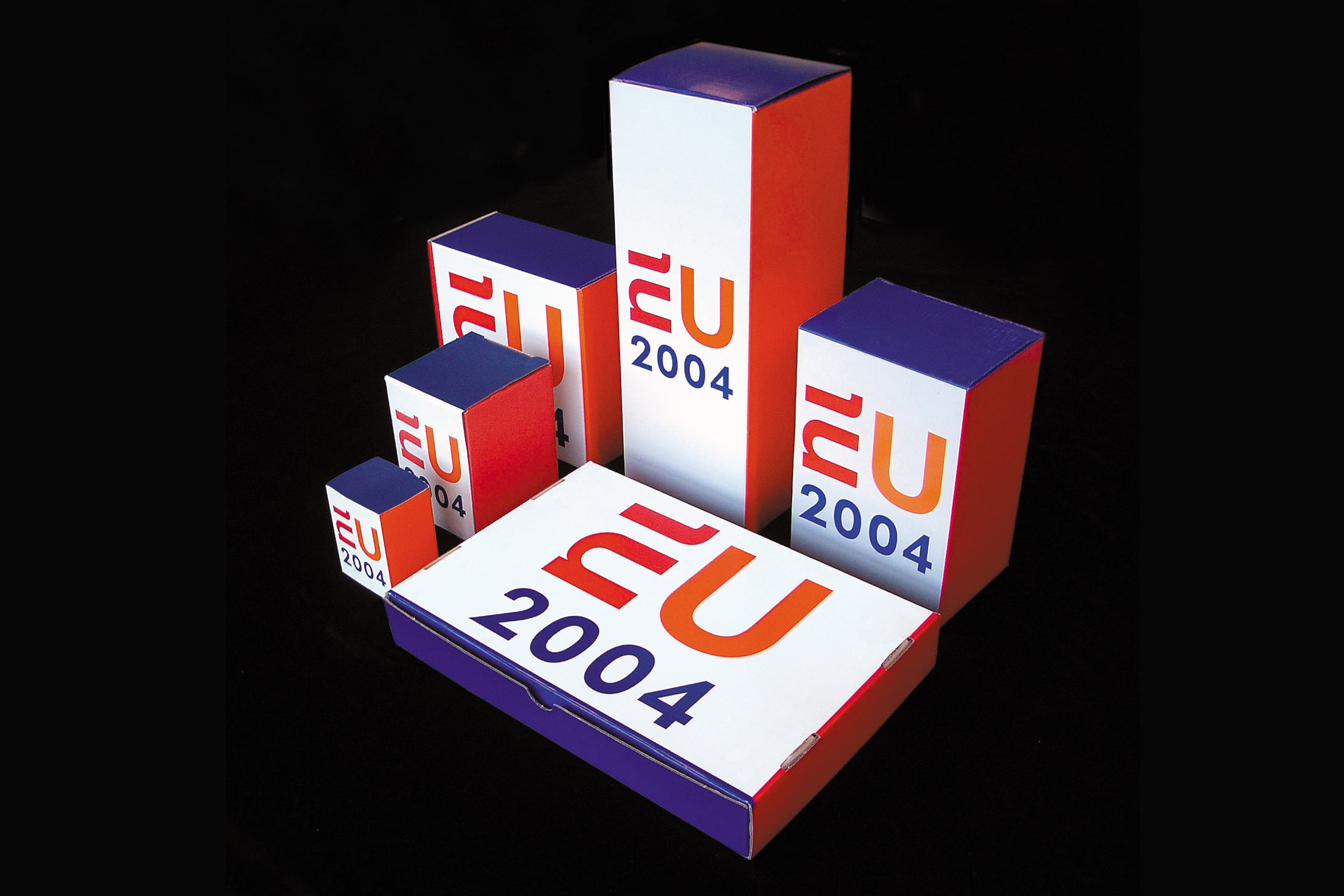
The core of our strategy was to design a logo that brings Dutch spirit and colour into the EU. The European Union isn’t always popular with the general public, so we found it important to stay away from typical institutional-style design. Without trying too hard to be ‘cool’, the objective was to design something robust, but also colourful and joyful, rather than serious or (worse still) boring.
Design
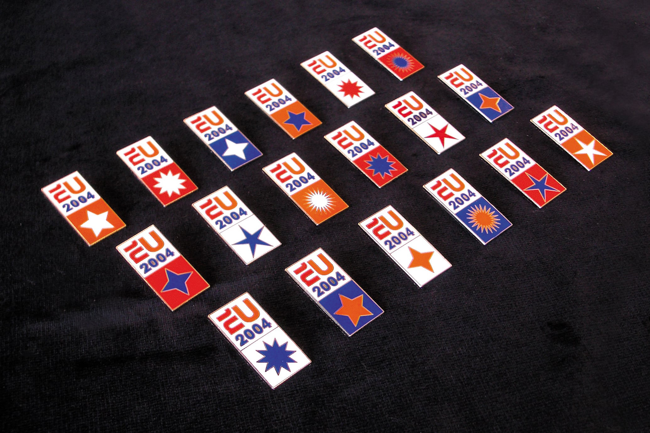
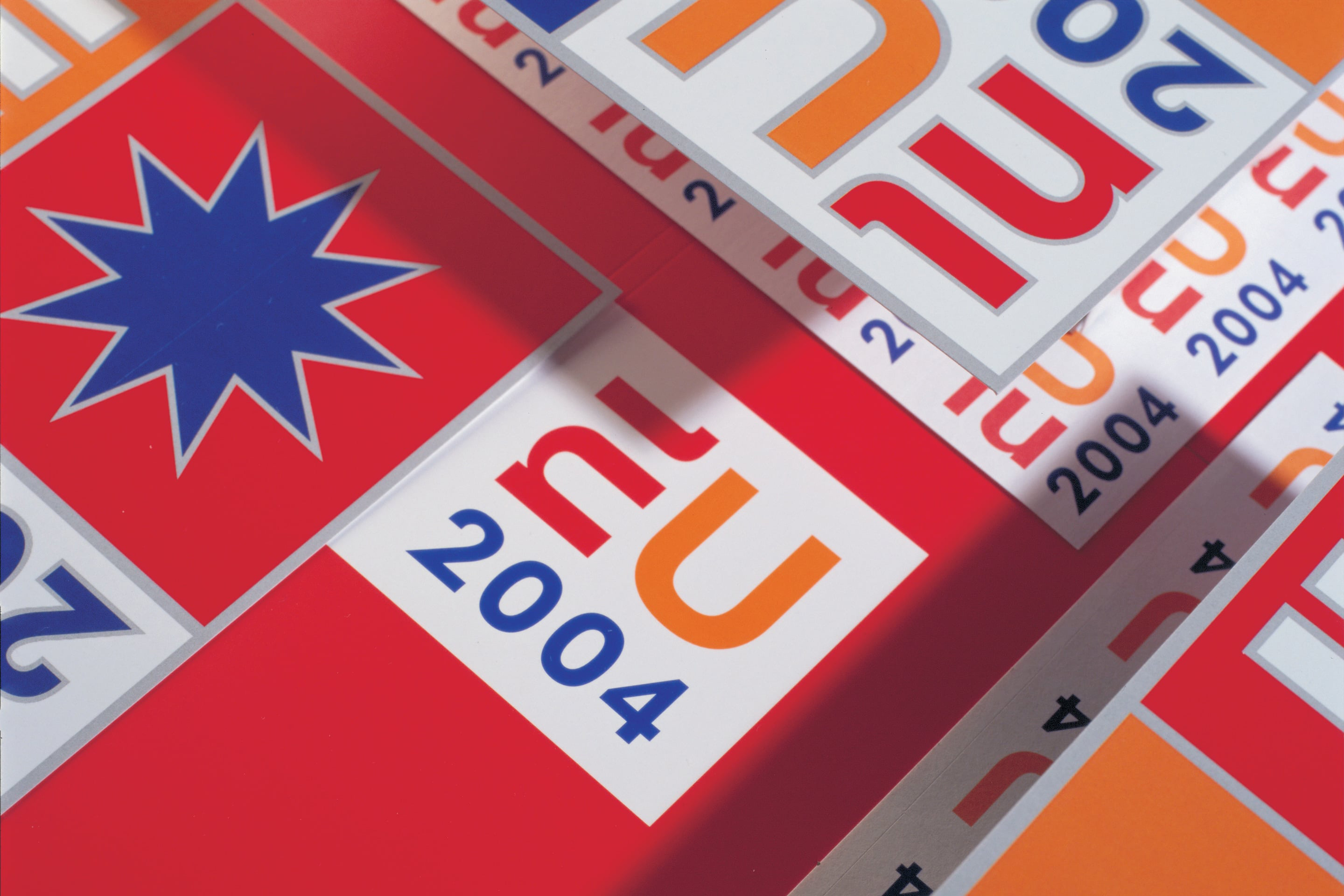
By revealing a hidden ‘NL’ in the EU initials we developed a clear identity. Introducing the year created a solid, square logo while the colours reference the red, white and blue of the national flag, as well as Dutch orange and EU blue. Proving popular with diplomats, politicians and journalists alike, the versatile identity lent itself to a range of applications including a website and a collection of pin badges bearing different stars – a reference to the EU flag.
Results
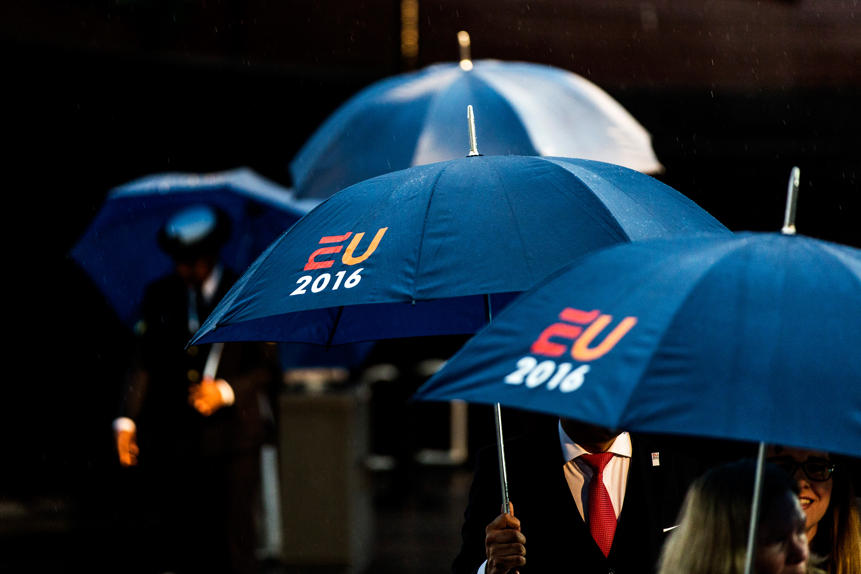
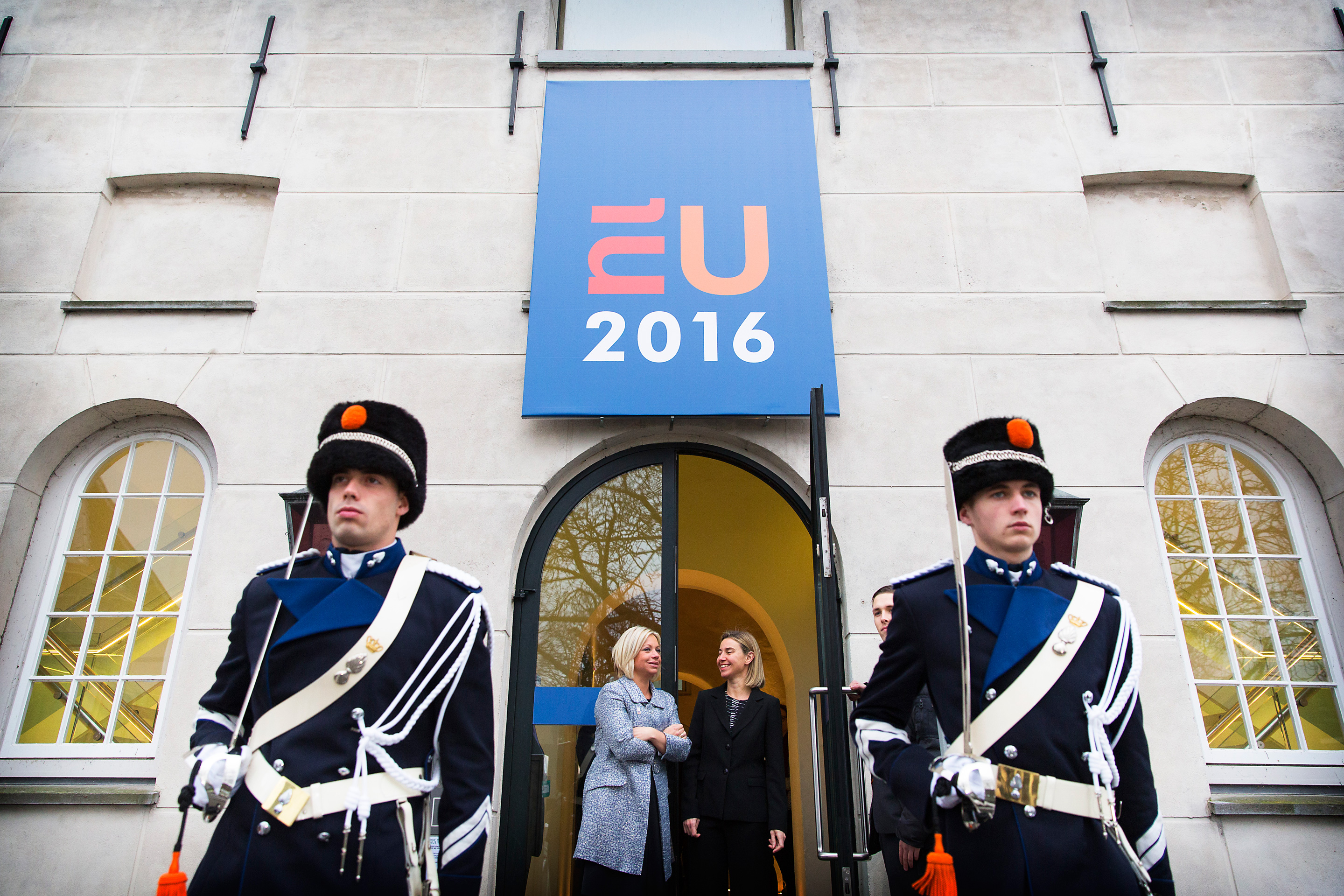
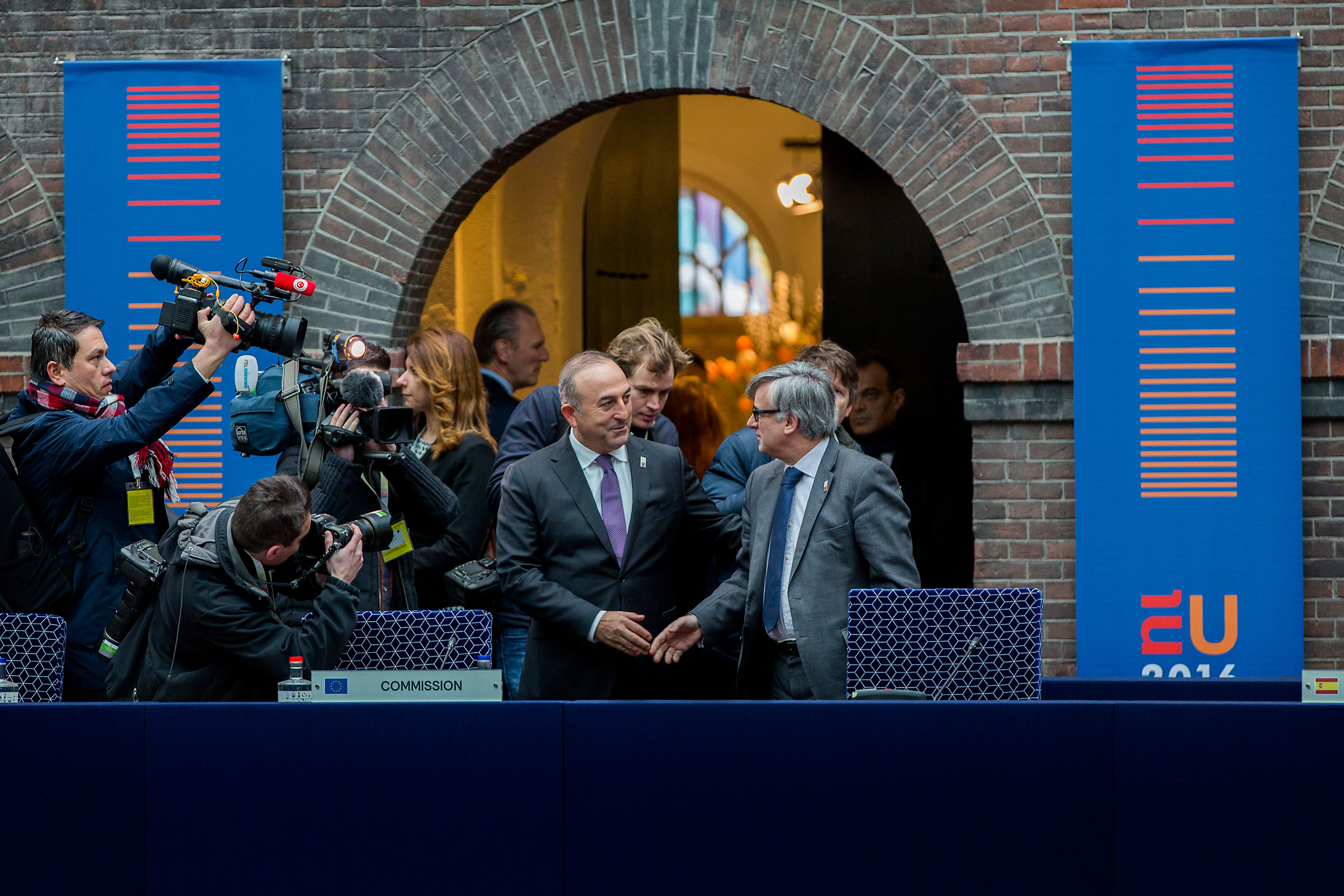
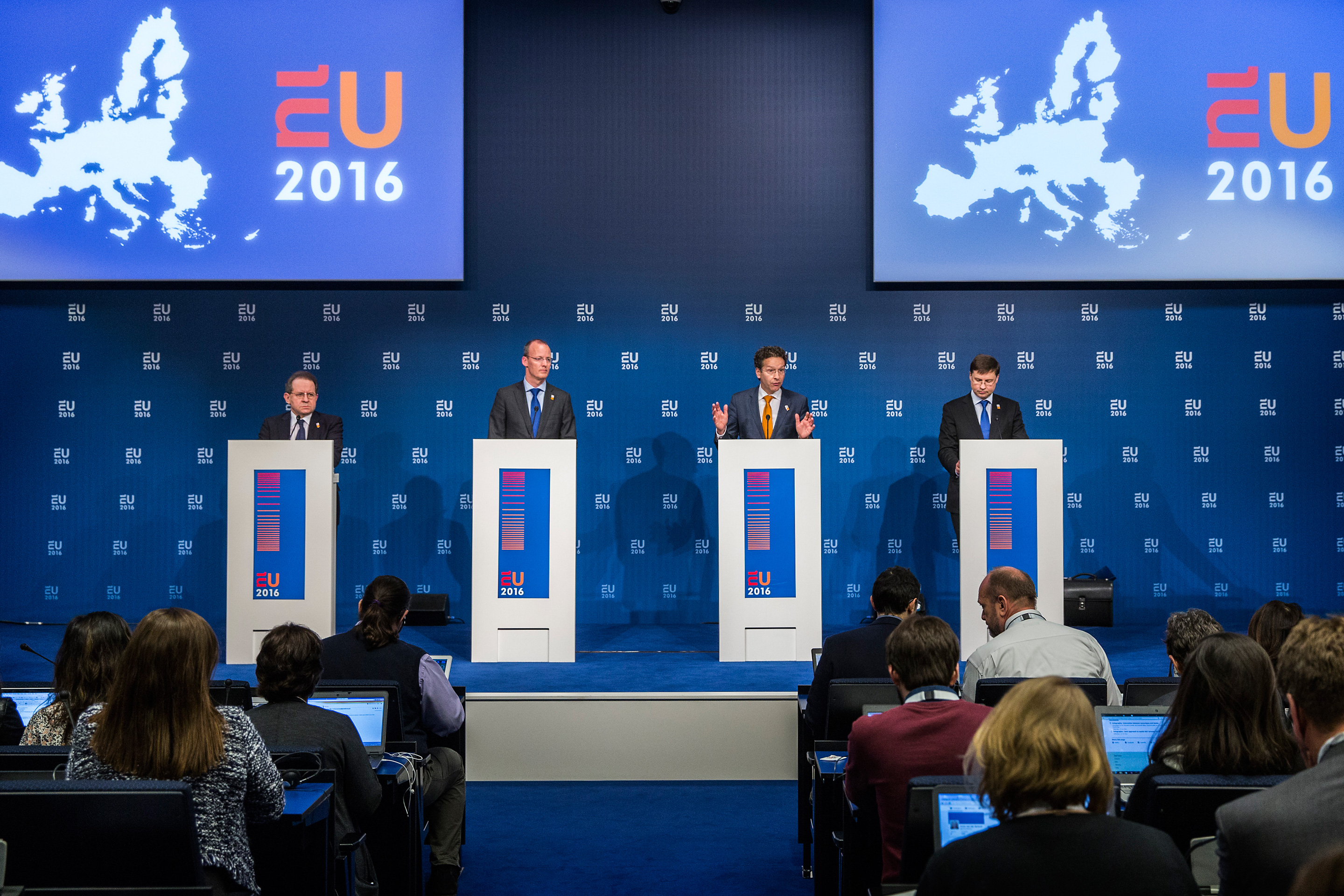
The popularity of the design took the organisers by surprise: after each meeting or event, most of the items featuring the logo were taken as souvenirs by diplomats and journalists. The 2004 identity proved to be such a hit that the logo was revived over a decade later, with only minor adaptations, for the 2016 Dutch Presidency.
