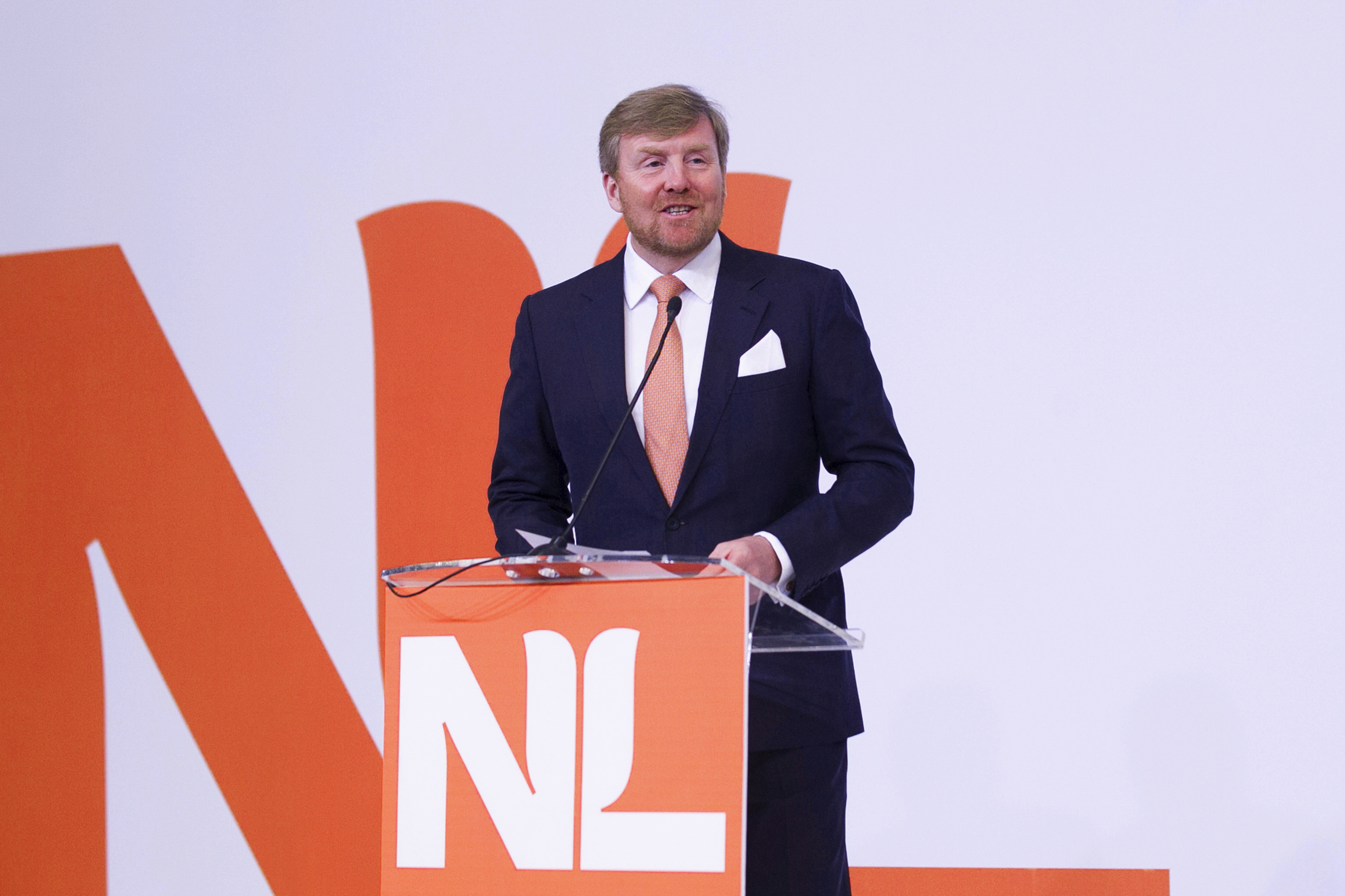
The Netherlands — Branding the nation on the international stage
Seeking a new visual identity for the country, The Netherlands approached a Dutch studio with a proven record for creating brands that stand the test of time – Studio Dumbar/DEPT®. The identity will be used for international communications promoting Dutch organisations, companies and initiatives around the world.
Strategy
Before the design process began we conducted extensive rounds of consultation with all the appropriate stakeholders and areas – from international businesses in finance, tech, industry, agriculture and so on, to ministries, embassies, media, creatives, universities, sports, and more. Strategically, our aim was clear: to replace the existing identity – an impressionistic, hand-painted ‘Holland’ and tulip symbol – with a brand far more in tune with The Netherlands’ status as a forward-thinking nation of entrepreneurs and innovators.
Design
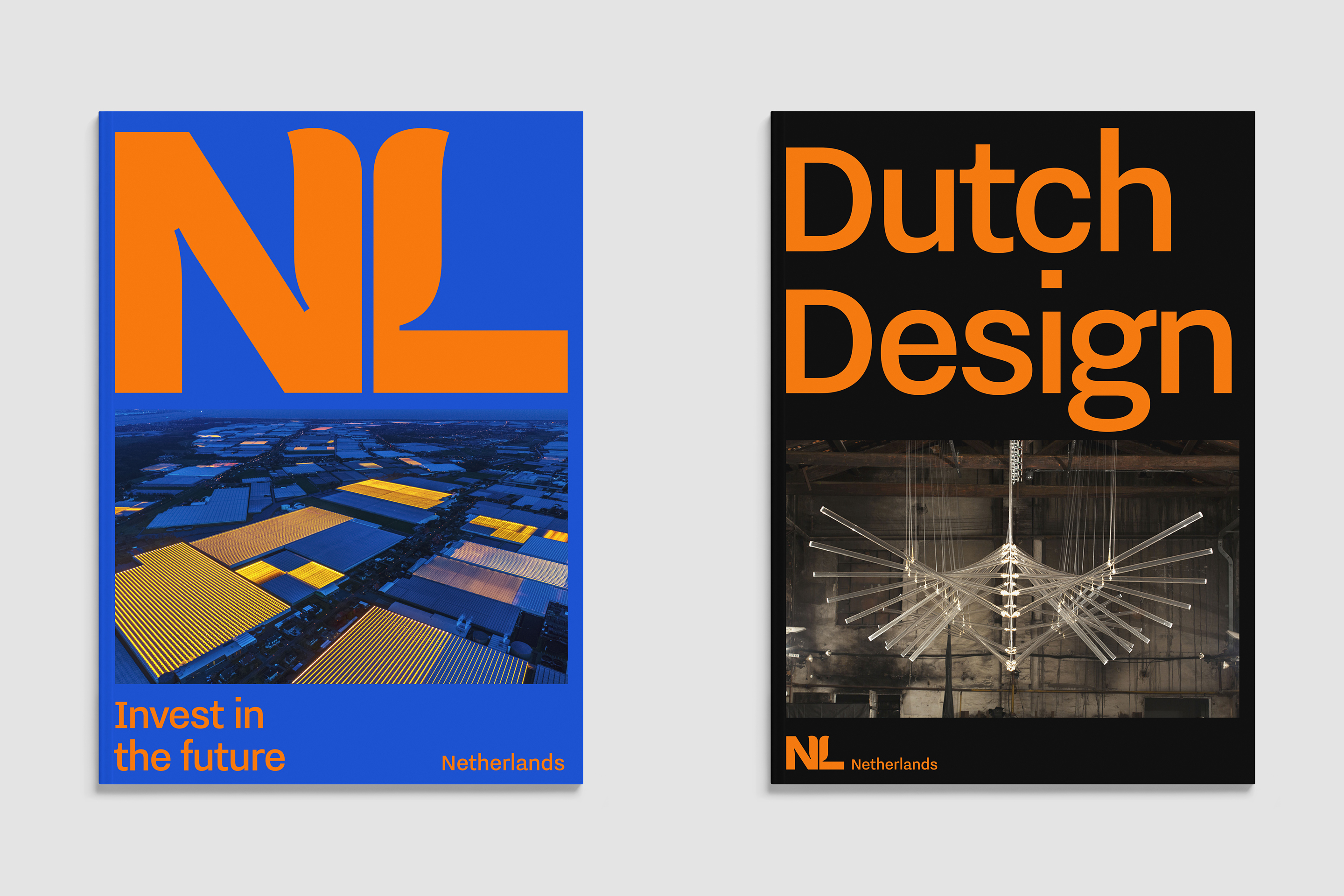
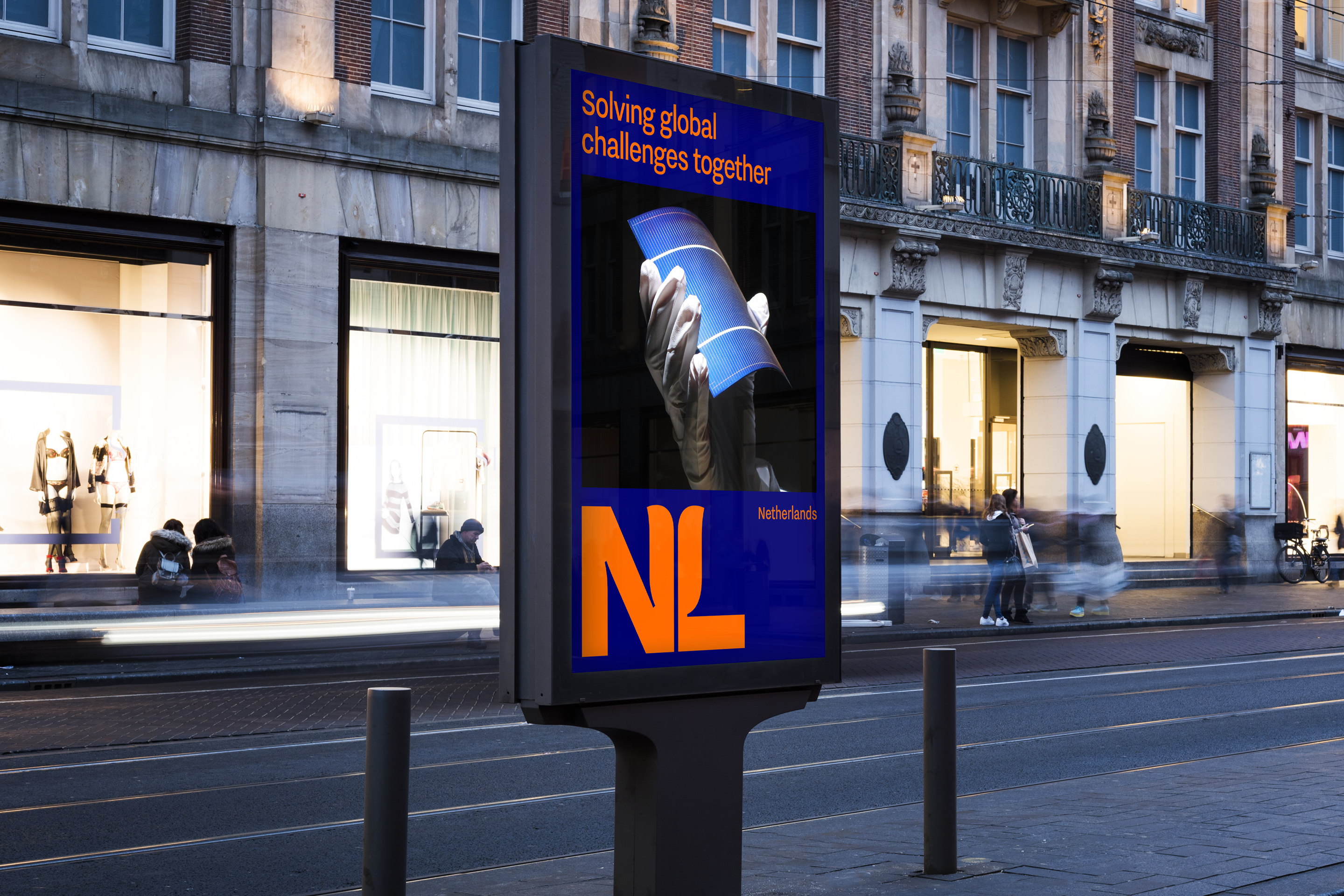
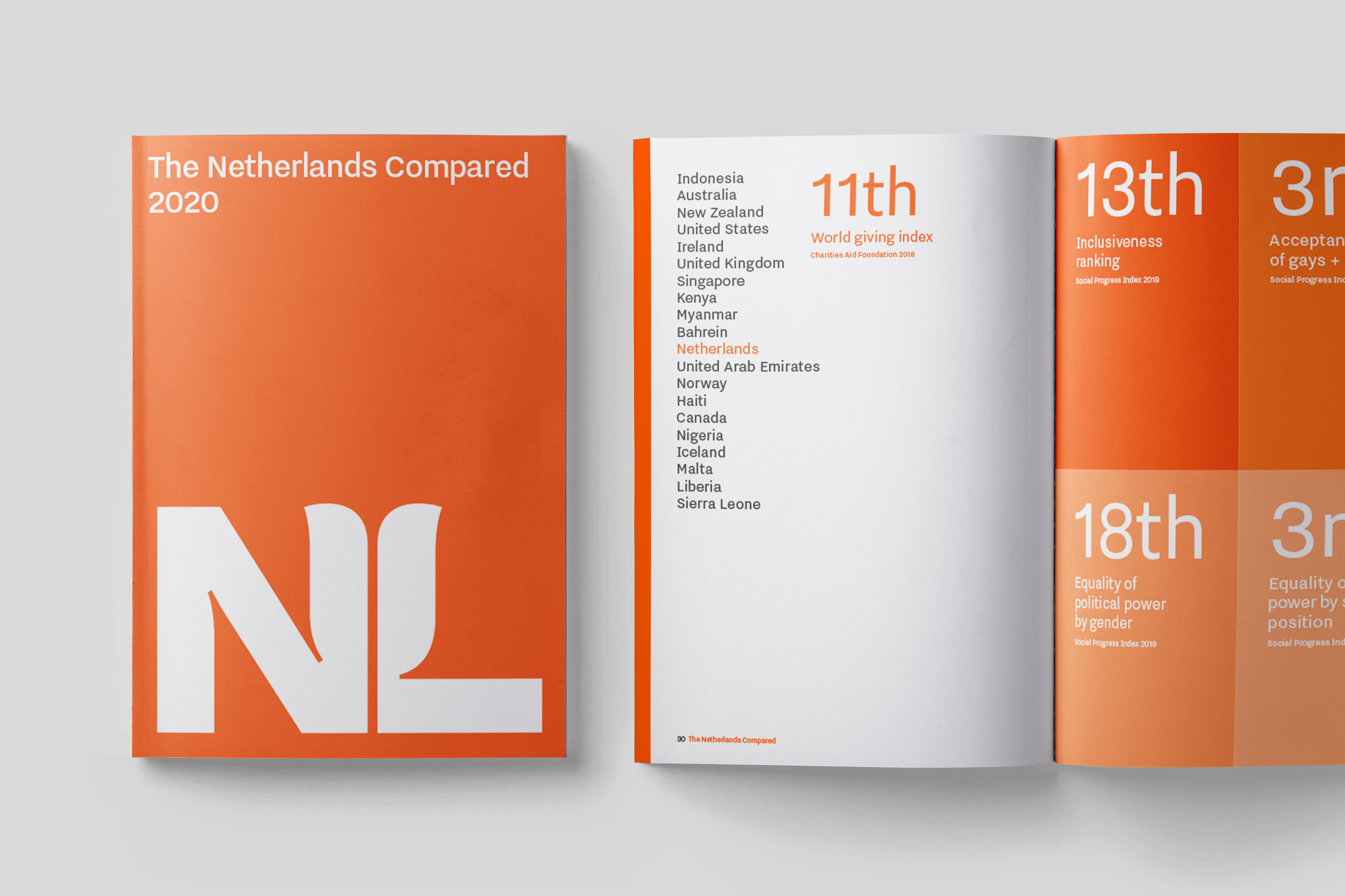
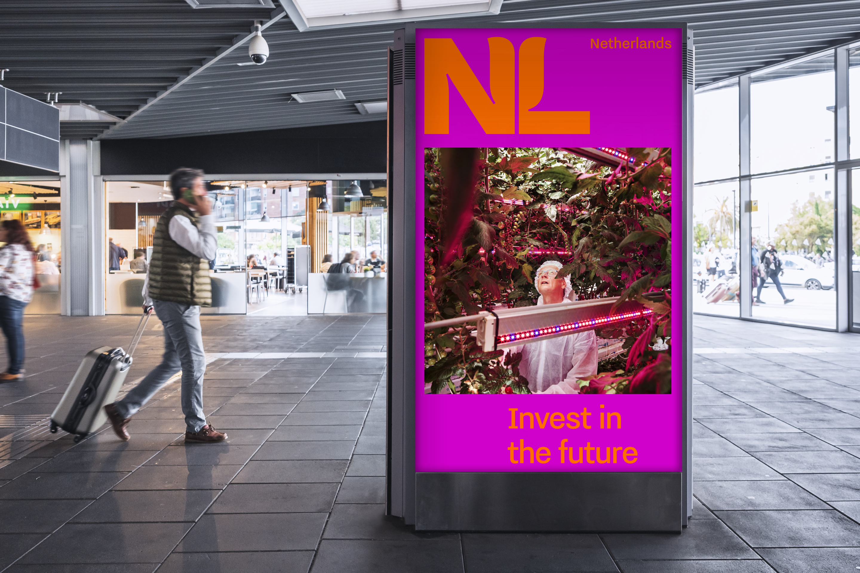
Simplicity, clarity and power. The new design draws on a well-known trinity: the colour orange, the tulip, and the NL acronym. All three are quintessentially Dutch, evoking an image that international audiences can recognise, while expressing qualities close to the hearts of the Dutch people. Based on the typeface Nitti Grotesk (created by independent Dutch type foundry Bold Monday), the NL logo – with its subtle reference to tulip petals – and accompanying logotype express a modern attitude, whilst communicating their message with absolute clarity.
Results
Having launched with a brand portal in January 2020, a wide variety of organisations are gradually switching over to the new identity. Widely covered in the international design press and beyond – including international business bible, Forbes – the new branding succeeds in unifying what the nation has to offer on the international stage.

