Dutch National Police — Identity and vehicle striping
This landmark project began when the merger of the State and Municipal police, two previously autonomous organisations, created one unified national police force. A new identity was required to signal this change to the Dutch public.
Strategy
Externally, the strategy was to develop a strong, authoritative identity that is also accessible and open. Internally, we had to negotiate the fact that the merger was deeply unpopular. It was important to sidestep the potential for internal, political or public criticism by avoiding design trends and gimmicks. Instead, we focused on a sober, honest viewpoint, seeking to focus on character and strength, clarity and transparency.
Design
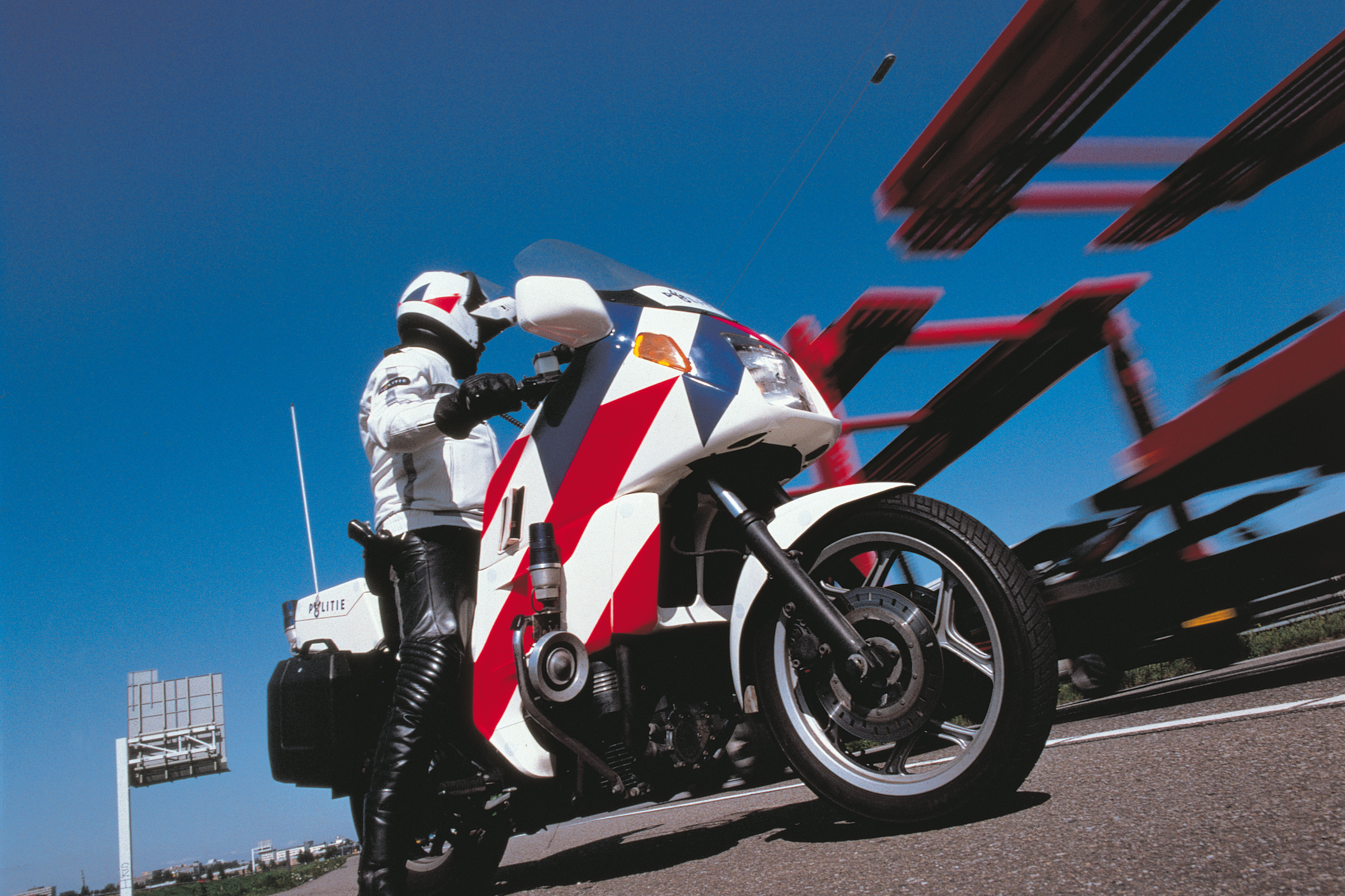
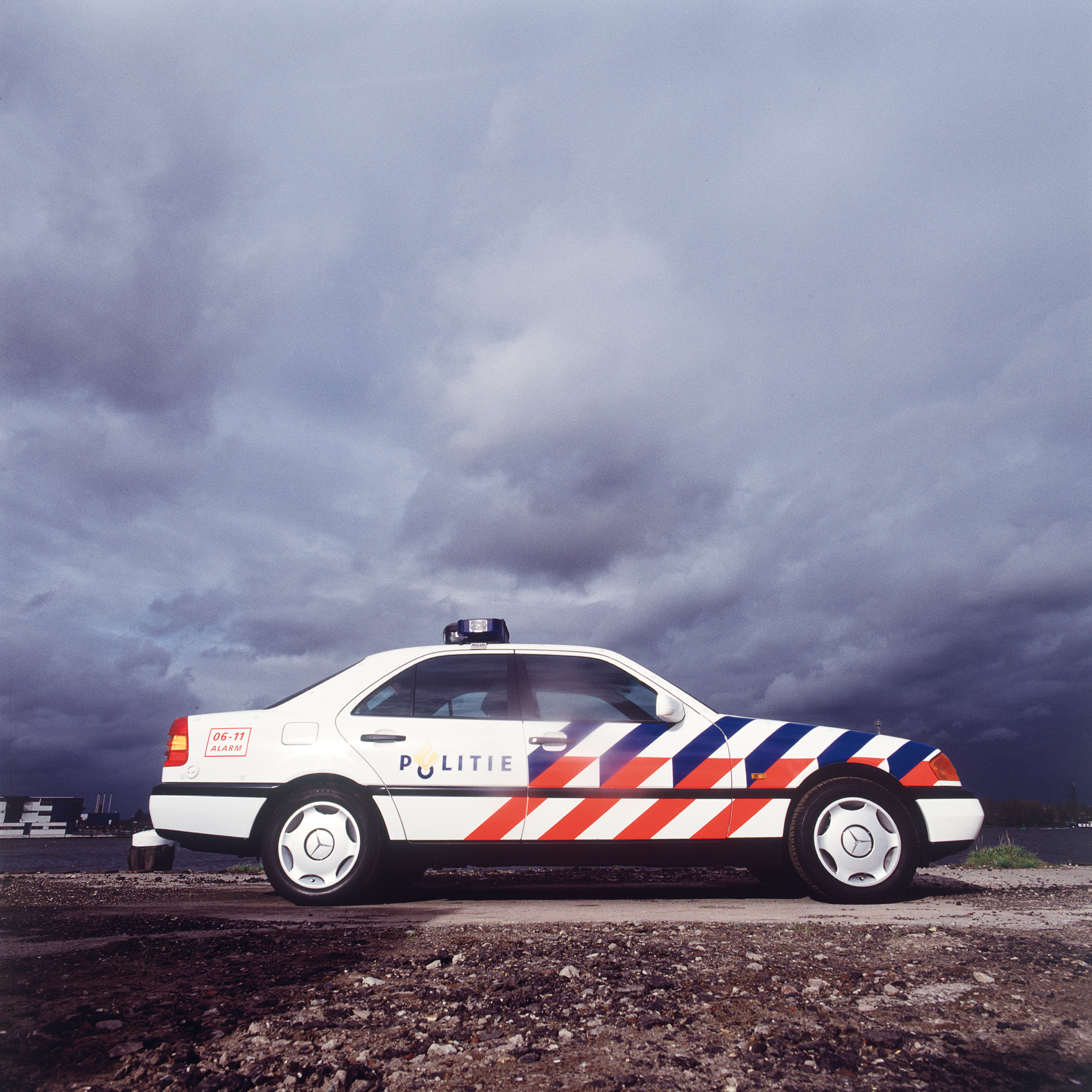
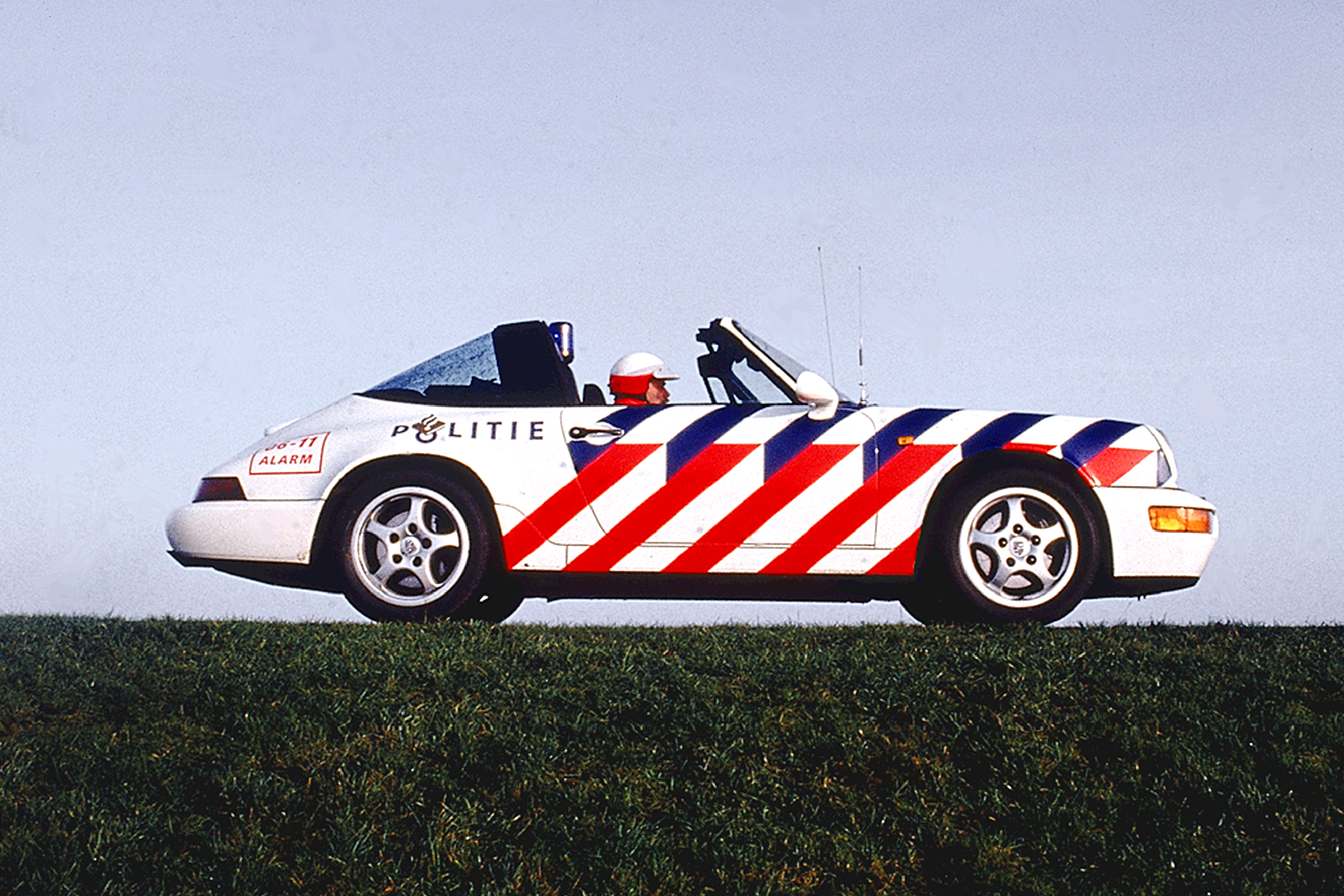
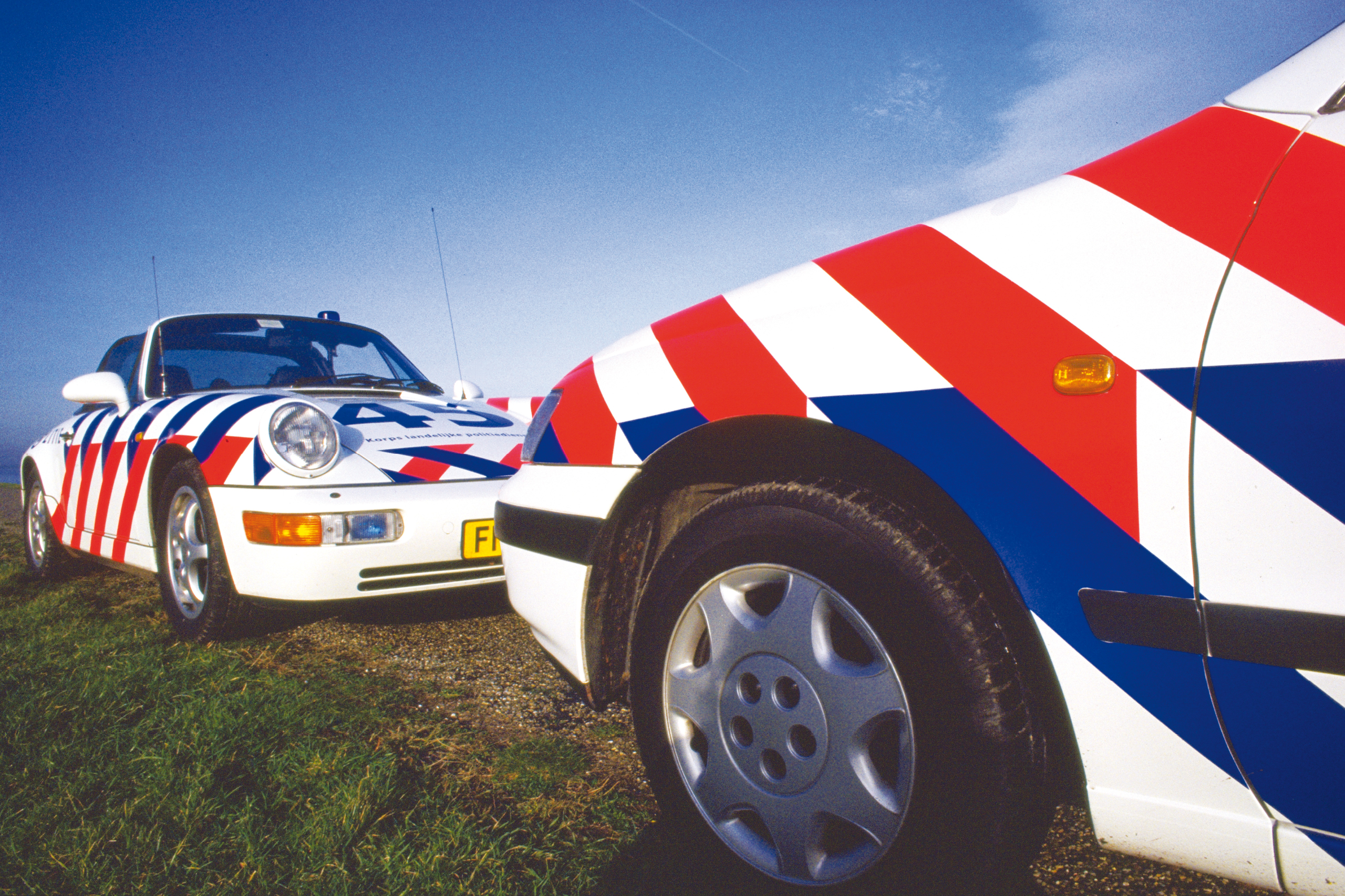
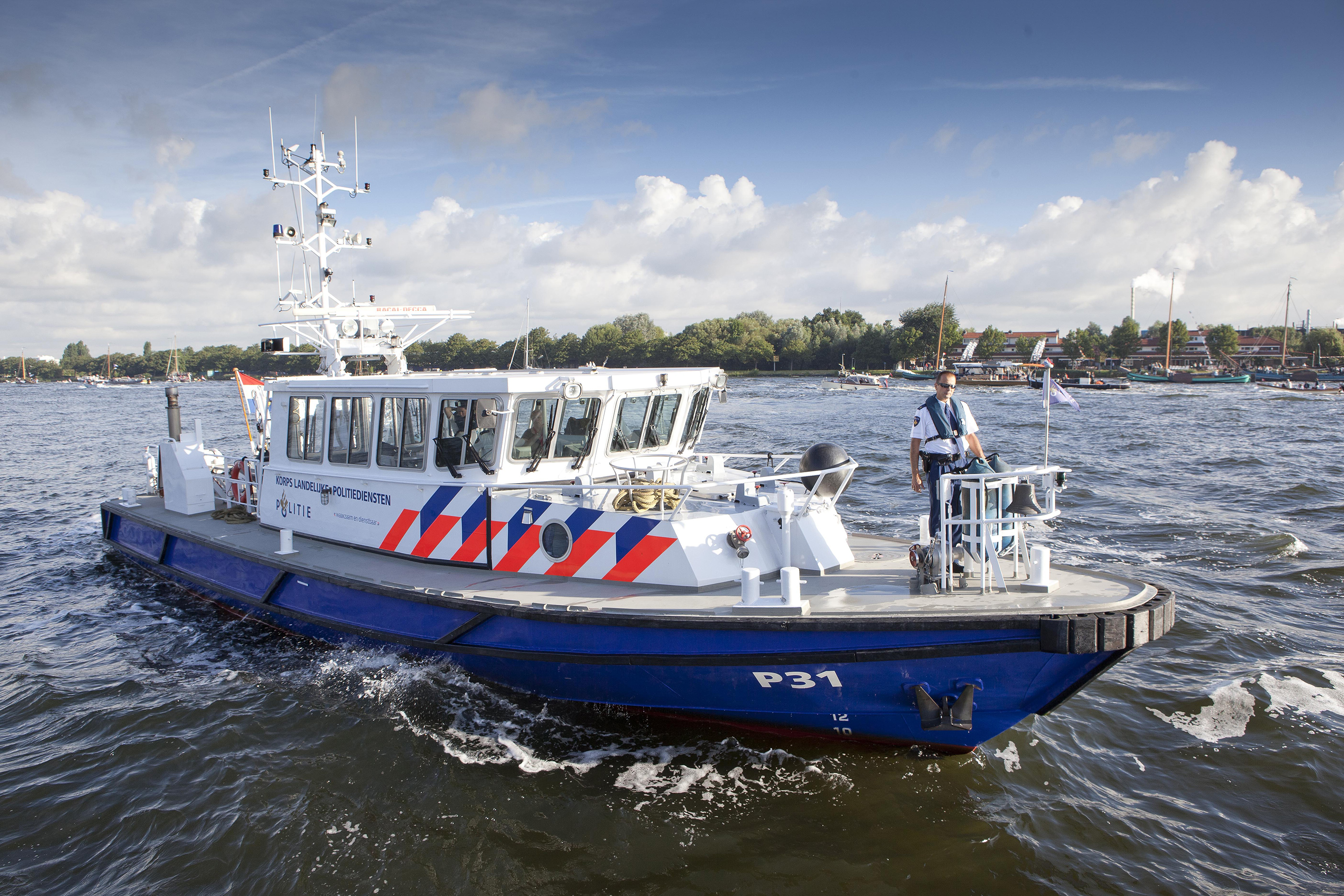
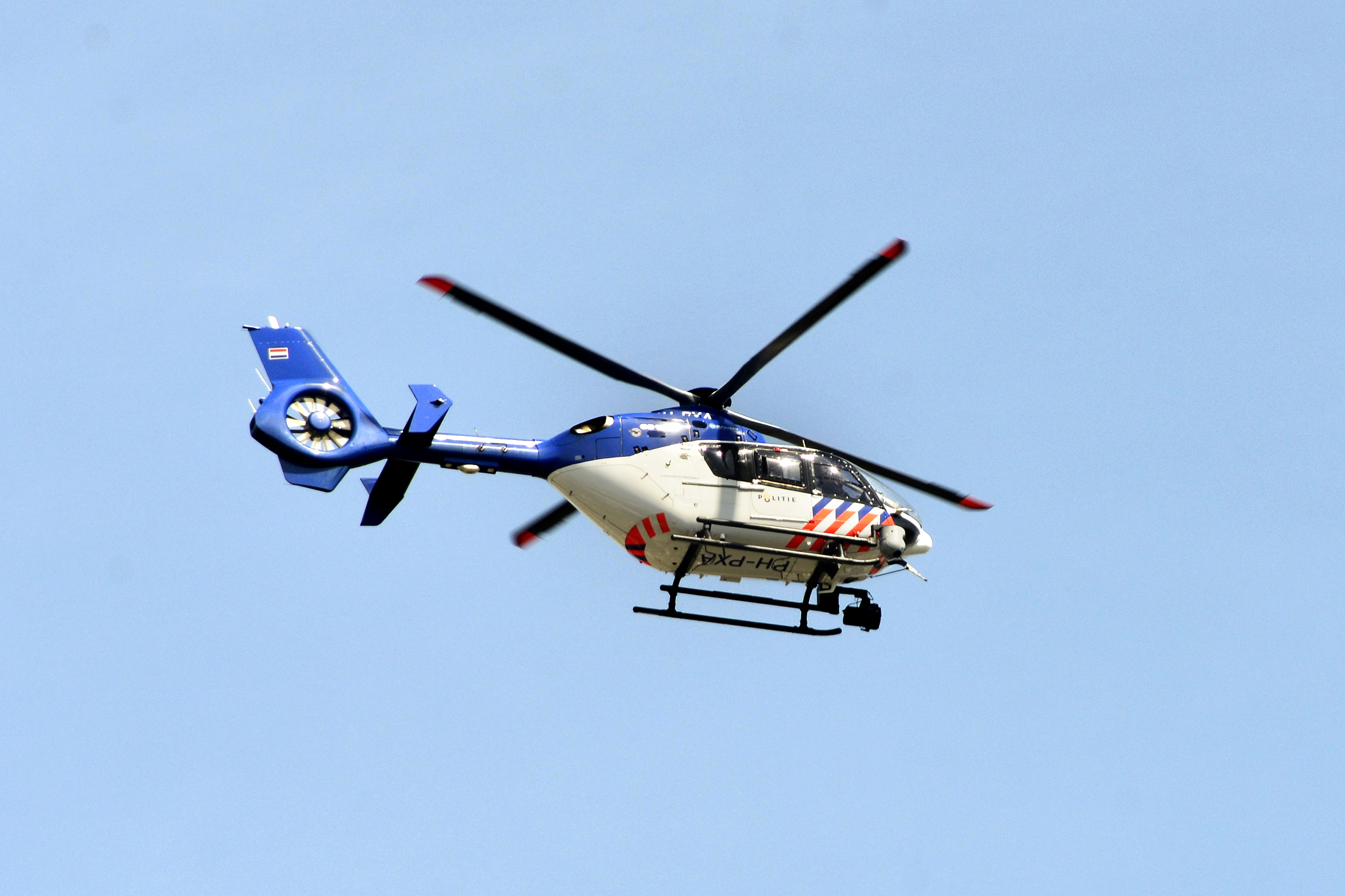
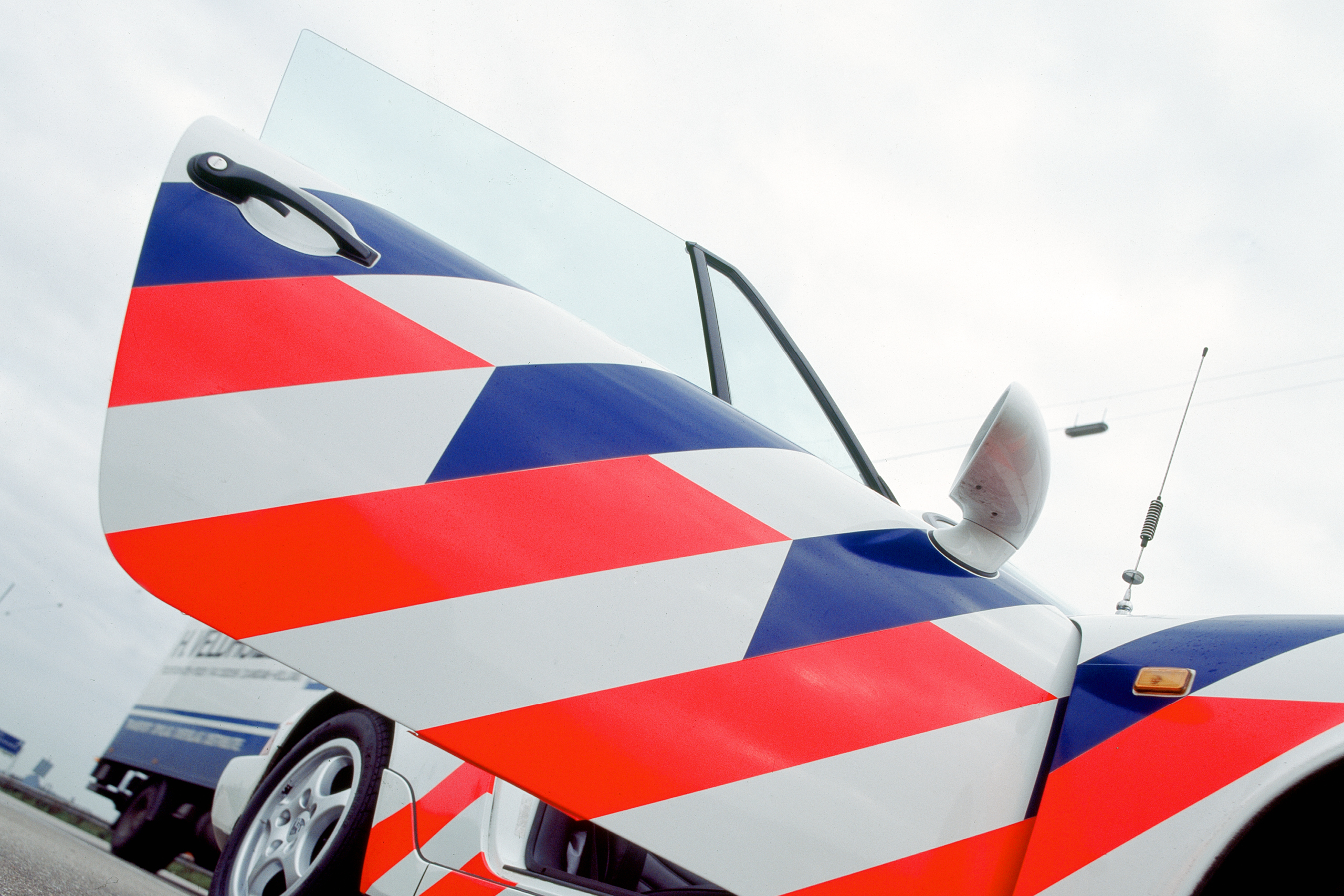
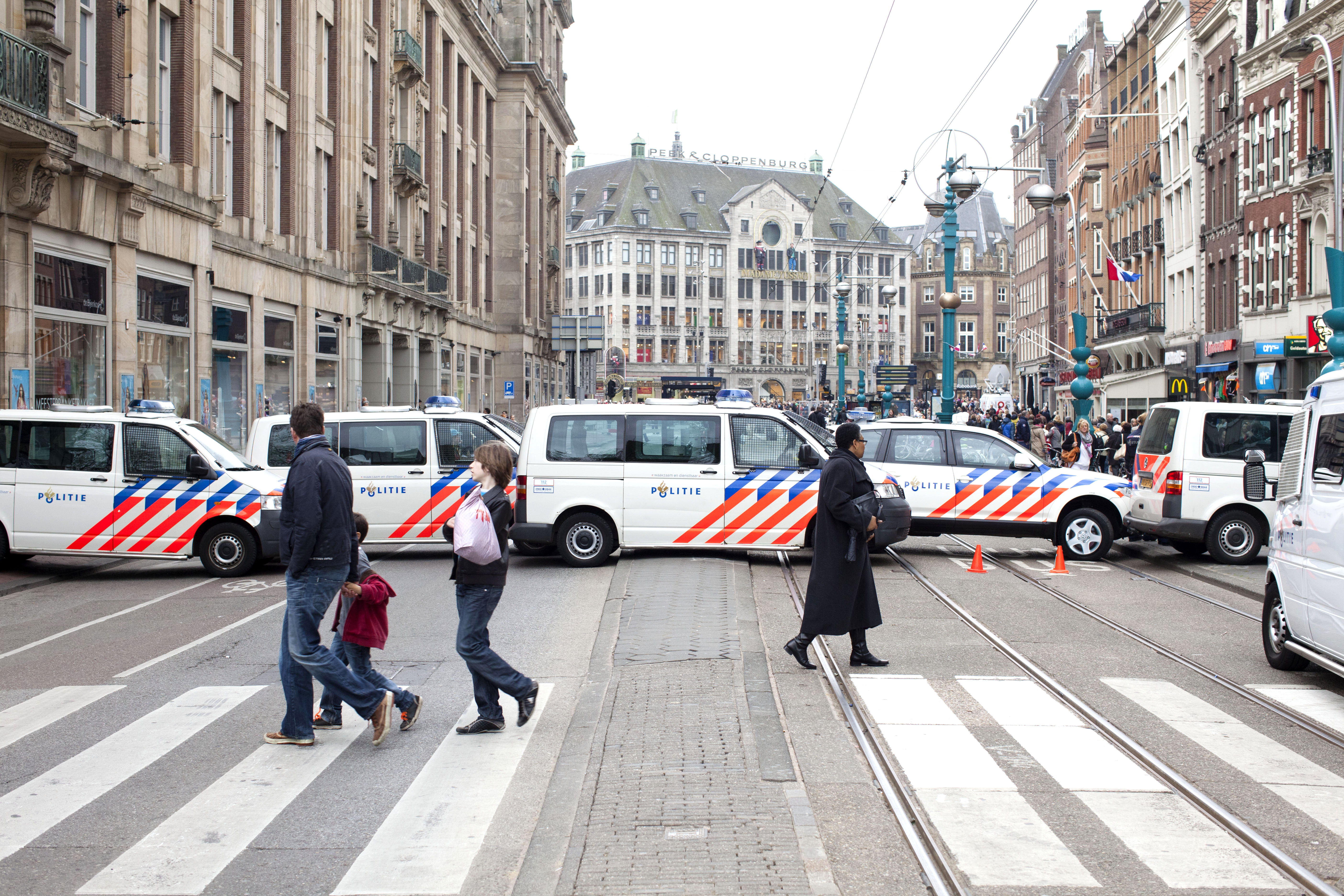
The new identity merged the spirit of the State and Municipal police forces. A radical departure from the 8-point star associated with police forces worldwide, the new logo soon became instantly recognisable. A strikingly successful part of the identity is the striping designed for all police vehicles. The angled stripes have won many awards and were voluntarily adopted by all of The Netherlands’ emergency services, including the Fire Brigade, Ambulance and Rescue Brigade.
Results
Commissioned in 1992 and launched in 1993, the visual identity is a superb example of durable identity design. The impact of the striping was profound. It quickly became popular within the police, creating a sense of unity and pride in an organisation that had initially resisted the merger. Research revealed that the public thought the police had increased their presence on the streets, when in actual fact the number of cars had decreased due to budget cuts. This public perception was attributed to the power of the stripes. In a survey by one of the country’s leading newspapers, the striping was voted number 14 in a top 100 of the most popular Dutch designs of all time.
