NEMO Science Museum — Making technology accessible to a large audience
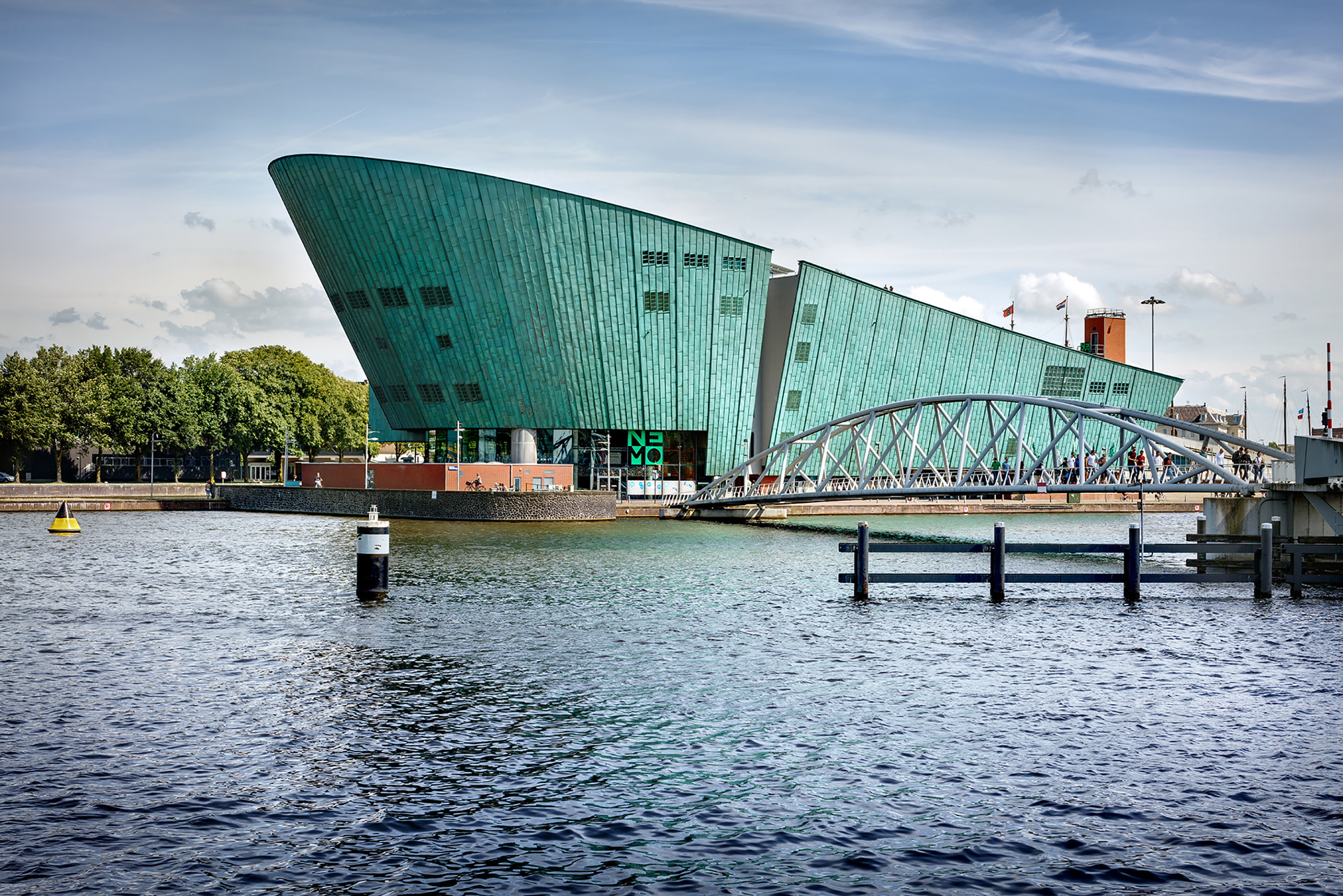
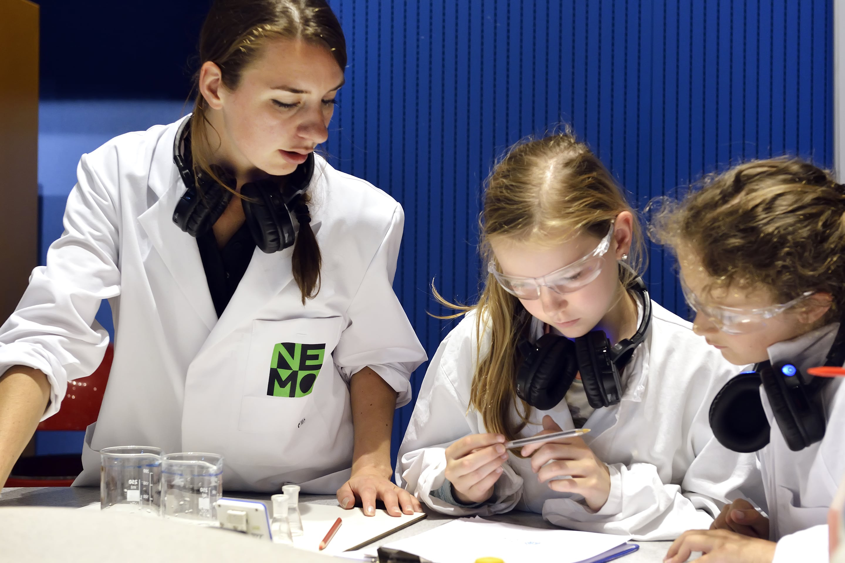
Housed in a landmark Renzo Piano building, NEMO Science Museum is famous for its innovative, joyful approach to making science accessible to children aged 6–14. However, many people are unaware that NEMO is responsible for other groundbreaking initiatives including education programs, festivals and Kennislink – a popular online education resource and magazine.
Strategy
The strategy was based on two pillars. One was to make sure NEMO would become a more dominant and recognisable brand across all of its communication channels and activities. Technology plays a huge role in our lives, but it can be very complex. NEMO excels at making technology accessible and understandable to non-experts. This informed the second pillar: for NEMO to be seen and known as the institute to turn to – a beacon, where technology and science are accessible to all.
Design
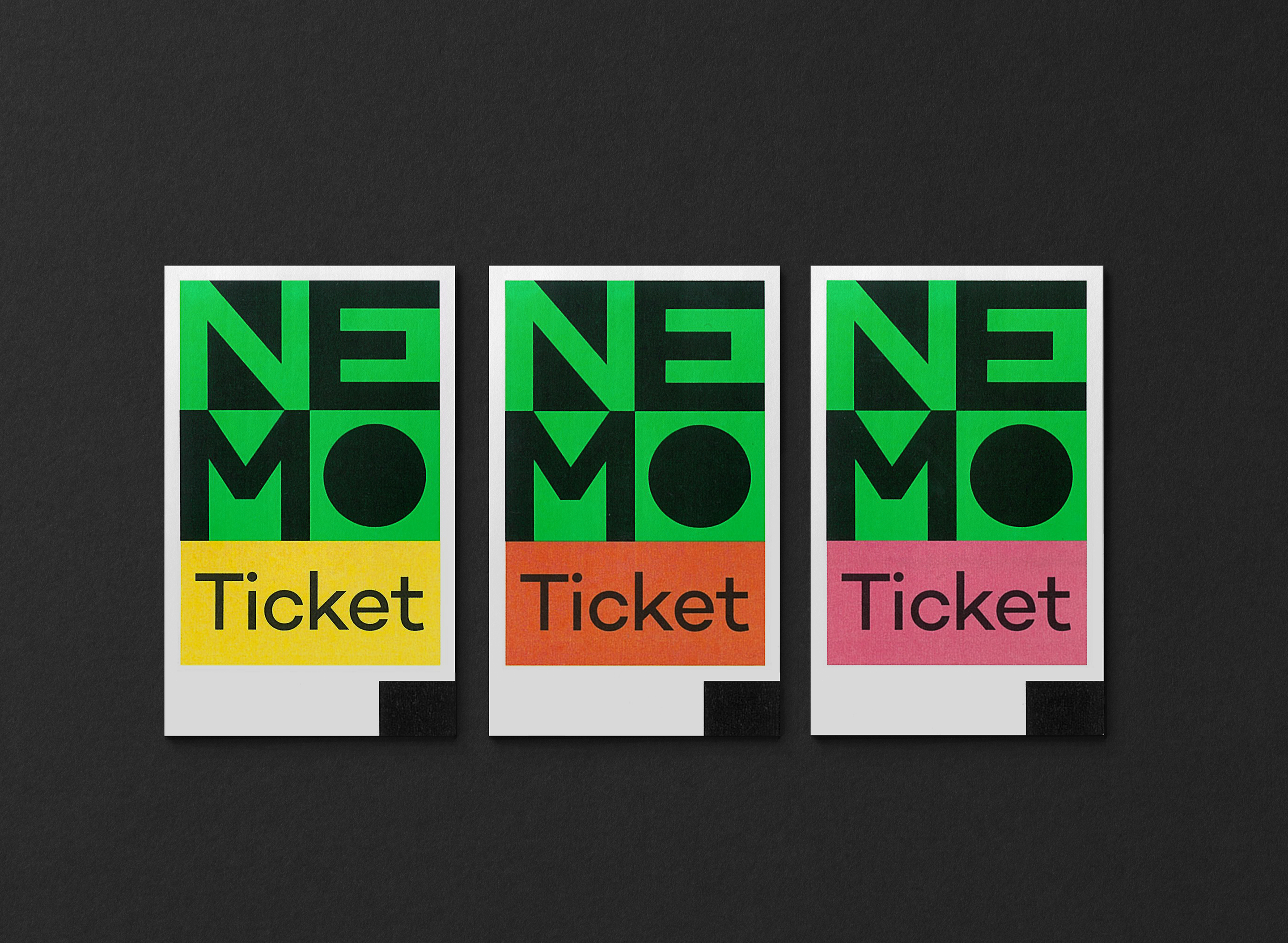
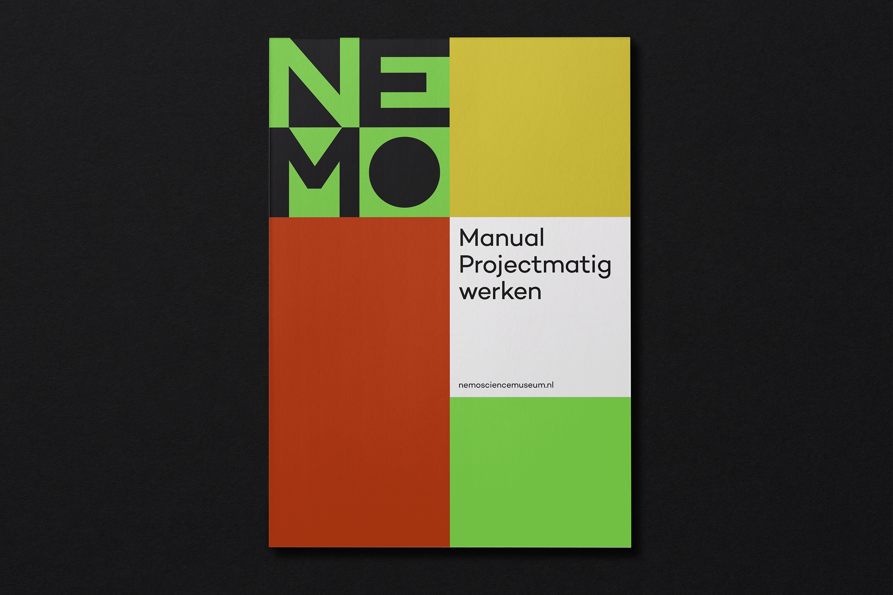
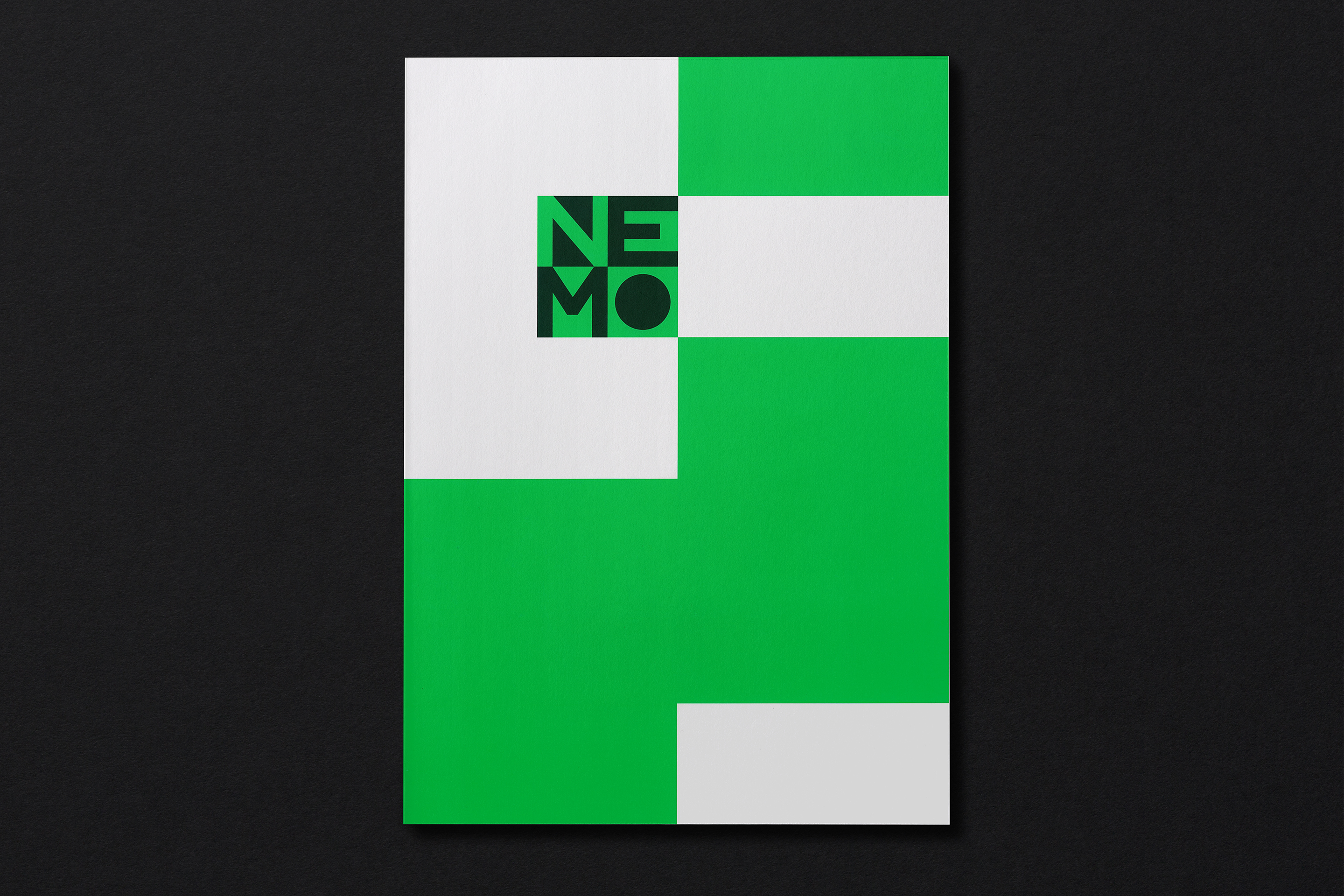
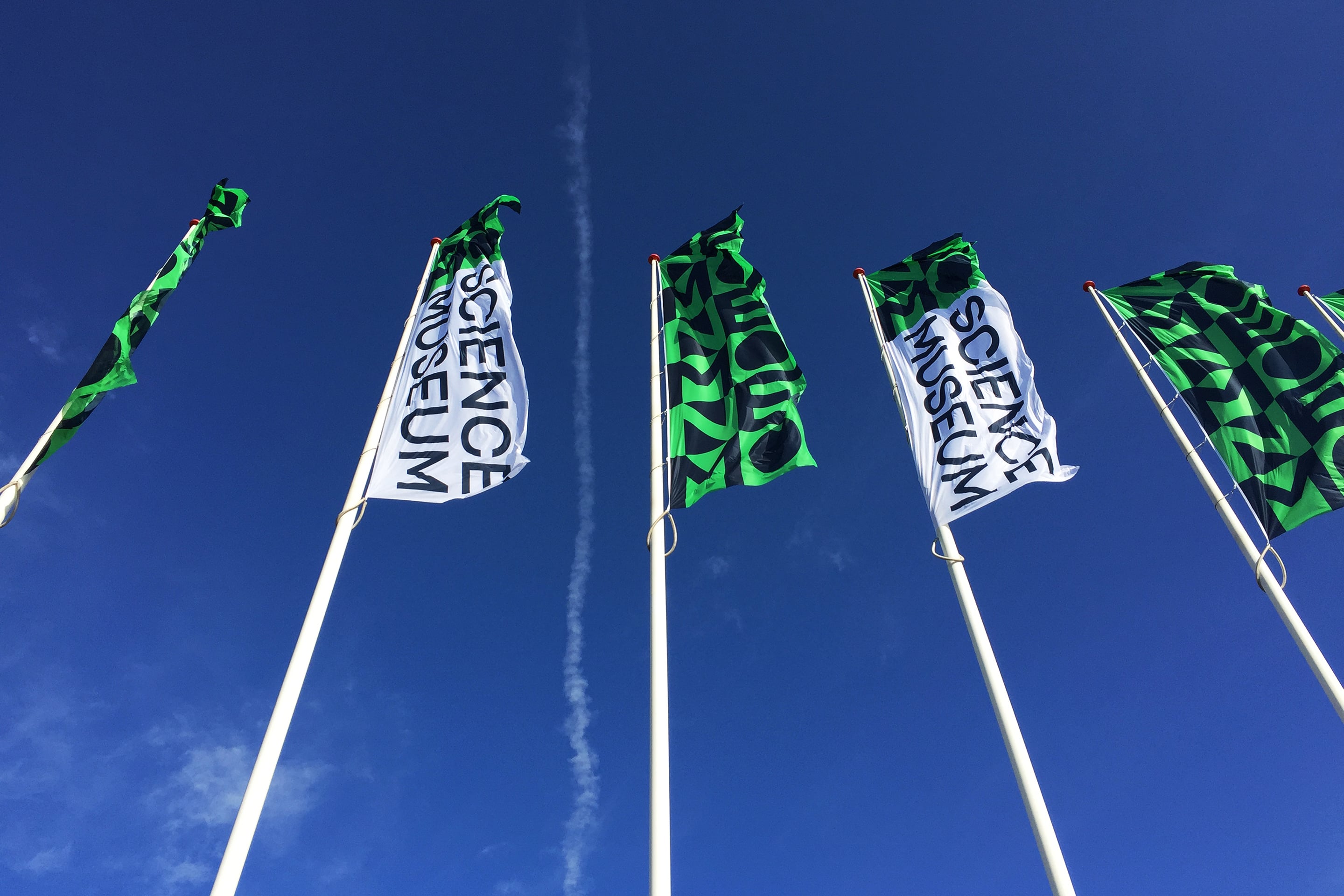
To make sure people find their way easily to NEMO, all its activities are now communicated under one umbrella brand. We created a strong identity that intrigues, inspires and surprises. Appealing to people of all ages, the word-mark has a playful, interactive quality. It is also clear and instantly recognisable on all communications, from huge, banner-like flags to online manifestations. Like NEMO, the identity is a beacon.
Results
The branding of NEMO has become much stronger with the new design. The fact that the new word-mark can be used across such a broad range of activities has helped to change the public perception of NEMO – from a museum aimed at children, to an influential organisation that makes science accessible to everyone.
