NS Dutch railways - Updating our 'own' heritage
The NS logo is probably one of the longest-standing logos still full in use; the lifespan and benchmark status of this project is testament to identity design at its best. To further perpetuate this vitality, NS asked us to update the visual identity.
Strategy
The design of the logo and visual identity of the Dutch Railways is part of our own heritage. Gert Dumbar designed the NS logo as a creative director at Tel Design. In 1977 he established Studio Dumbar, who worked on Dutch Railways projects throughout the 1980s, including information graphics for route planners and timetables that are still in use today. The NS logo remains one of the oldest logos still in use; the lifespan and benchmark status of this project is testament to identity design at its best. To further perpetuate this vitality, NS asked us to update the visual identity.
Design
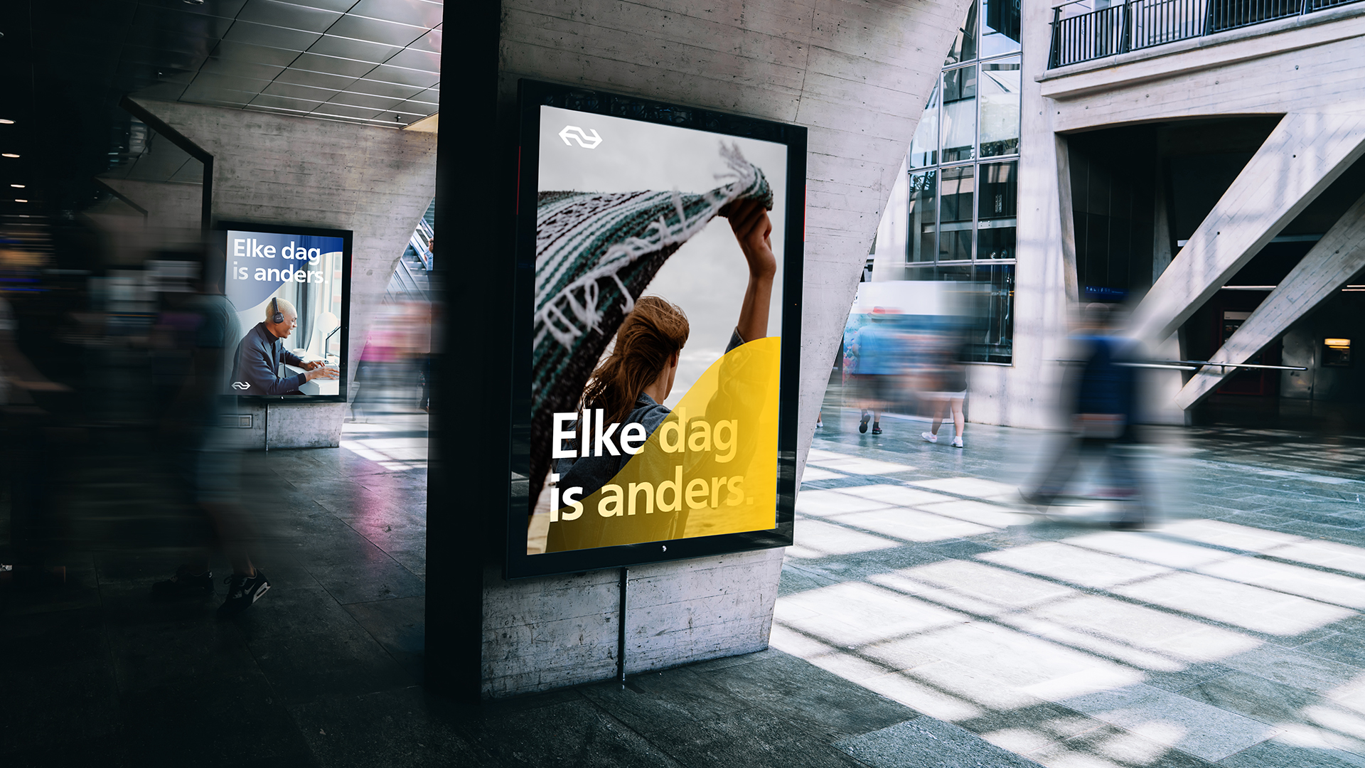
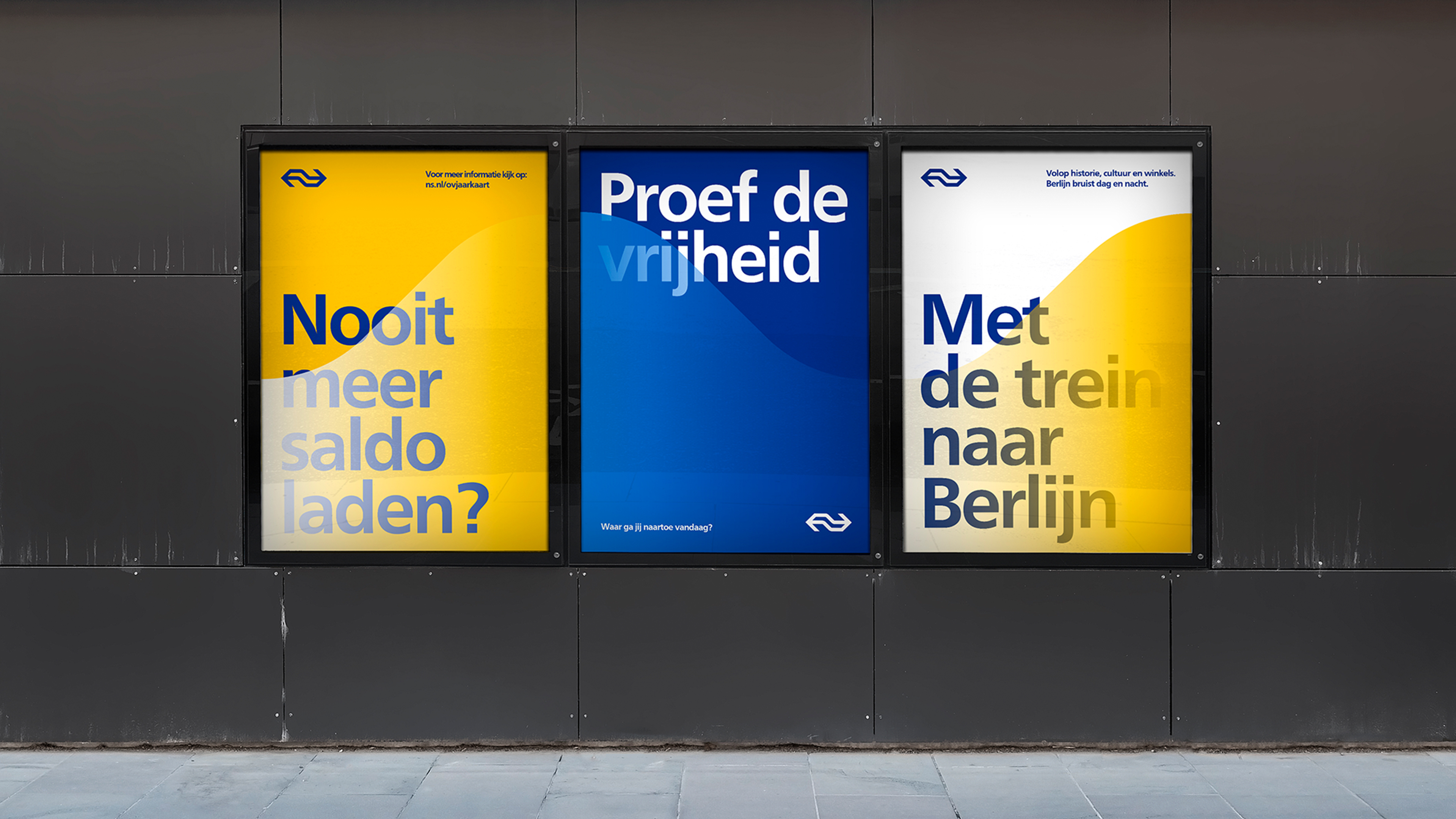
The Dutch Railways have substantial amount of touch points and a complex challenge in governance. Partly we focused on simplifying the basic design and execution, bringing the identity back to its core. Next to this, we introduced the ‘flow’ as a new element. The flow adds roundness, warmth and an organic effect of motion to the identity.
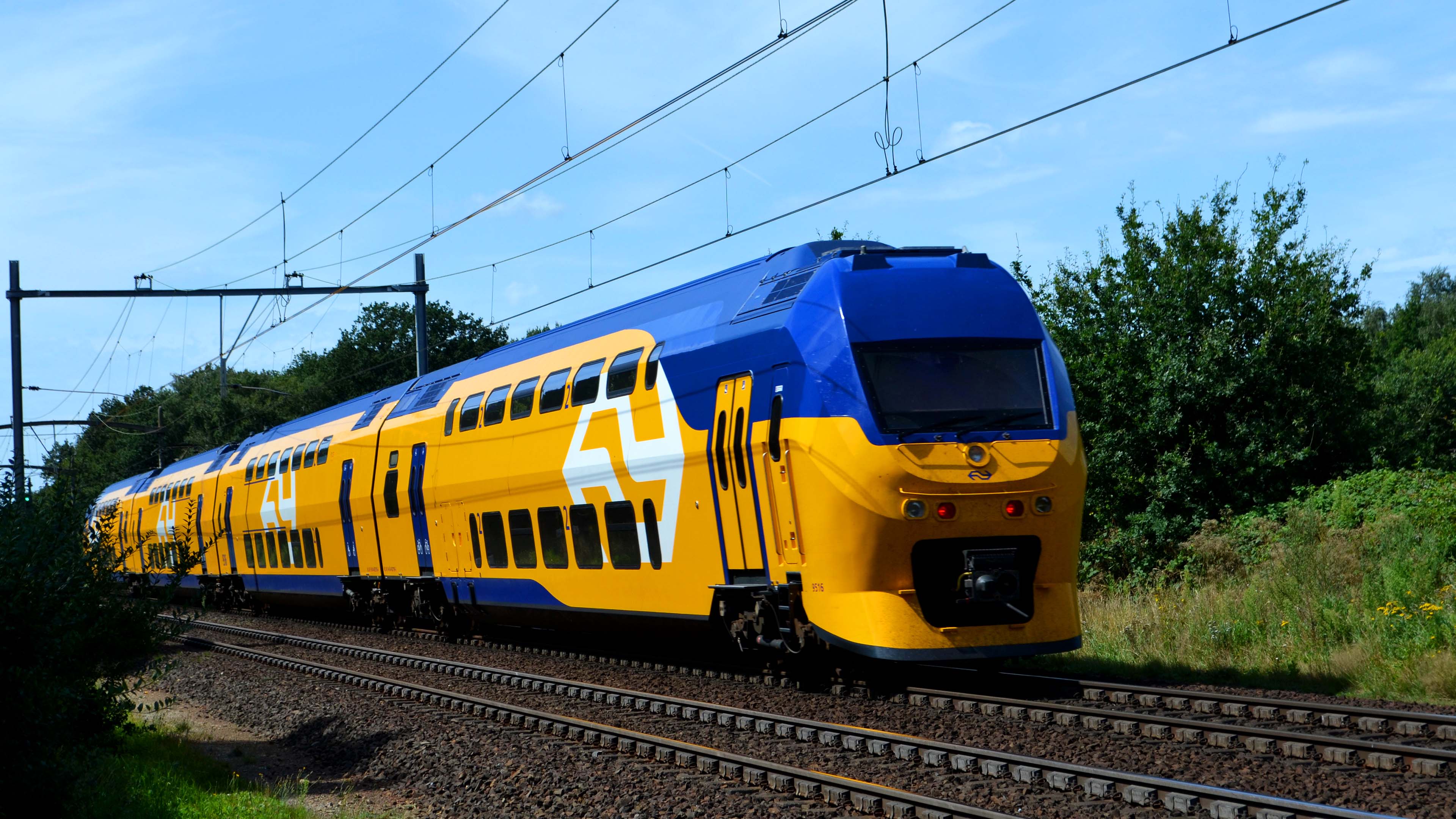
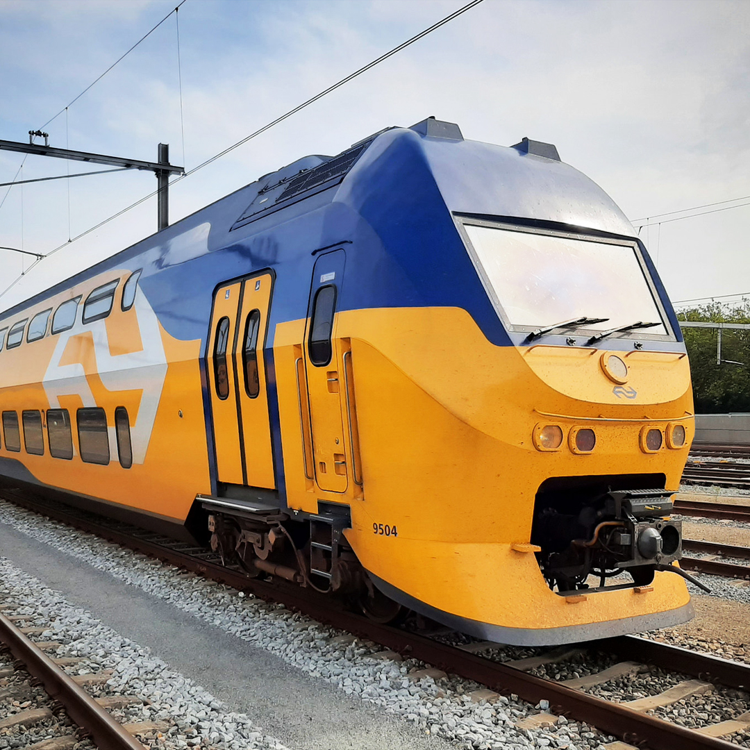
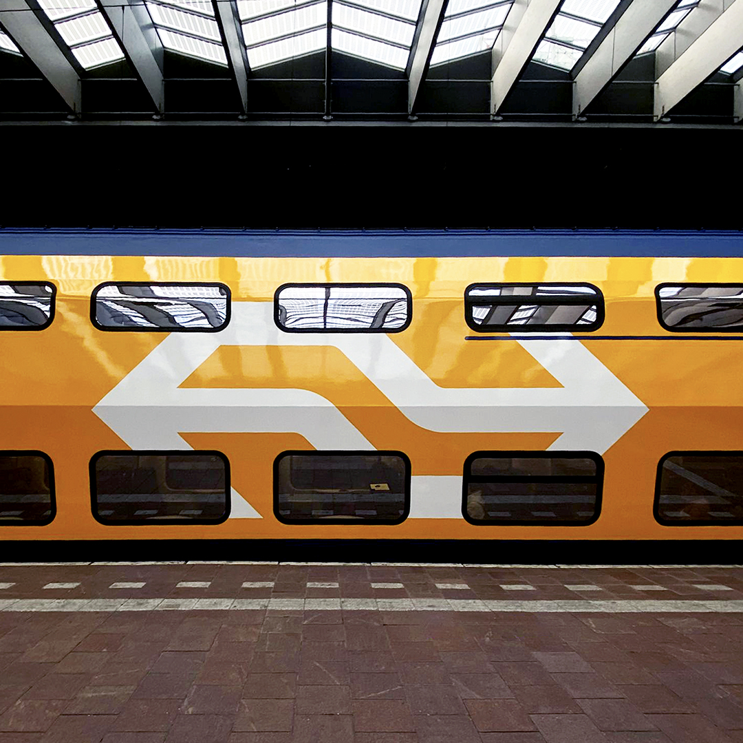
The train is, obviously, the most crucial part of the customer journey. Studio Dumbar/DEPT® created a new design for the trains. The design integrates the idea of the flow, it gives a more prominent and proud position to the logo and it makes the train look more modern and faster. Whereas currently each type of train looks different, in the long run all trains of Dutch Railways will feature the new design
Results
The update of the visual identity is a careful balance of change and continuity. The logo and the colour combination yellow/blue, the strongest assets of the identity, remain intact. At the same time the renewed branding opens a new chapter in what is seen as one of the most iconic identities in the Netherlands.