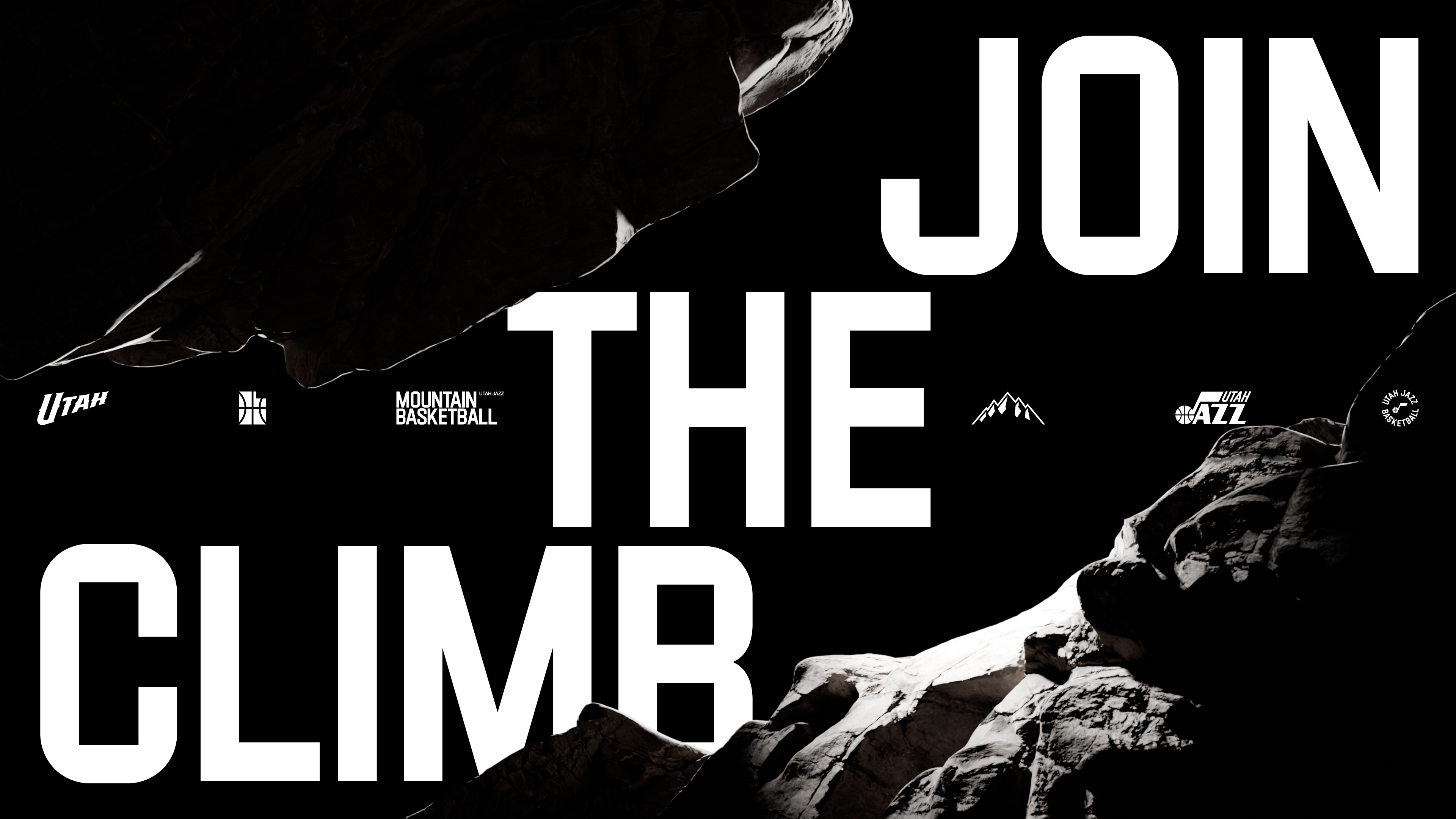
Utah Jazz — Reclaiming the iconic mountains
For Utah Jazz and its fans, the 25-26 NBA season saw the welcome revival of an iconic jersey – purple, emblazoned with 'UTAH' and mountain graphics - worn during the 1990s by some of the sport's most celebrated players. This shift prompted a reassessment of its visual identity. Motivated by previous collaborations, Utah Jazz invited Studio Dumber/DEPT® to build on its Mountain Basketball theme, and refresh its visual identity accordingly.
Strategy
While the name Jazz recalls the franchise's roots in New Orleans, Utah has been its home since 1979. Shifting the focus from Jazz to Utah - and from Music to Mountains - indicates a clearer connection between the team, its locale, and its loyal fanbase. Visible from downtown Salt Lake City, the 7,000 ft peaks of The Wasatch Front inspired the iconic 1990s jersey design, and again they proved key - establishing a strong brand proposition, and a unique attitude.
Design
We delivered an expansive design system that climbs, collides and reaches new heights, infusing both static and motion graphics with renewed vigour. A toolkit of core design elements encompassed colour palettes, typography, patterns, 3D illustrations and motion - all united by the guiding principles, Ascend and Impact. Typography and patterns Ascend to connect the movement of the sport with the verticality of the mountains - constant elevation, lifting every composition, transition and graphic element. Impact moments embody power - fueled by large type, flash-frames, high intensity transitions and dramatic lighting. These ingredients ensured a consistent spirit for the entire season.
Results
The refreshed identity and dynamic motion reinvigorated the Utah Jazz brand, creating a much clearer connection with its local fanbase. A sophisticated look and feel distinguish it from the glossy visual vernacular often associated with American sports, while communicating messages with clarity and impact across all touch-points, at all times.

